Exercise: A Visual Diary
Collect leaflets, flyers and postcards; take photos of things you see in the street; keep pages from magazines – anything and everything that is visually stimulating to you. There is right or wrong, the important thing is to actively look at the world around you and become genuinely curious about visual languages.
Reflect on what you have been collecting: are there dominant themes emerging? You may find yourself interested in a particular area of design, era or design product. What does this tell you about your own visual language and culture awareness?
I have created a Pinterest board to save any images that appeal to me and are not related to any particular exercise or assignment. I have made it part of my daily routine to spend about 10 minutes scanning Pinterest for any images I find inspirational or interesting.
Pinterest Board – Visual Diary
Since starting this course I have been collecting examples of design that are visually stimulating to me, which I keep in a folder for reference. I try to analyse any material I come across (whether in print, on screen or otherwise) to try to understand how it was created, the message it is trying to convey and how successfully (to me) this is achieved.
A selection of examples (both online and scanned) are below, along with reasons why these appeal to me.
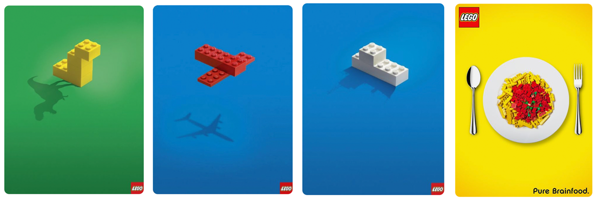
I think these Lego adverts capture the essence of the product, requiring the person to use their imagination and creativity. You would think it’d be quite difficult to sell coloured blocks of plastic, but the shadows are added to show the creative possibilities. The use of bright, basic colours reinforce the essence of ‘fun’. There is a lot of white space in the designs, which makes them clean and focussed. The fact that Lego is such a well-known, global brand means that very little, if any, wording is required. The advert on the right uses the metaphor of lego being like food on a plate – boosted by the term ‘Pure Brainfood’. I like the simplicity of these designs, which I think is what Lego aimed for.
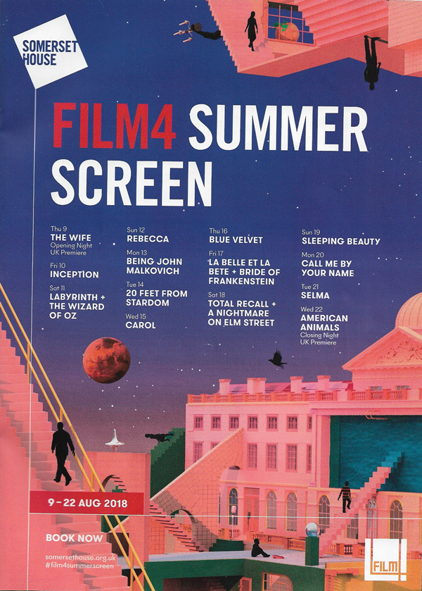
The first thing that appeals to me about this design is the colour palette, which I think is inviting and gives the impression of warm summer nights. I also like the layout as it is organised, legible and there is a clear hierarchy to the content. Additionally, the use of illustration always interests me.
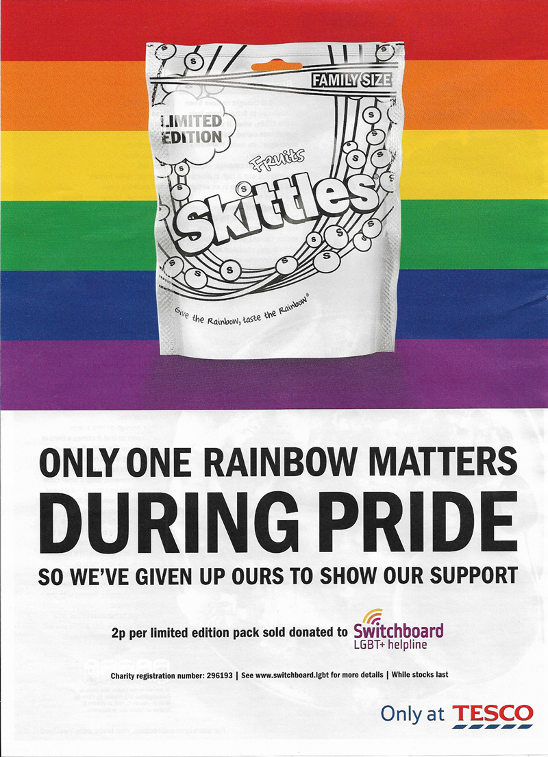
I found this advert to be quite eye-catching as it has taken out the most recognisable feature of the product – the bright rainbow colours – and turned these into the Pride flag, making this the only colour in the whole design (beside the Switchboard logo).
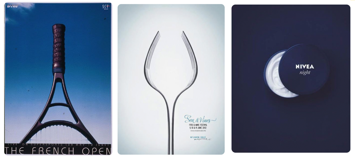
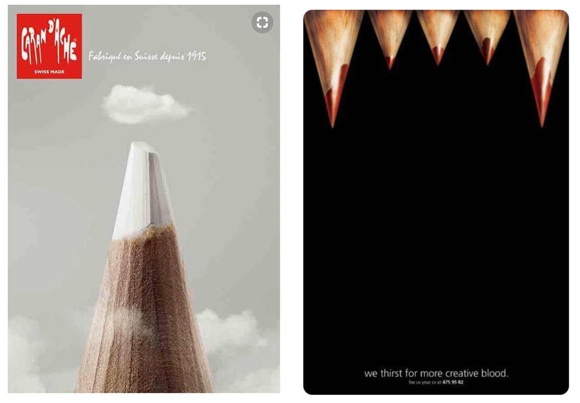
The three designs above and two below are examples of photographed objects being used as metaphors. I particularly like the simplicity of the Nivea Night cream and the ‘creative blood’ adverts.
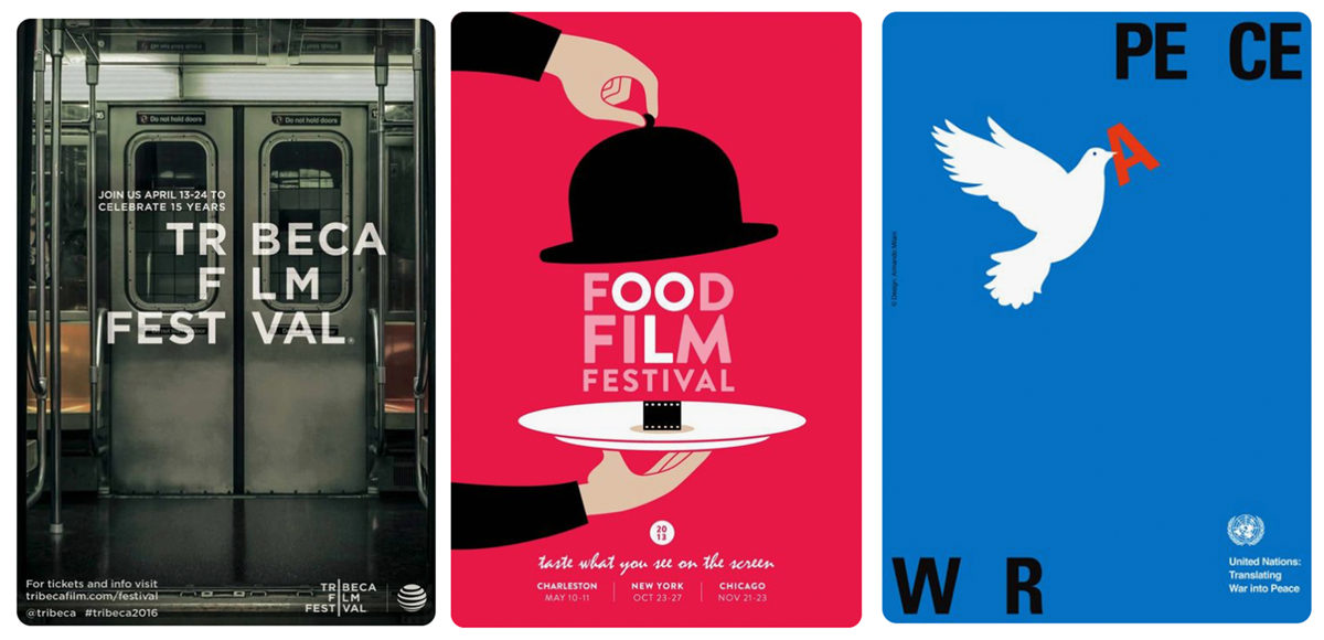
I am becoming more and more inspired by the use of typography as part of the design, as I think this is more visually appealing than just placing text on top. These three designs are examples that demonstrate this.
From what I have gathered so far the dominant themes are:
Minimalistic – I am definitely drawn to design that is not cluttered and uses white space/negative space effectively.
Colour – I seem to like design that use limited, bold colour palettes, often with just one or two hues along with black and white.
Illustration – I really like designs that makes use of illustration as this is an area that I hope to end up working in. I prefer simplified, vector style designs.
Mixed Media – Many of the materials collected show I am drawn to designs that incorporate physical objects/photography, which was quite unexpected as I have never really thought much about working in that way. However, I think some of these are really cleverly created and I find them inspirational.
Typography – Before beginning this course, I never really paid much attention to the design of text. However, I am becoming ever more interested in this area and I am very keen to see how particular typefaces are selected for different purposes. I particularly like designs that make the text part of the actual design.
I am most impressed by design that makes you think long after seeing it.
Currently I do not feel I am looking at material from a wide enough range of sources, which inhibits my visual and cultural awareness. This is something I am intent on improving, for example by taking photos of anything I see of interest when out and about, which is not something I presently do very often. However, I do think I am gradually improving and becoming more aware of different design trends and designers. I have found reading books to be particularly helpful with this.