Exercise: Birthday List
BRIEF
Create a poster of a birthday calendar that can be pinned to a noticeboard or wall to remind you of dates and, as it will be there a long time, it needs to look good.
Start by collecting all the birthdays of your friends and family. You’ll need their name and birth date, to decide whether or not you buy them presents or just send a card, text message or email. Design a page to include all of this, ordering it in a way that best suits you and including as much additional information as required.
RESEARCH
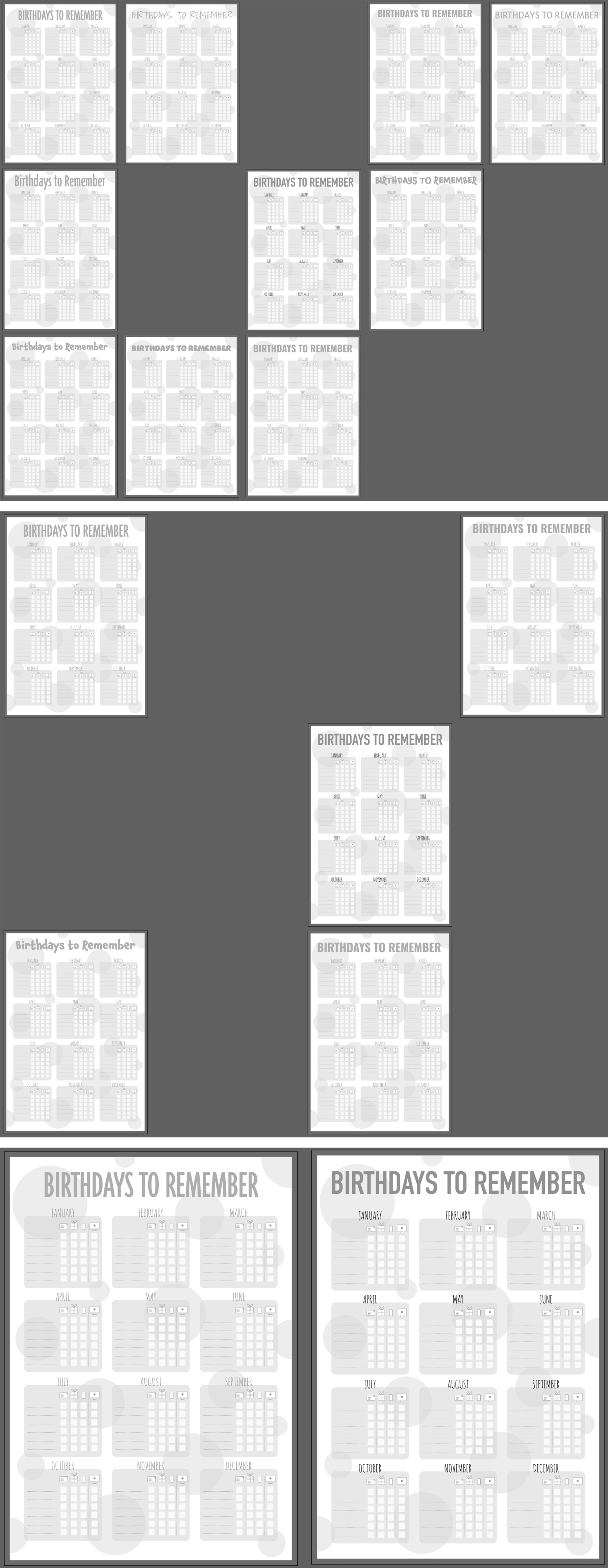
I thought I would begin this exercise by looking for some examples, however, the small selection that I came across were not very inspirational. A few of the best can be seen below:
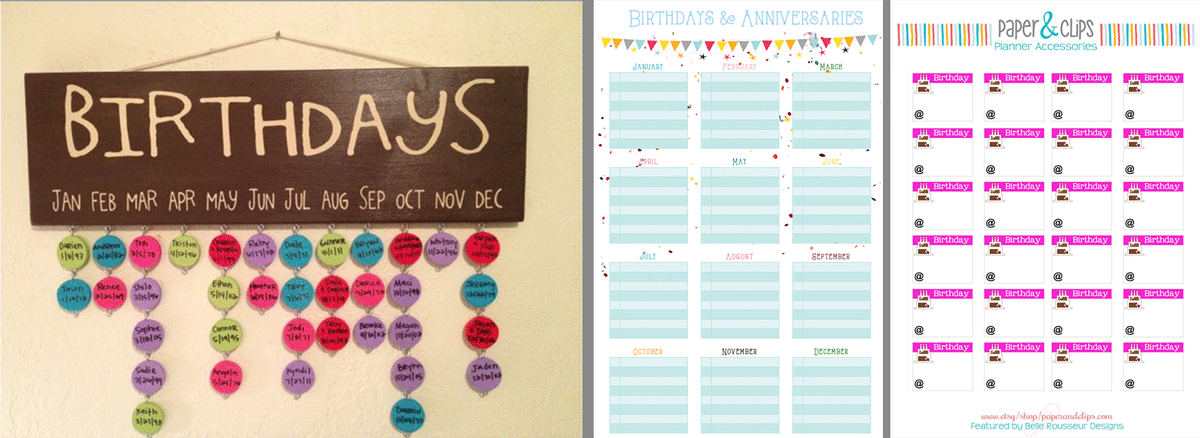
As the exercise brief clearly states that the poster would be for my own use, I decided to just create something that is to my personal taste and use it as an opportunity to implement what I have learnt so far.
PLANNING
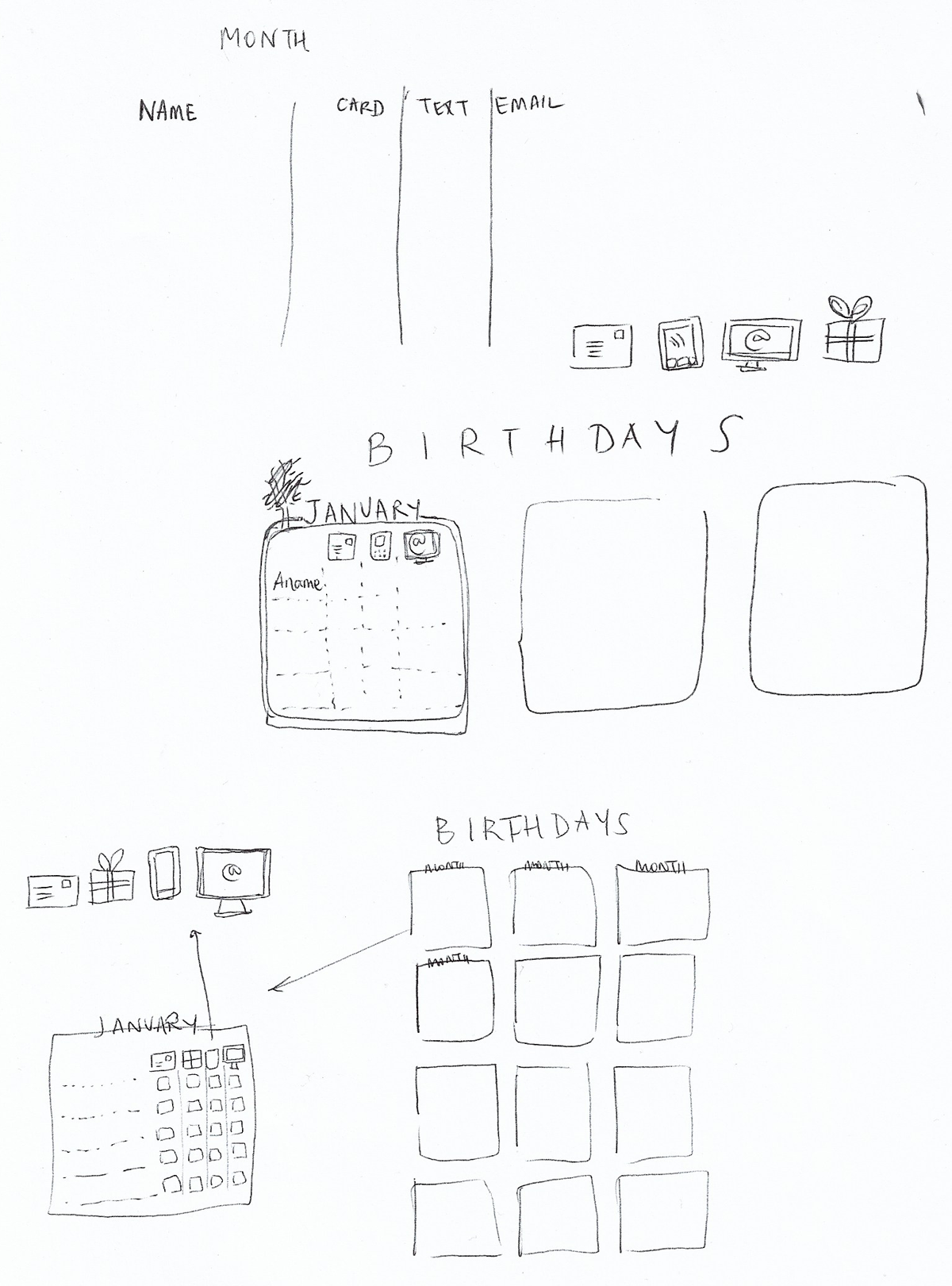
I considered the information that I would want on the birthday calendar. I decided that it would just include the person’s name and whether they would receive a card, gift, text or email. I made a very rough sketch of my idea for the layout. I needed to make sure I incorporated enough white space within the design despite there being a lot of different elements on the page.
DESIGN PROCESS
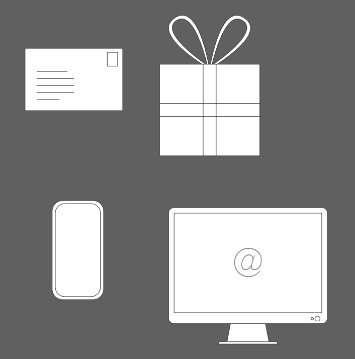
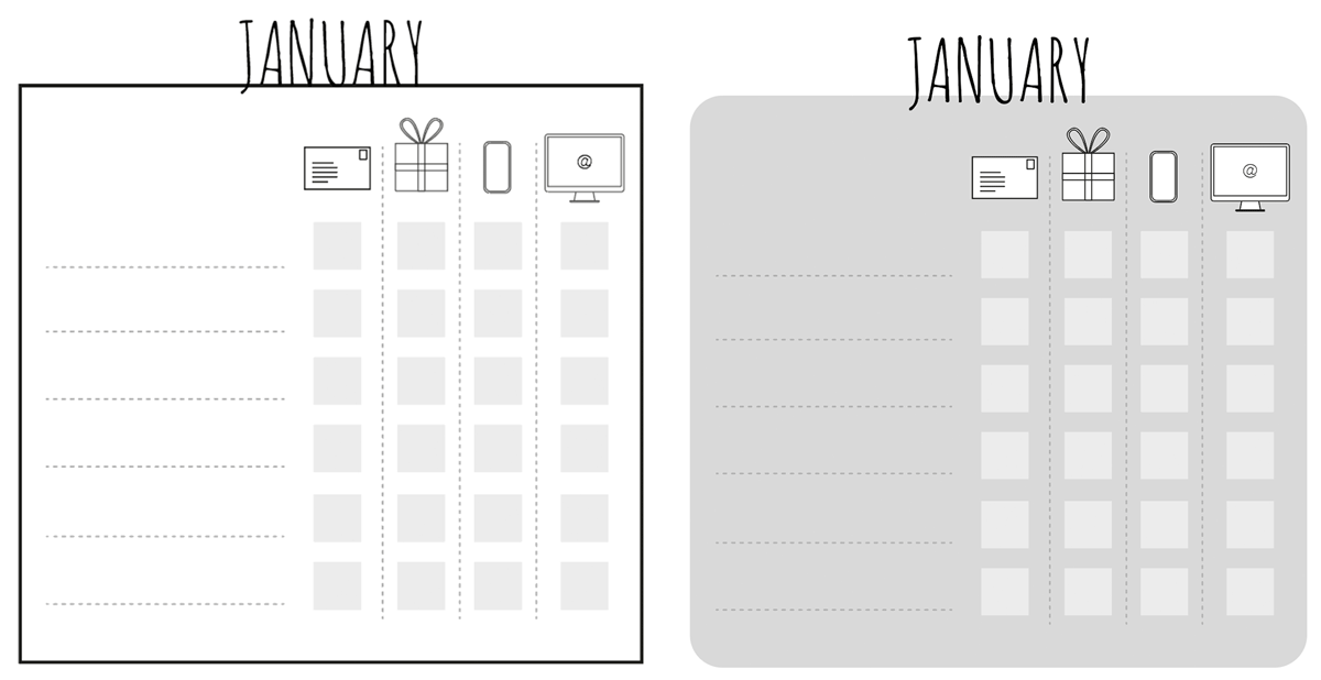
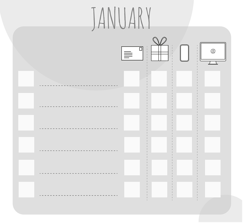
I began this exercise by using Illustrator to design the four symbols I would be using to represent: card, present, text and email. I wanted to keep this very simplistic yet easily recognisable.
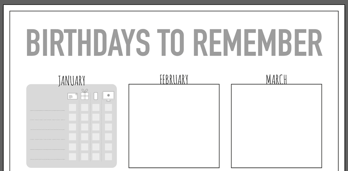
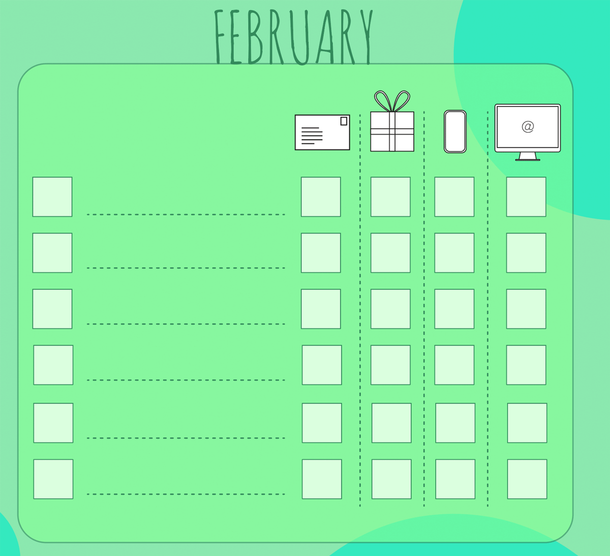
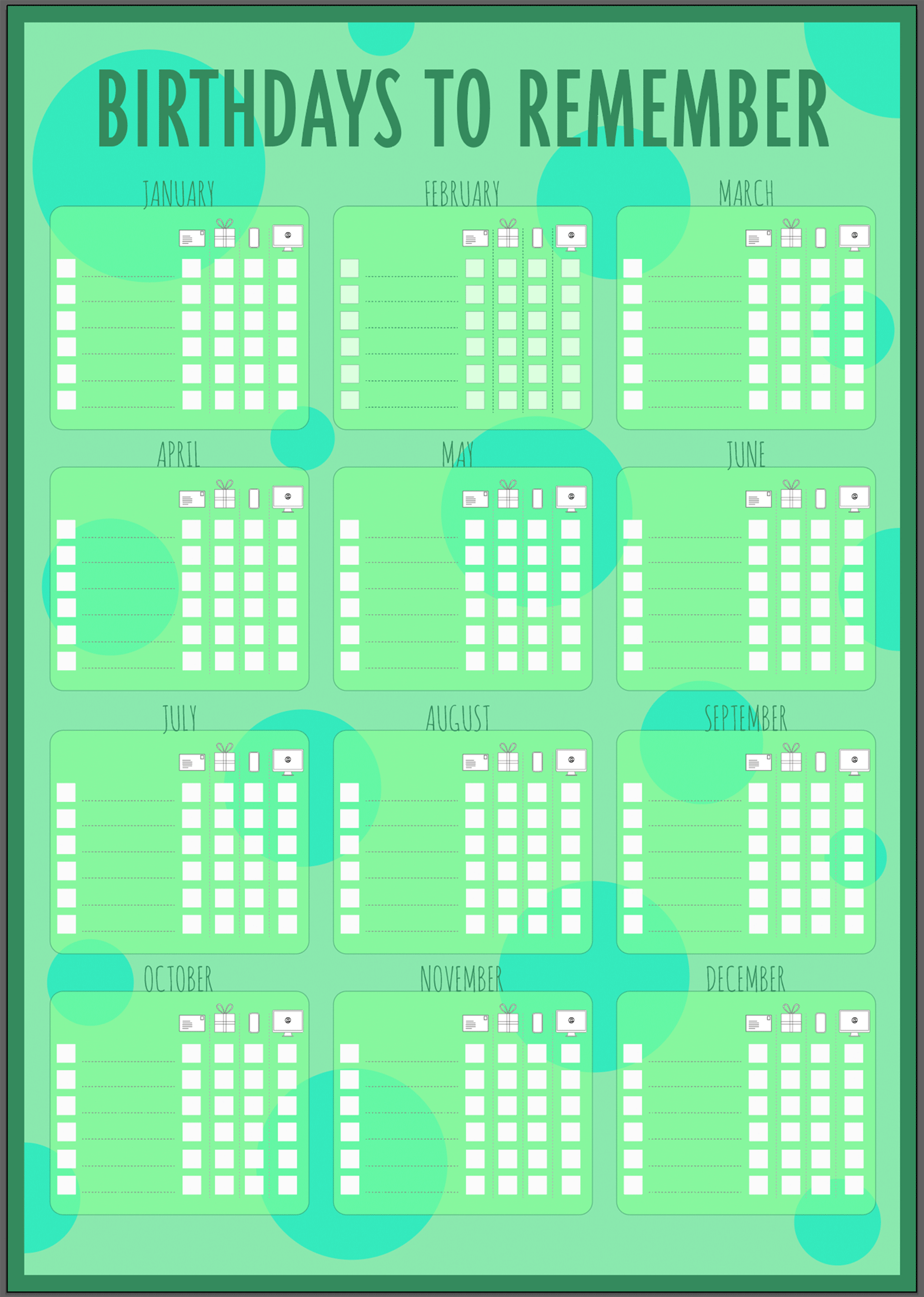
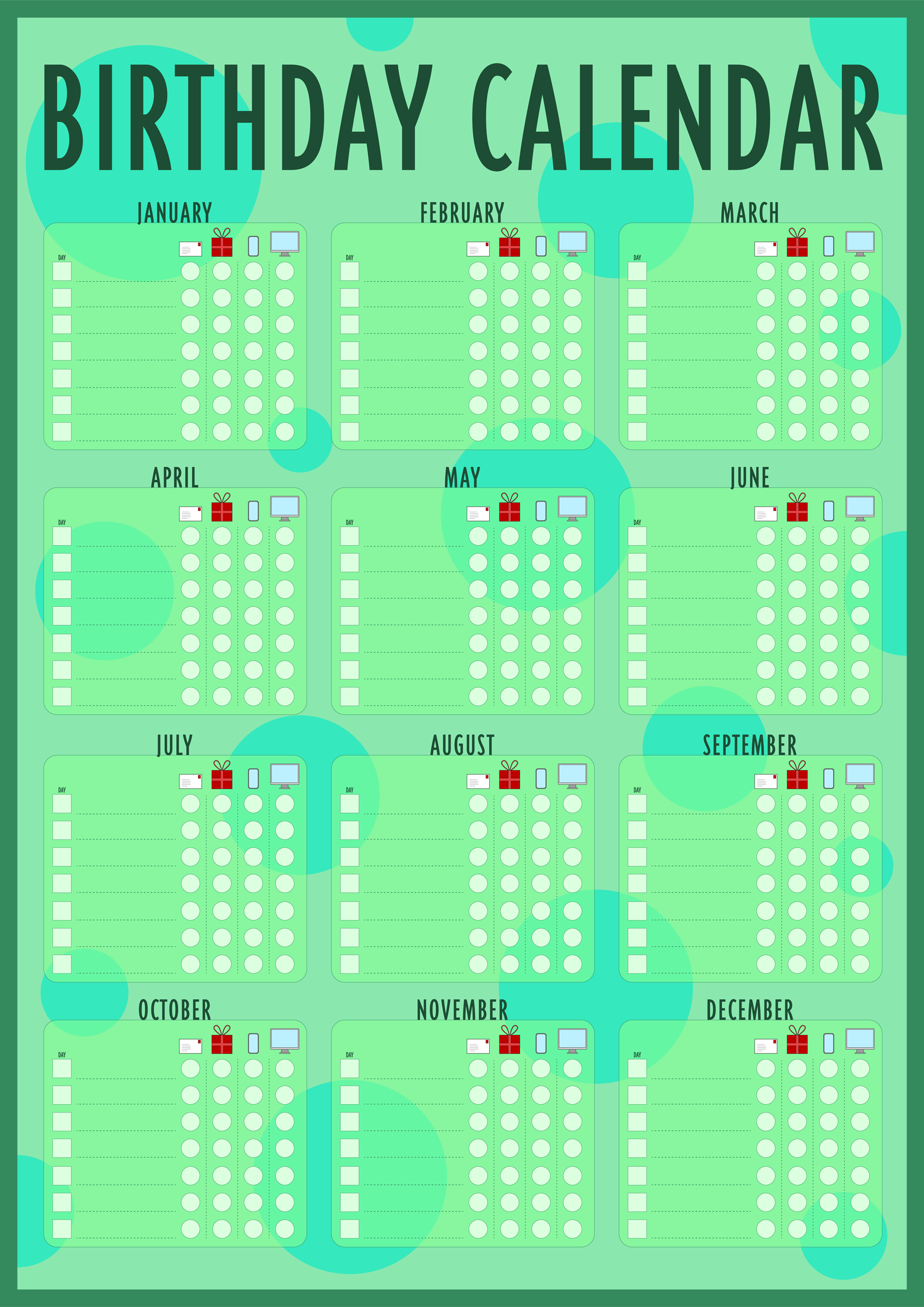
Next, I created an A3 size artboard onto which I placed twelve boxes, one to represent each month of the year.
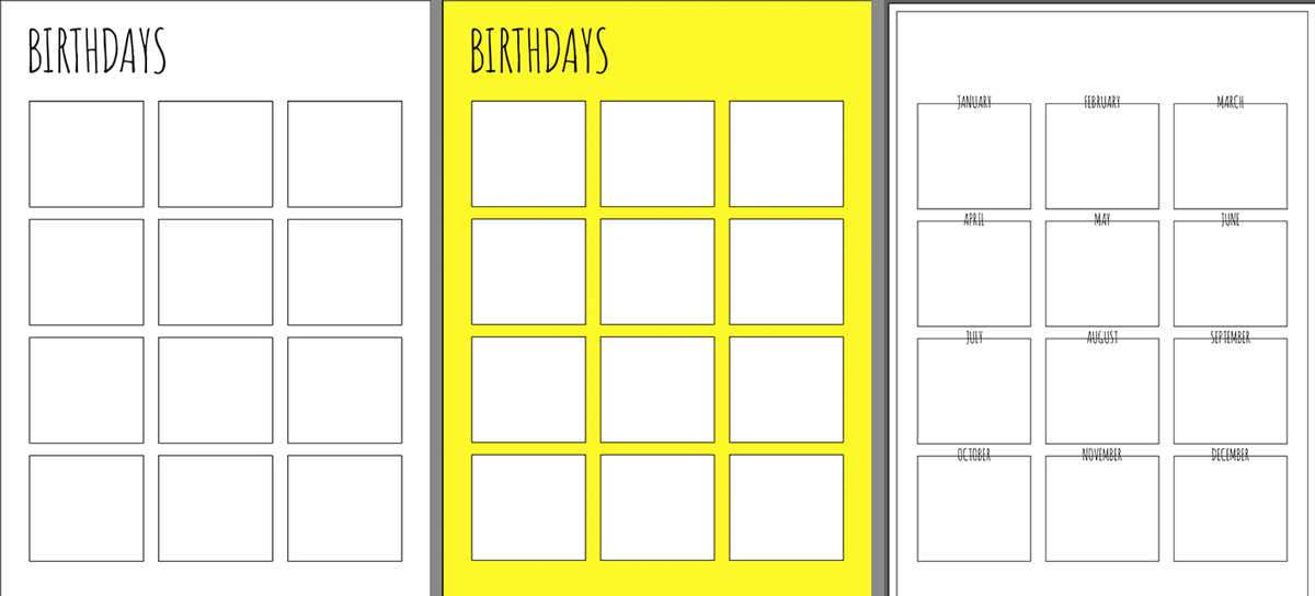
I then started to think about the layout for each month’s box.
I worked on just the one month as I could then replicate the design for the others.
I then considered the font I would use for the title of the poster. I placed the different options side by side which made it easier to see which ones worked better than others.
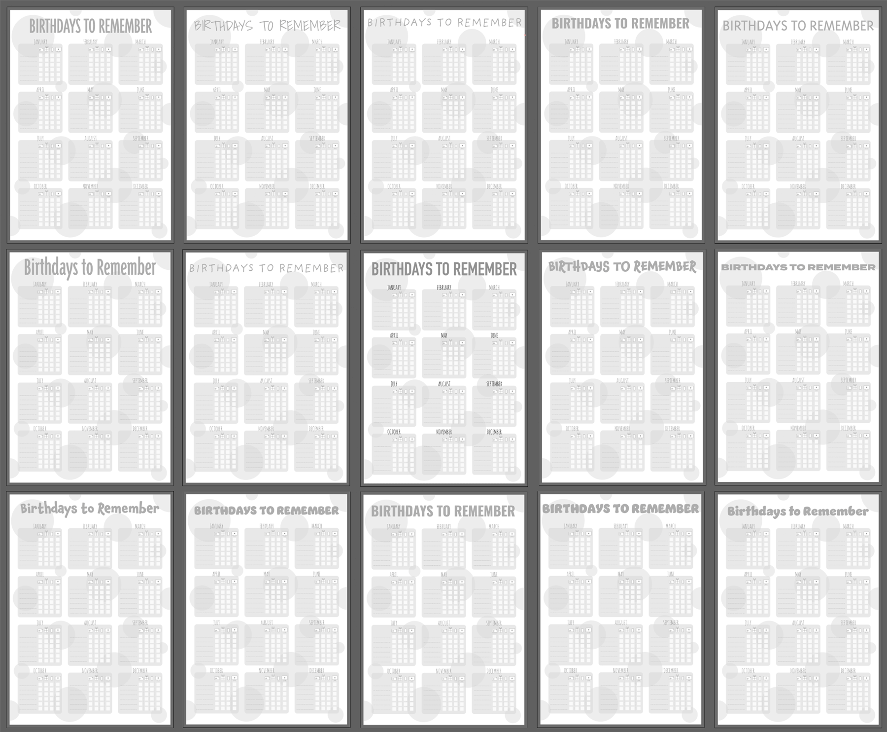
I could then cut out the ones that I felt were less successful. The aim was to use a font which would stand out, but not over dominate the poster.
The font I chose was: Triplex Fond Sans OT (Regular) as I thought it worked well with the overall layout.
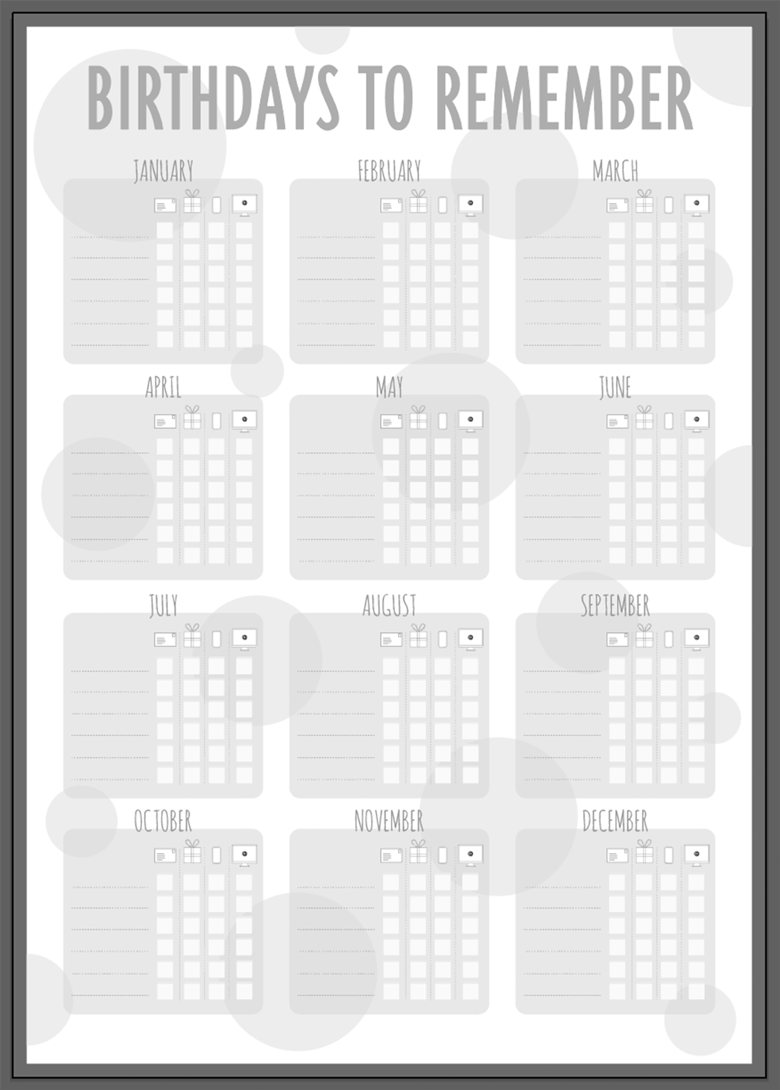
I realised that I had not added a space in the boxes for the day of the month to be added, so I remedied this.
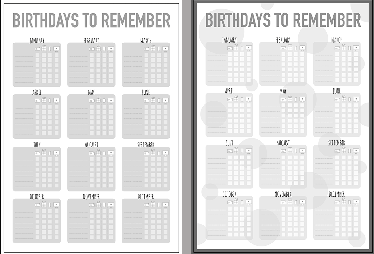
I had then reached a stage where I wanted to decide on the colour theme for the calendar. Initially I did think of using yellow and purple as these, particularly the former, are often thought of as ‘happy’ colours. However, I then decided that if the poster was to be put on the wall at A3 size, I would rather it had a more soothing colour scheme, based on green, as this is meant to assist in creating a more productive environment.
I used the Adobe Colour Wheel and found a pre-existing colour scheme that I particularly liked.
I applied this to the various elements in the design.
As before, I worked on a single month and then replicated any changes across to the others.
I then thought about what colours would be appropriate for the symbols. My first choice (below left) resulted in the gift symbol being too dominant on the poster, so I decided to use red instead (the complementary of green), which worked much more harmoniously. I also amended the alignment of all the elements in the box, which improved it immensely. I also changed the columns on the right of the box to circles as I felt this was much more visually pleasing and linked to the circles in the background.
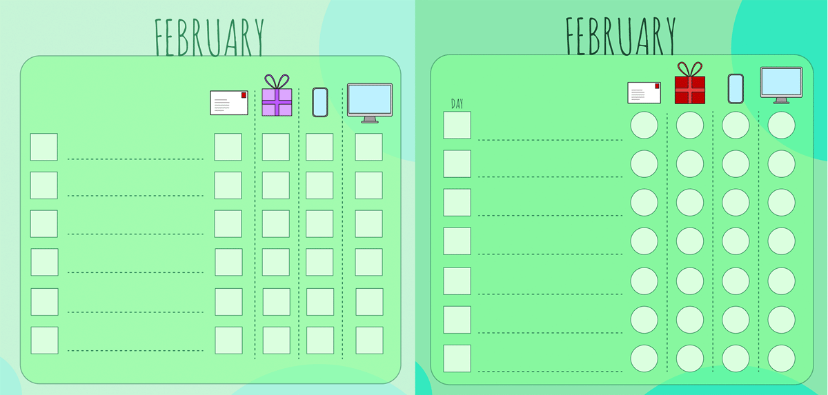
I decided that the font I had used for the months was not the ideal choice, so I used the same as the title. The boldness made the words stand out much better on the layout. I also added the word ‘day’ just to make it more obvious what that column was for.
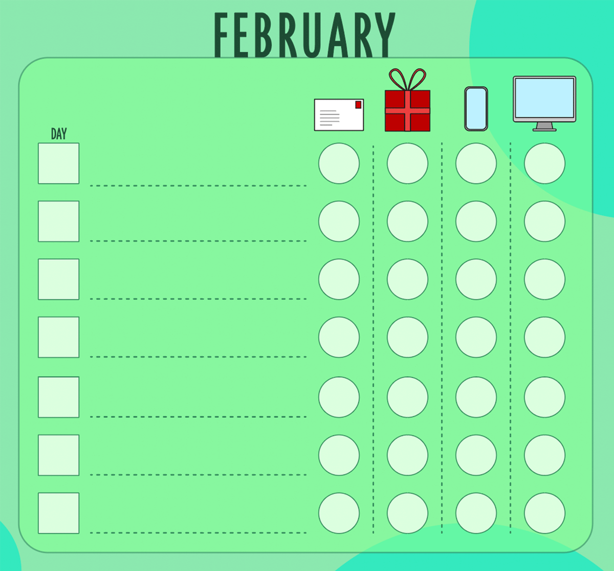
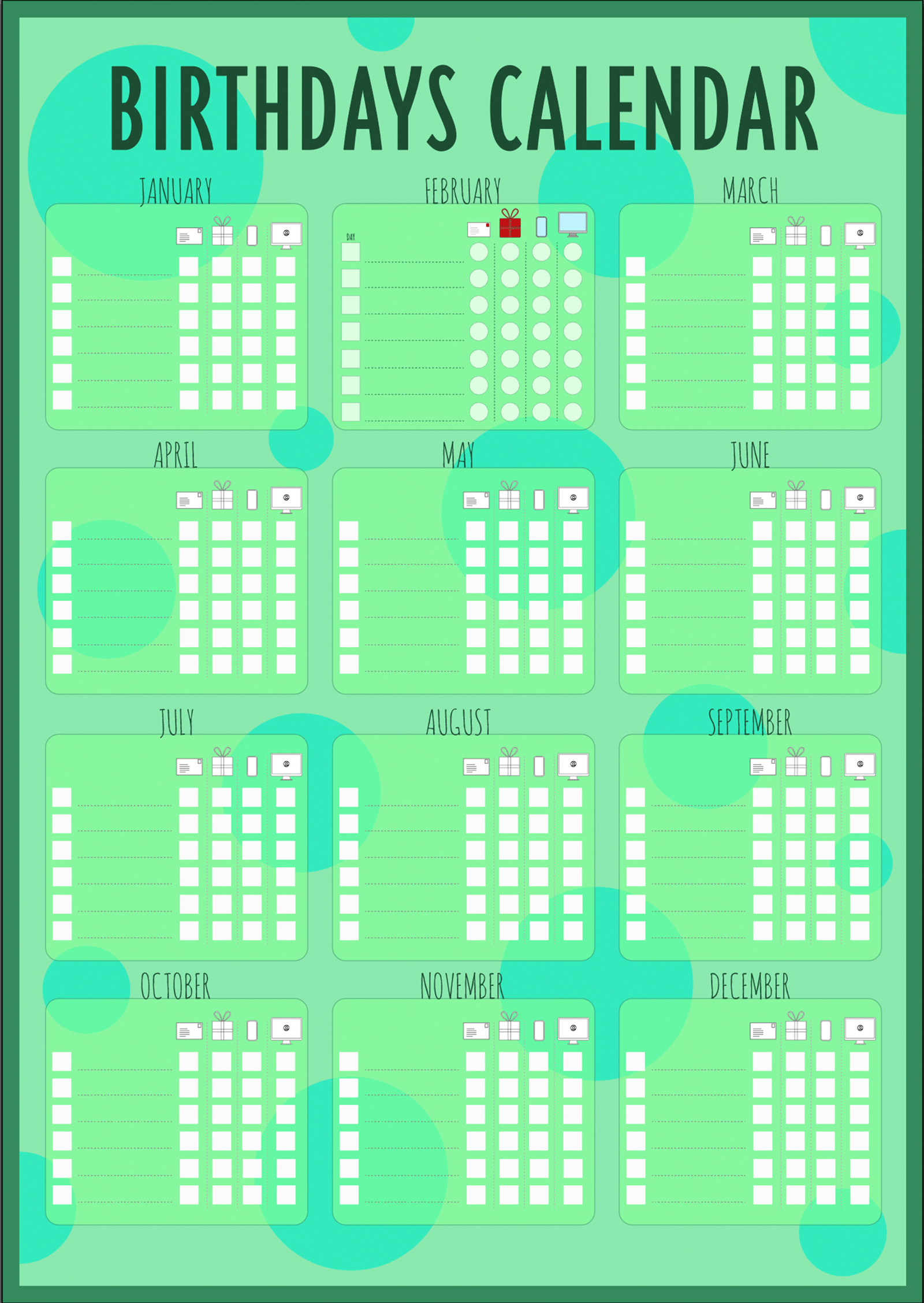
The final design of the birthday calendar can be seen below.
EVALUATION
There were certain design decisions that I took, which I would like to provide further reasoning for. These included:
- Lowering the opacity of the month boxes – I thought this would add some depth to design, especially once I added the background circles. Due to the nature of the purpose, i.e. a series of tables, a large number of boxes were already present.
- Circles – I initially added the circles to just the background to add some movement and depth to the layout. However, the addition of further circles within the month boxes and rounded corners softened the overall design, making it less formal and ‘scientific’ in appearance.
- Working without colour – I have been learning quite a bit about colour and the use of values, so I decided to not add any colour until I had the layout defined. I could also focus on creating strong contrasts by using greyscale and altering the value of this for each element. Once the layout was more less ready, I could add colour, but as this was from a pre-existing colour scheme the contrasts I had created became obsolete. This is something I would need to take into consideration next time.
I found this exercise very valuable in terms of consolidating what I have learnt so far. Creating the layout without adding any colour was very worthwhile as I was less distracted, so this is something I want to continue to implement and master. I thought the final design worked well in terms of the objective of the exercise and would be fit for purpose.