Exercise: Chance Housing Association
BRIEF
The Chance Housing Association has been set up to try and help first time buyers get onto the housing ladder and they want you to develop a brand image for their stationery.
It is important to them that the Association is seines being different from the other local housing associations – more modern, more helpful and definitely welcoming to young people wanting to buy a house.
They want to use their logo on their letterheads and office stationery and it will also be used somewhere on the sheets that hold the property details. It also needs to be reproducible in the local newspaper and professional trade magazines.
Research other housing associations’ and estate agents’ styles. Look at other publicationsdesigned for a similar audience. This information should help you identify as much what you want to do as what you do.
Using just typography sketch up some designs. You want to come up with at least three initial ideas to show the client. Decide which one you think works best to further develop.
Mock up a letter head and business card using the logo and house brand. Look in your local newspaper and mock up an advertisement to fit in the paper. Measure thespace carefully remembering to leave sufficient margins so your text isn’t cramped. Phtocopy in black and white onto cheappaper – does your logo still work? Have any fine lines got lost? Are the differences between colours still discernible?
What feedback to you get from other people?
If need be, go back and adjust your artwork. Make up a presentation pack to show the client (your tutor).
KEYWORDS
I started this exercise by extracting some key words from the brief:
- different
- reproducible
- modern
- helpful
- welcoming
- young people
- typography
- 3 initial designs
- letterhead, business card, newspaper advertisement
- presentation pack
RESEARCH
Next I looked at some examples of existing Housing Associations’ logos via a Google Image Search. From this initial sample I noticed that the colours green and blue are used the most – these colours are linked to new beginnings and calm, so are quite effective choices in this context. Many of the logos incorporate houses or roofs to link to their purpose. The majority use a sans serif font. I think these are better suited for this purpose as they appear more modern and bold.
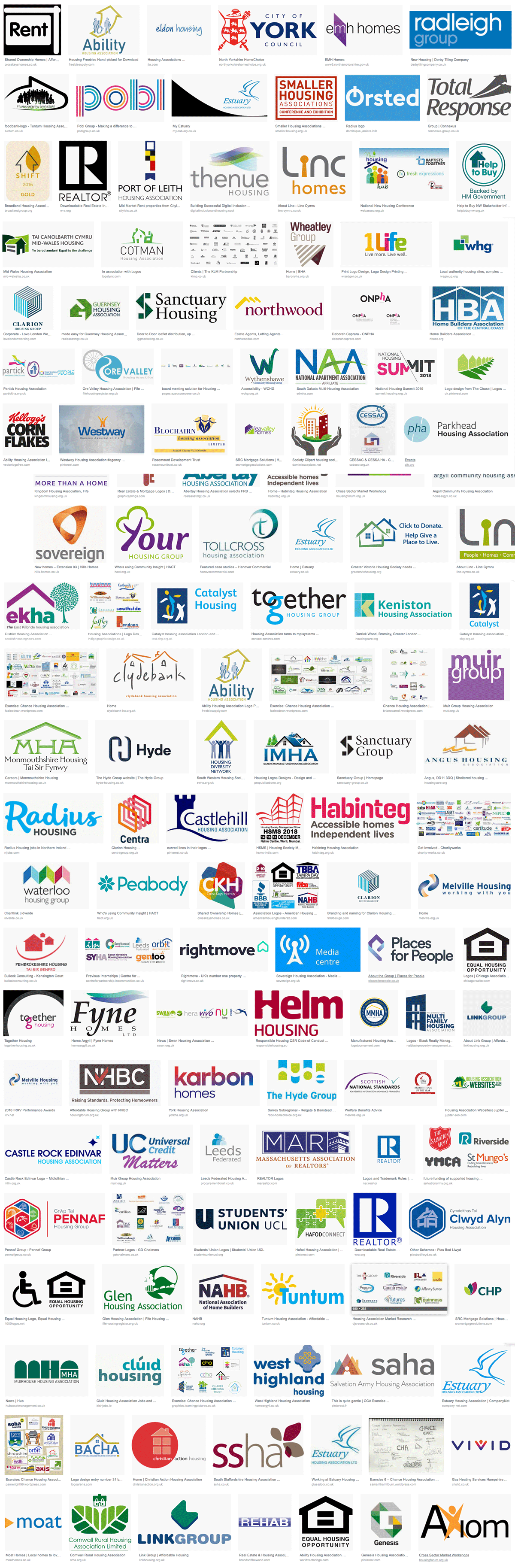
I looked at a few examples of Housing Association logos more closely, some of which I made notes on:

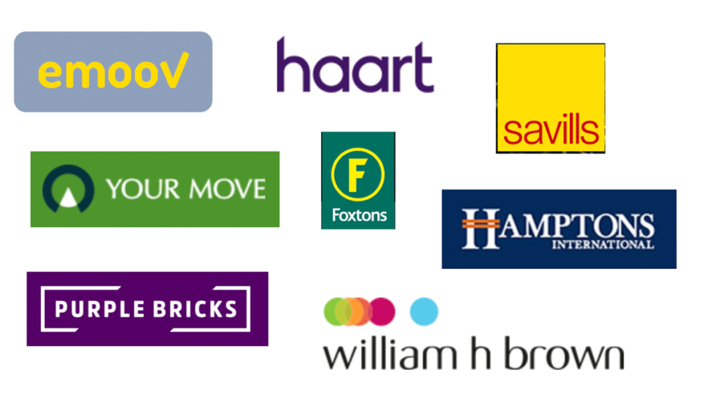
I also had a look at various estate agent logos. I personally preferred the Housing Association examples as I thought they were more imaginative and personable. However, I realise the two are aimed at different audiences so this would have to be taken into consideration.
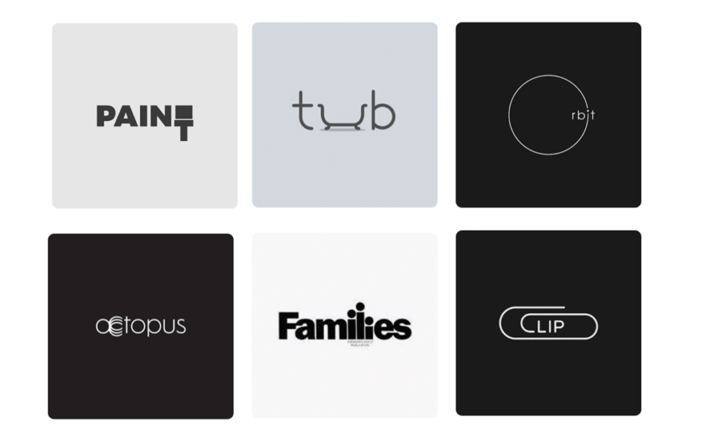
I then looked at some examples of logotypes via Pinterest which play on the letters to illustrate the meaning. I really enjoyed these and admired the imagination of the designers to use a single letter in such creative ways.
IDEAS
I then moved onto mind mapping some of my own ideas based on the examples I had looked at so far. I thought about words that could be associated with the name to reflect the desired tone and message of the brief. I tried to keep in mind the target audience and also started to think about fonts and colour choices.

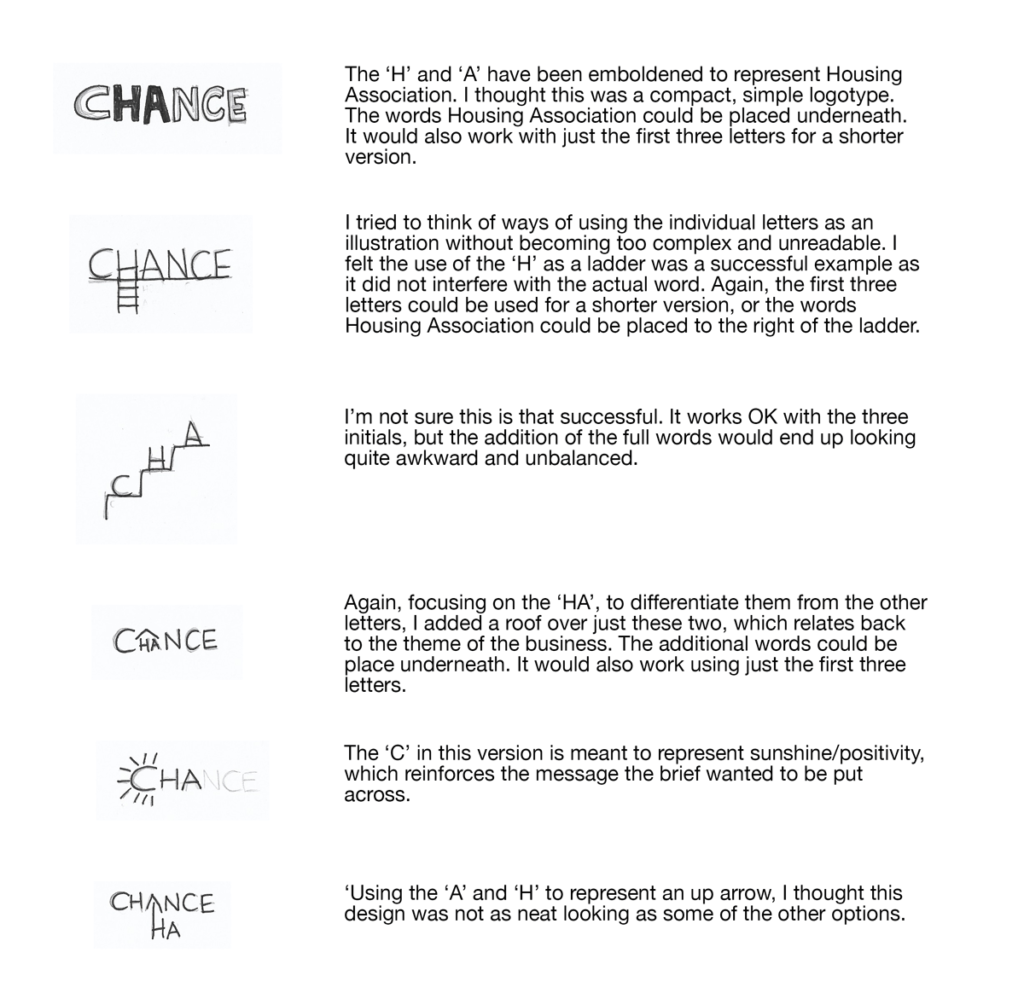
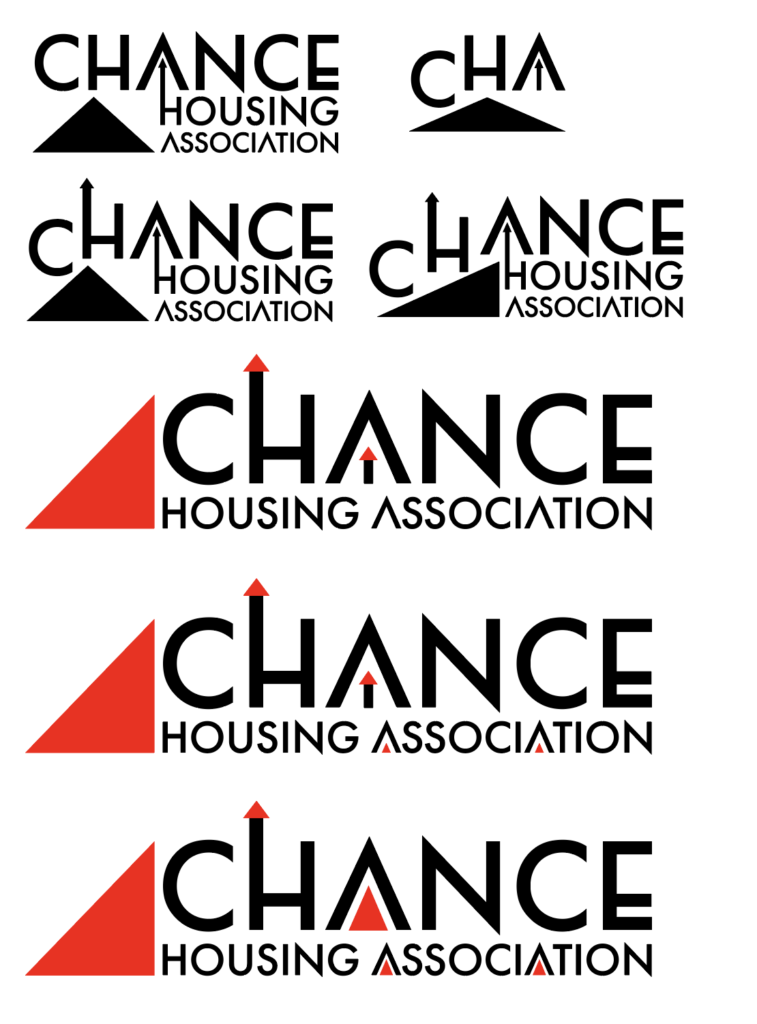
I then made some rough sketches based on these ideas. As the brief required a logo based on the typography rather than one that is based on illustration I found it really quite challenging to be imaginative with the letters/words.
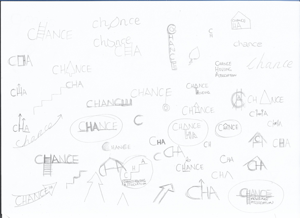

I spent quite some time and consideration on this part of the exercise and I managed to come up with a few designs that I thought had the potential to be developed further. I made some notes on these as shown below.
EXPERIMENTATION WITH IDEAS
Using these ideas as a basis, I experimented on Illustrator to see which, if any, I could get to work successfully. I started by selecting some typefaces that I thought would be appropriate for a modern, youthful feel.
I experimented with each of these to replicate the first of my ideas:


I thought the most successful attempts from this selection were those using Futura PT, Century Gothic Pro and Mr Eaves XL Mod OT as the letter width and spacing suited the purpose and worked best contrasting the weights of the letters. However, I did not think this idea was particularly interesting or eye-catching. Also the strong contrast between the black and white made it quite difficult to read the words.
Next I attempted to evolve the idea of the letter ‘H’ being a ladder.
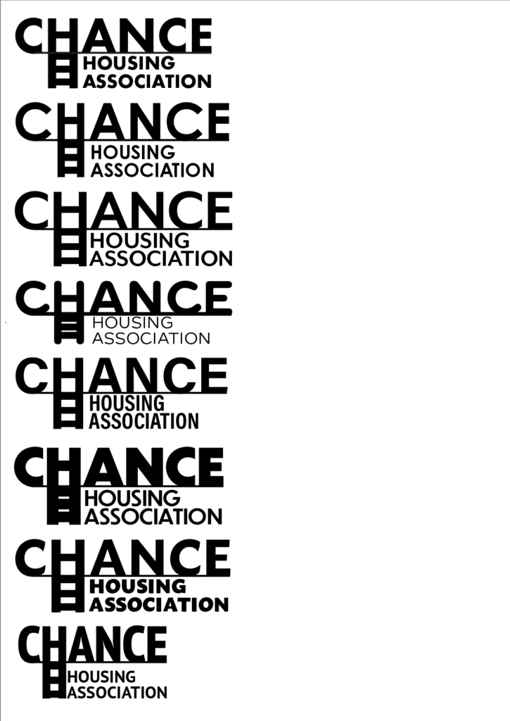
Again, I thought some of these worked better than others. I felt the best were the top three, which, as above, used Futura PT, Century Gothic Pro and Mr Eaves XL Mod OT. I could have improved the letter spacing of the smaller text, but this was just to see whether it would work or not. I thought this worked better than the previous idea in terms of design, but I’m not sure of it effectiveness in terms of relating to the context.
Next, I worked on the idea of putting a roof (which also could be interpreted as an up arrow) over the ‘HA’, which would link to the idea of a house and also differentiate the letters from the others, so they stand for Housing Association.
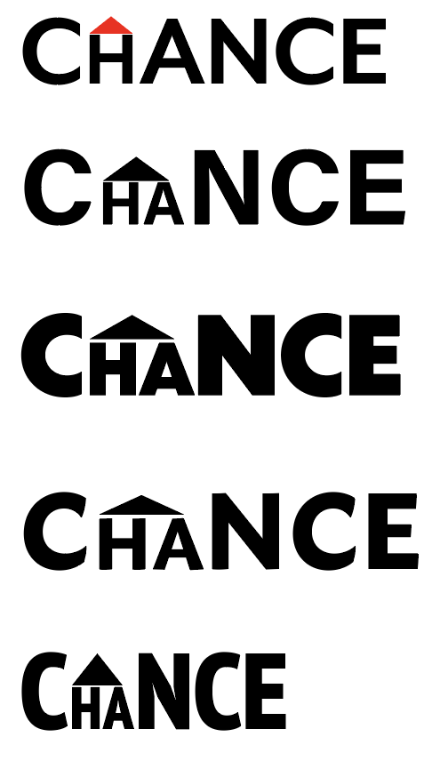
I thought the one that worked the best out of these was the third from top. However, I decided that the word lost some of it’s readability by shrinking the two letters and made it look disjointed. I did, however, feel that the idea of using a triangle for a roof/up arrow was something I would return to.
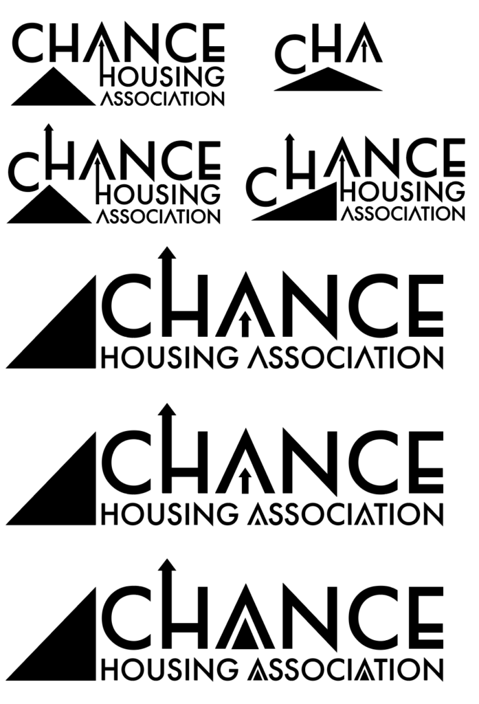
I then played with a few other ideas (below), but these were not very successful and looked quite amateurish.
I decided to expand on the idea of using triangles to represent a roof or up arrow (i.e. to represent progress and positivity). I chose Century Gothic Pro as the typeface which I then manipulated by removing the cross bars of the ‘A’s to fit in with the triangle theme and also lowered the crossbars of the ‘H’ and the ‘E’. I was quite pleased with this idea so I worked on several different versions.
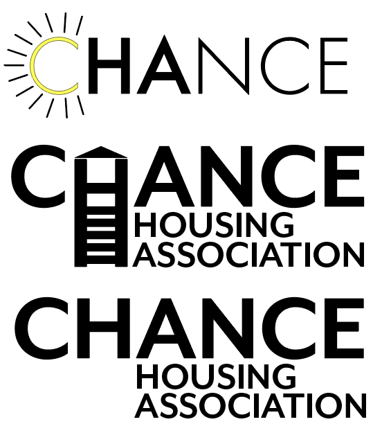
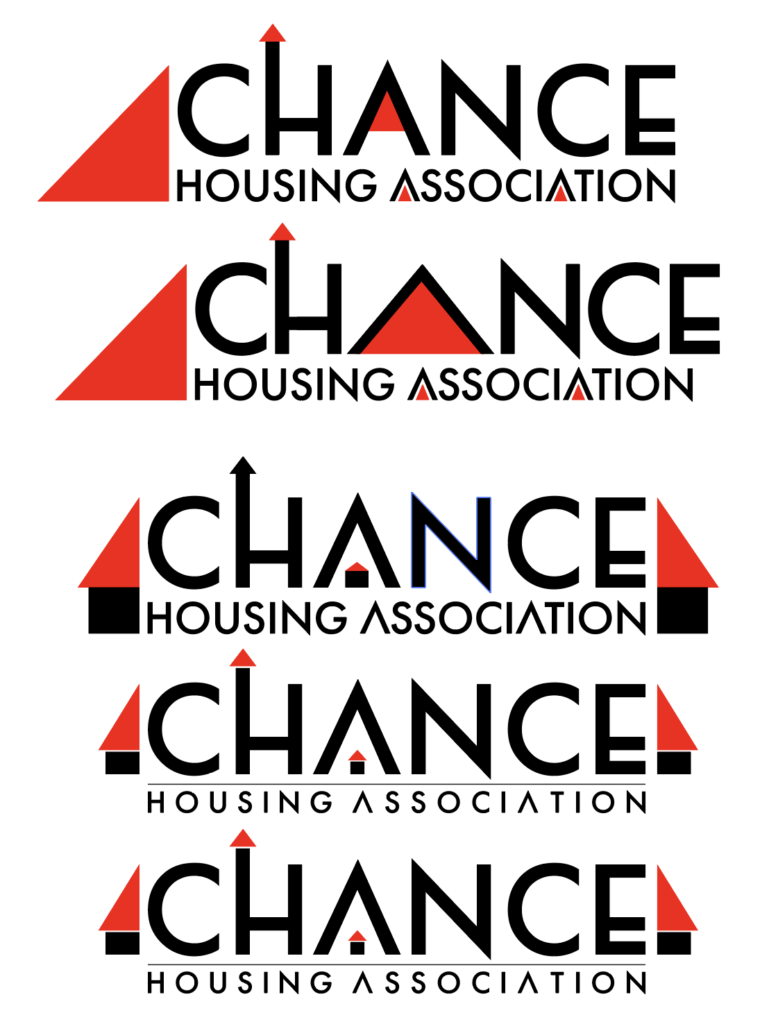
Moving the triangle to the side rather than underneath the CHANCE allowed for the text to fit more neatly together. I then decided to add colour. Referring back to the examples I had looked at during my research, most logos make use of just one colour, whilst still being effective when viewed in black and white. I decided to use red in my logo. This was partly because red is often associated with the colour of roofs and partly because it can be seen as a positive, powerful and ambitious colour. However, I did think it might be seen as a bit aggressive, so I decided to come back to this as the brief required the logo to be friendly and welcoming.
I then worked on the positioning of the different elements within the logo. I was conscious that I wanted to keep the text as readable as possible, so decided that adding any block of colour to the inside of the ‘A’ affected too much. So I chose to put a small house/up arrow in the ‘A’ instead, which I felt worked quite well and did not distract from the text.
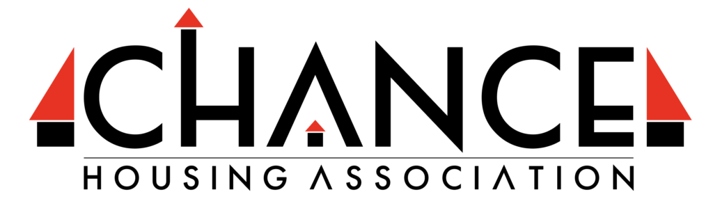
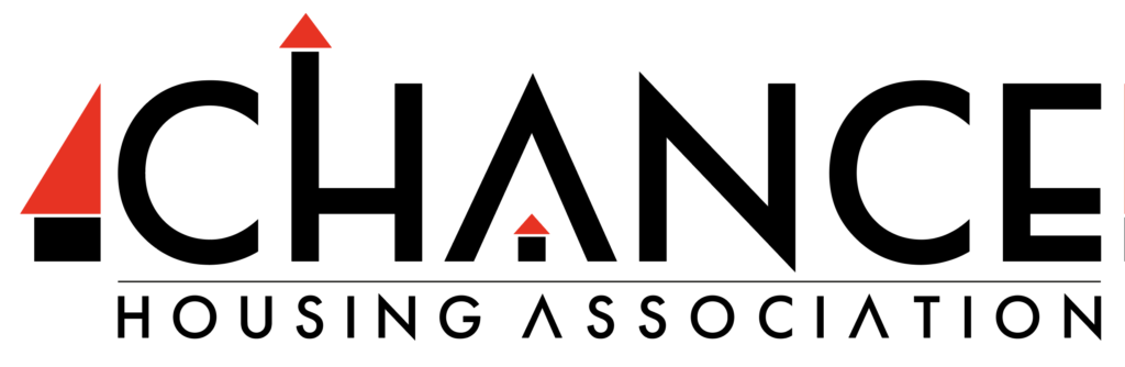
I felt I was getting close to coming up with my final logo proposal.
However, I thought that the ‘half-house/arrow’ on the right would prevent the logo fitting neatly on a page. So I removed this, which I decided was a definite improvement.
I still was not sure about the colour red, so I changed it to orange instead. This colour looked more like a roof colour and also has connotations of happiness, positivity and friendliness. I think this choice worked better than the red in terms of meeting the brief, but I was not sure if perhaps the black appeared too dominant.
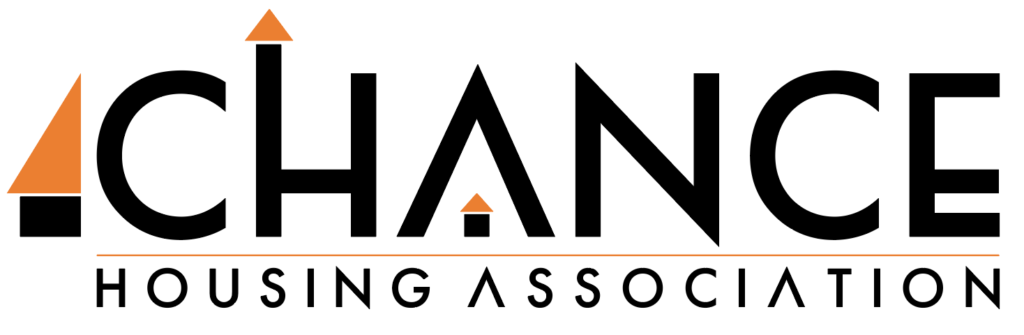
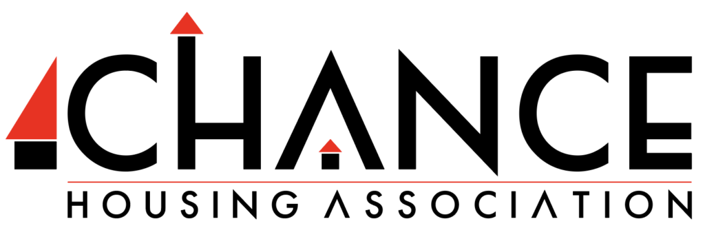
I decided to stick with the red, but I also added colour to the line, which I felt was an improvement as it broke up the black a little.
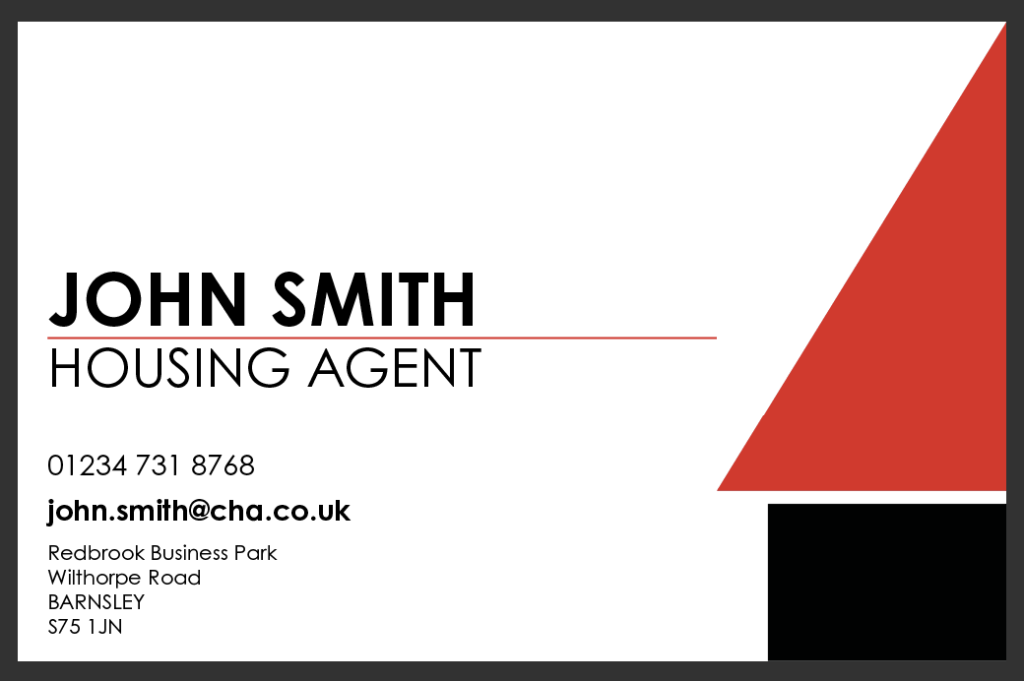
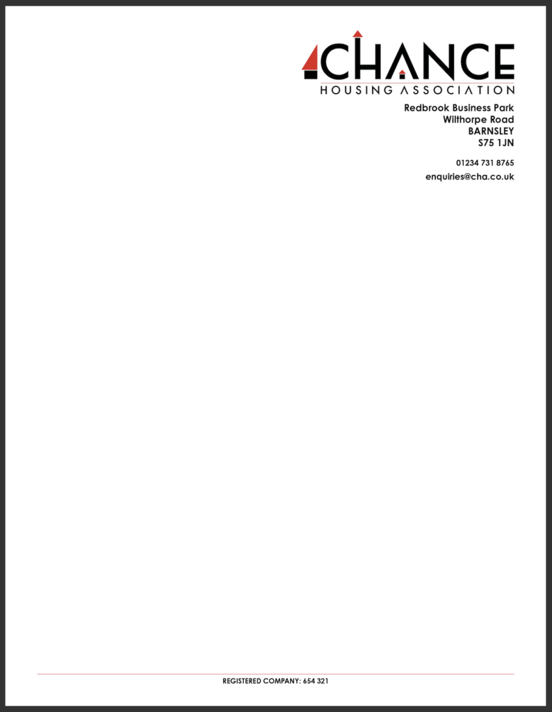
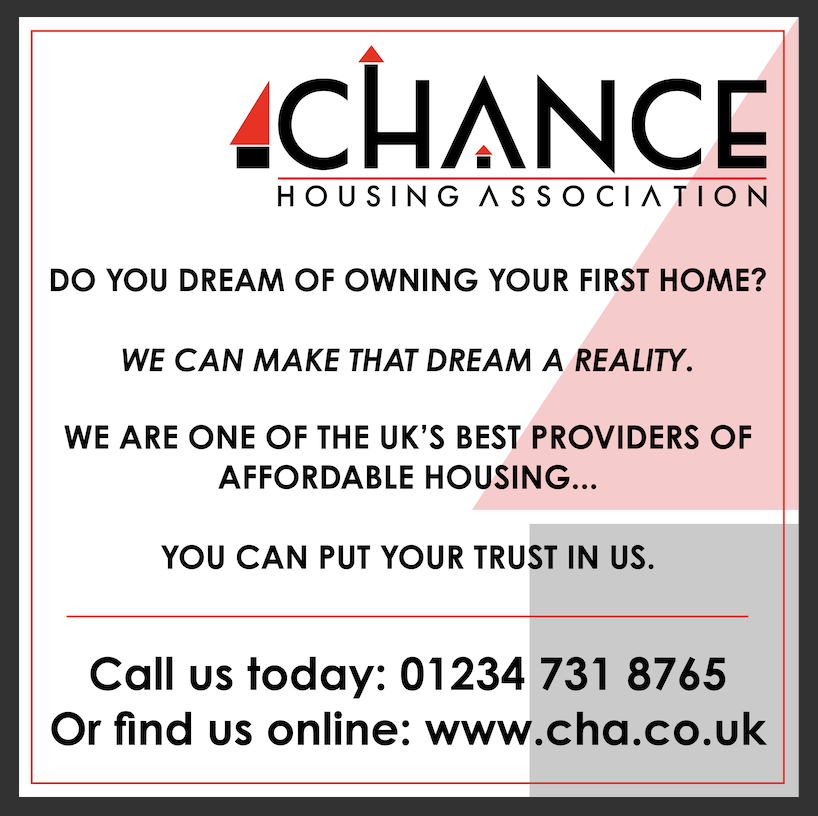
MOCK UPS USING THE LOGO
I used InDesign to create a business card, letterhead and advertisement using the logo.

EVALUATION
I found this exercise very challenging as I was not familiar with the genre. It really helped to be able to look at examples and find common themes for Housing Association logo designs. I also have no experience in designing logos at all, so I was quite apprehensive about this as I knew how difficult it is to create a successful one. I also found it tough due to the logo being typographic in style rather than illustrative, so I had to consider typefaces. In addition, I am still not that confident with my knowledge of colour.
Logo design is challenging, but it forces you to be creative with your thinking, so it is well worth learning more about it.