Exercise: Giving Information
BRIEF
Find some examples of information graphics (e.g. bus timetables, city maps, diagrams or representations of statistical data). Look at the way they are designed and think about what decisions the designer made. What can you learn from them and when would it be appropriate to use a similar design solution?
For this exercise you are going to describe your immediate surroundings using information graphics (e.g. plan of your desk, layout of your house, your journey to work, etc).
Before you start you will need to think about scale and how the informaton will be broken down. Create a graphic that represents an aerial or front on view of your location. Think about hierarchy of the elements in the composition and the dynamics needed to draw the viewer’s eye from one stage to the next. Use typography, numbers and colour to describe what is being represented. You may want to produce a key to help understand what is being shown, as well as a diagram title to put things into context.
RESEARCH
I began this exercise by looking at examples of infographics via a Google search. I selected those which caught my eye and considered some of the common design factors.
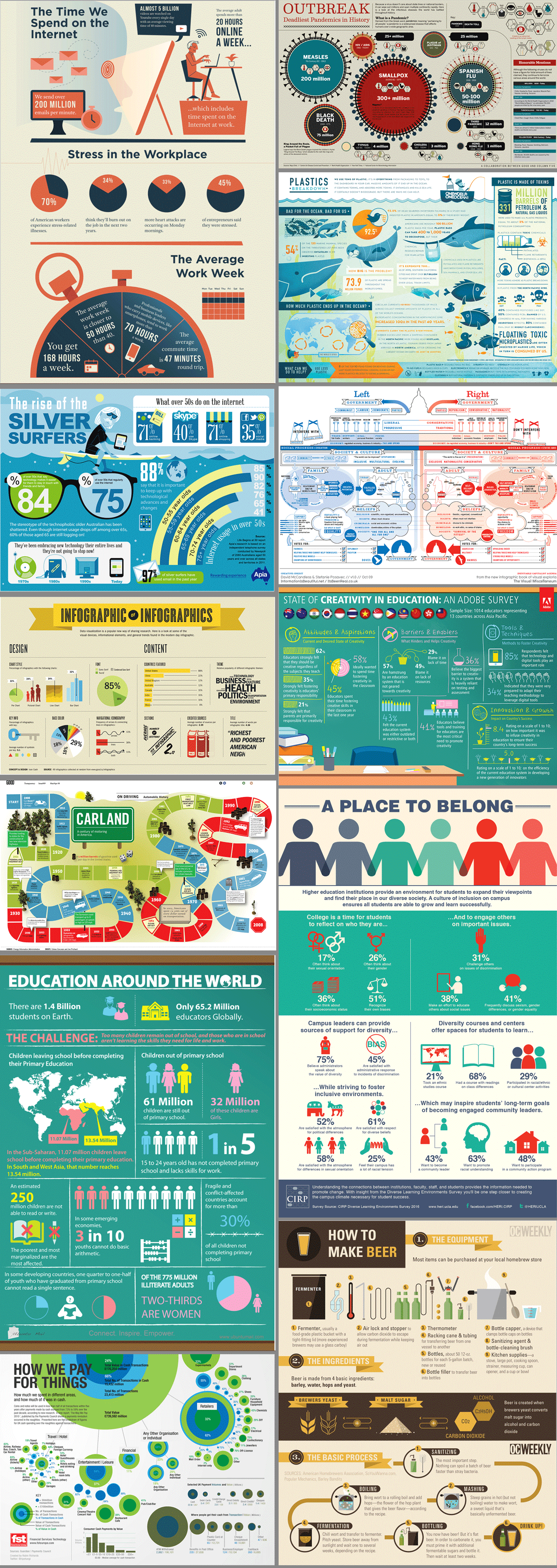
The key points I noted included:
- There is a very limited use of large blocks of text, which results in often complex information being condensed into concise and comprehensible points.
- The typefaces used are generally sans serif and bold.
- White space has to be used effectively to ensure the eye is not overwhelmed with information.
- There needs to be a clear hierarchy and it should be effortless for the viewer’s eye to move across the design.
- The information is divided into sections on the page, which is necessary to create a sense of order and readability.
- The use of illustrations, mostly simplified, vector graphics, enhances the message of the infographics, that is, they should serve a purpose.
- There is very limited use of bold contrasting colours, rather most employ a limited colour palette of two or three hues (often of complementary colours) with the value being adjusted for various shades and tones.
Next I looked at examples of bus timetables to look for any common design features. There is large volume of repetitive data that has to be shown in a organised and easy-to-use way. This is done using a table format to which colour is added in a logical fashion. Generally, just one colour is used in various shades and tones, which makes the colour less dominant as ‘decoration’ on the page, but rather a visual aid for the reader. One of the most noticeable techniques is to alternate the colour of each row/column, which creates a clear distinction between them – this is very useful when someone wants to find the appropriate information at speed.

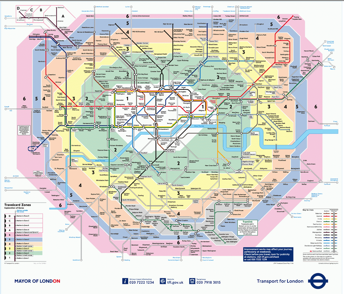
I then looked at the London Underground Map and thought about what considerations had gone into its design. For such a complex system, it is very impressive how the design of this map is so readable and useable. It is an example of how reality has been simplified (e.g. the shape of the River Thames) and the focus is on communicating the information rather than producing a 100% realistic representation. Again, the use of colour is employed so that lines and zones can be easily distinguished and followed. There is no superfluous text cluttering up the page – everything has a function.
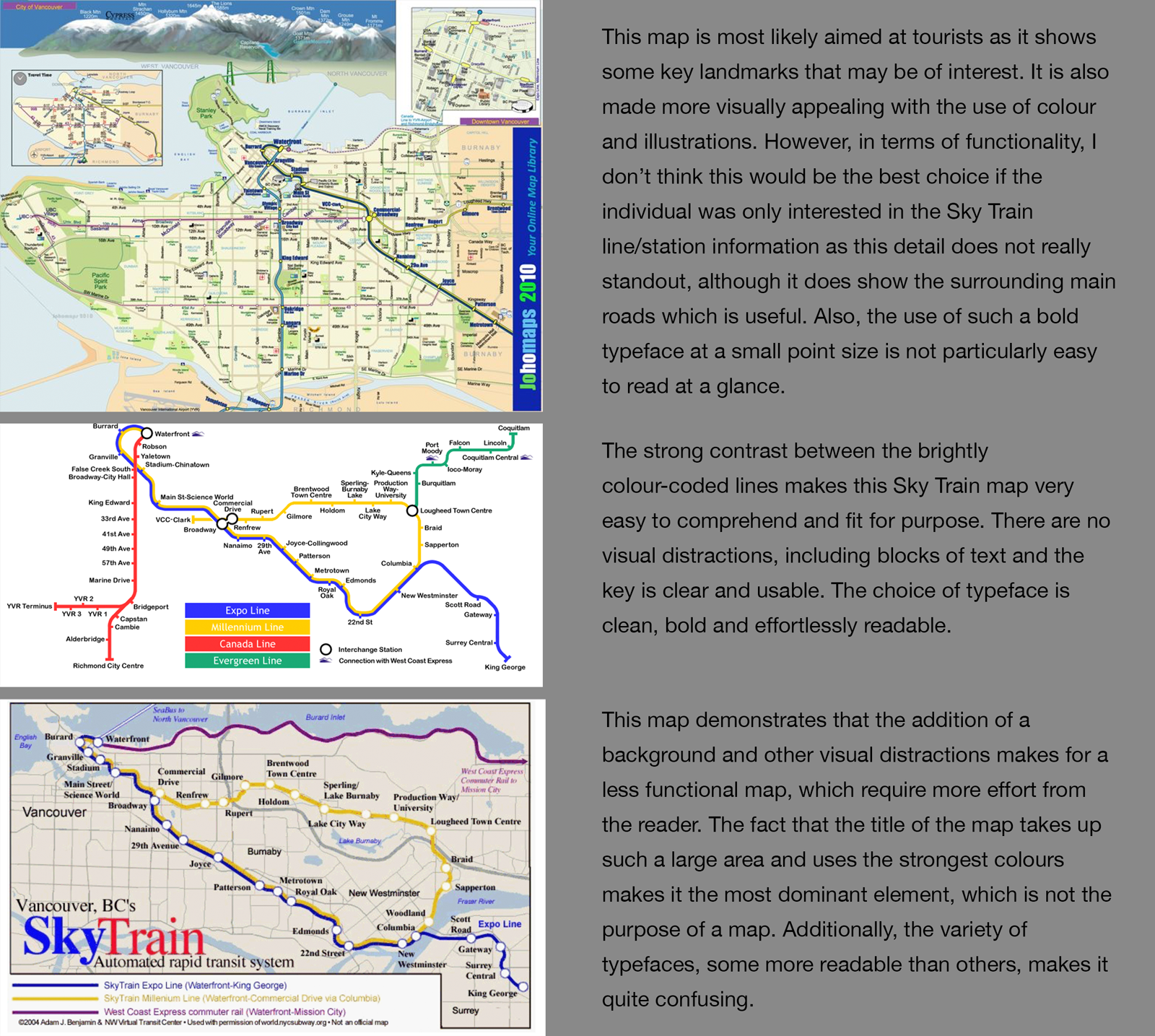
Following on from this I looked at three examples of maps of the same train line (the Sky Train in Vancouver) and compared the designs.
Next I decided to look at some examples of information designers, these included:
Robert Nippoldt – I liked the design of Robert’s infographics. He uses a very limited and muted colour palette along with what look like hand-drawn ink illustrations with lots of personality. Although I am unable to read German, it is still possible to get the main points of the infographics, which I believe demonstrates a very successful design.
Moritz Stefaner – Moritz takes data, such as from online searches for particular terms, and turns this into visual representations that can be easily interpreted. I thought some of his designs were really engaging and enjoyable to look at.
William Playfair – I thought it notable that he invented the pie chart, the bar chart and the line chart, which are all very important in terms of visually representing data.
IDEAS
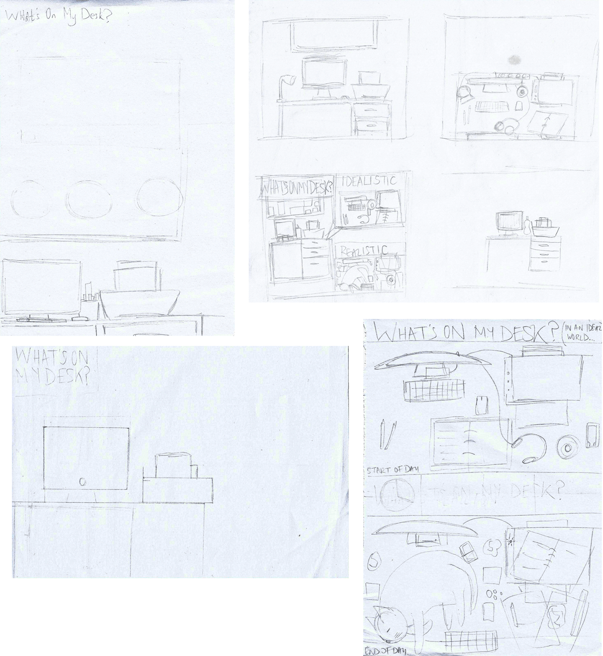
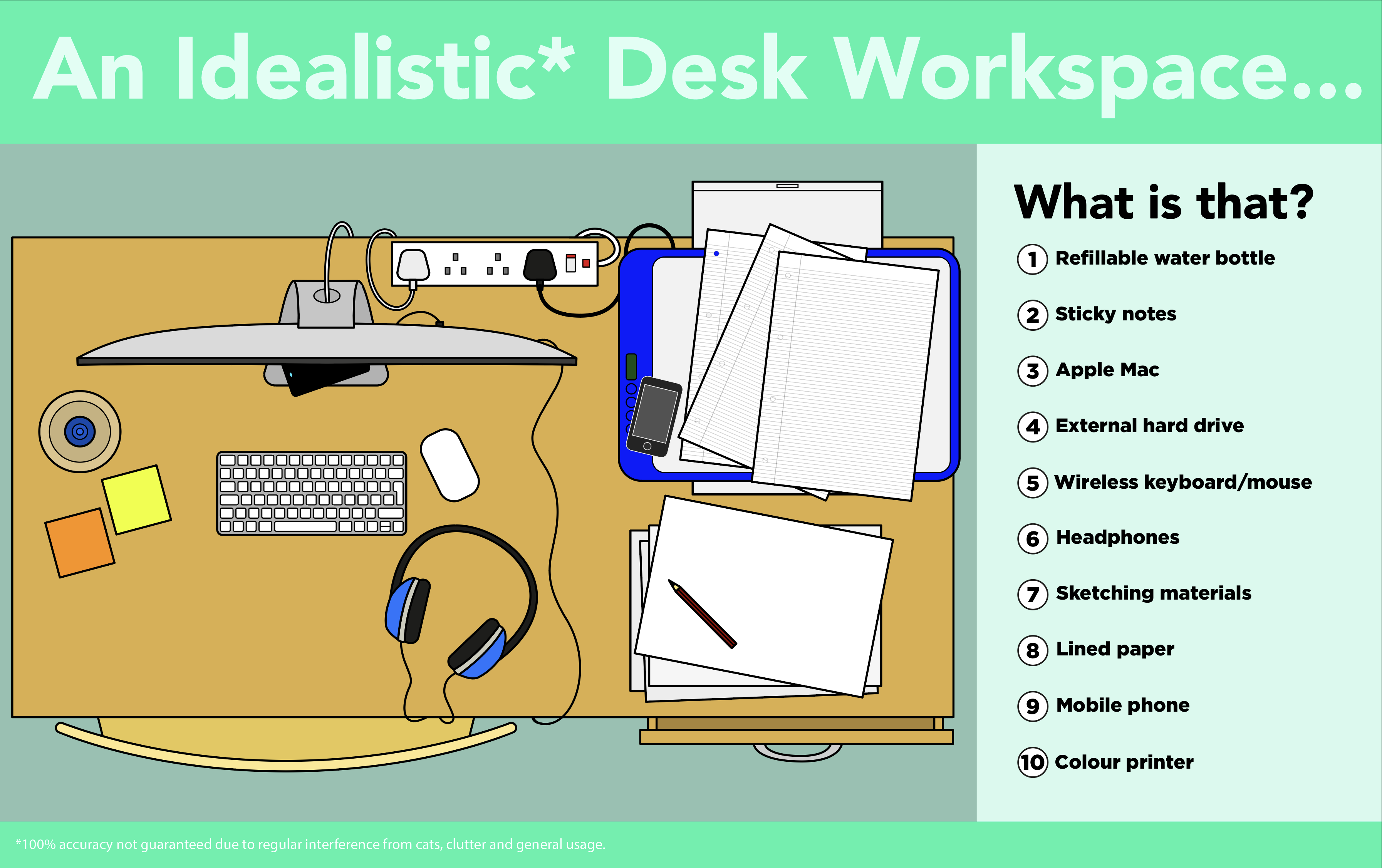
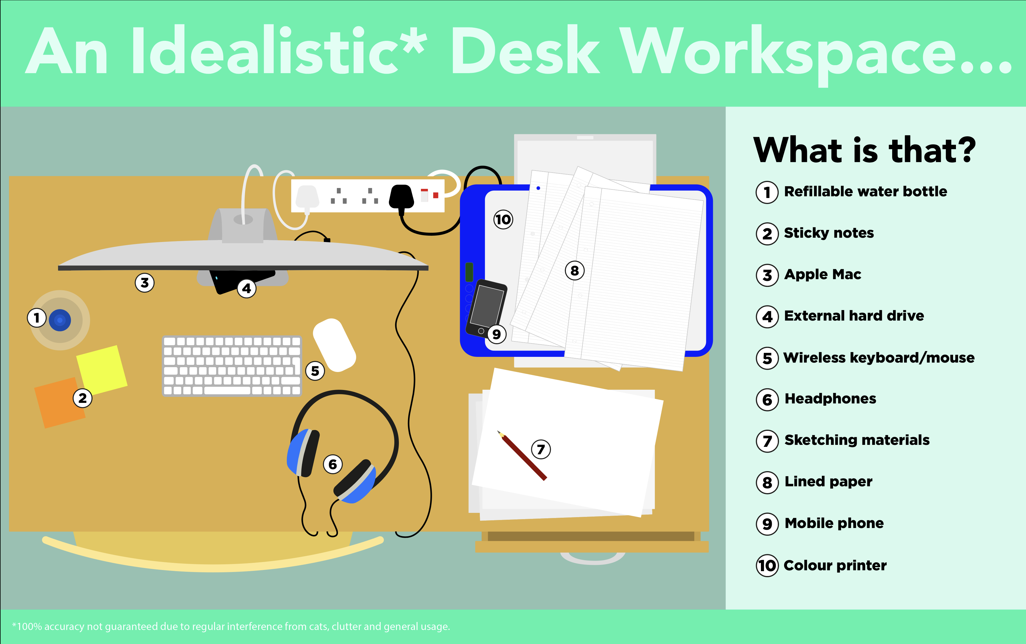
I decided to design an infographic of my desk workspace. I initially was quite unsure how to go about this, so I looked at some examples, a few of which can be seen below.
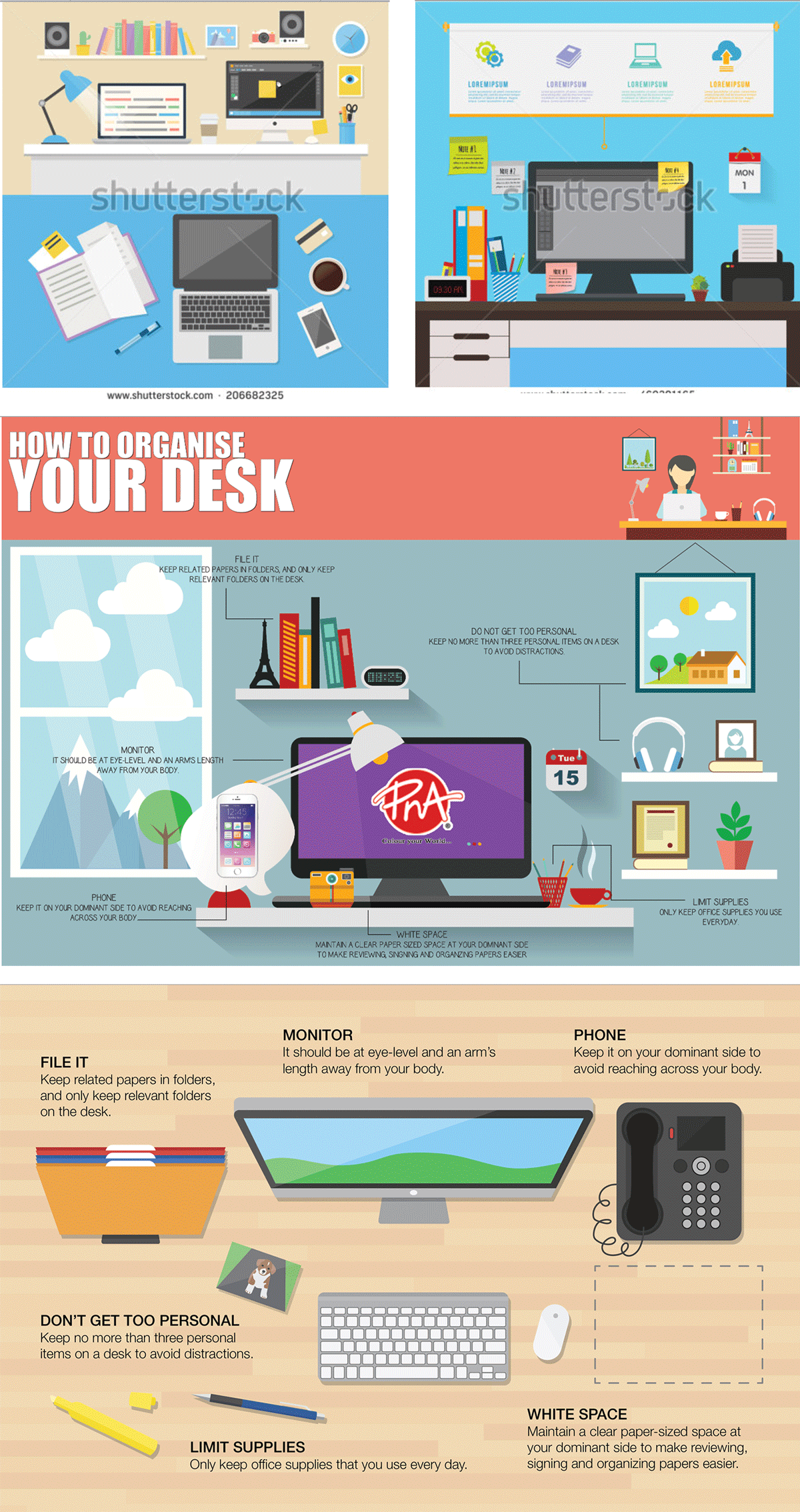
I found Shutterstock to be quite a useful resource for this as I was very keen to create an infographic in a similar illustrative style, i.e. vector-based.
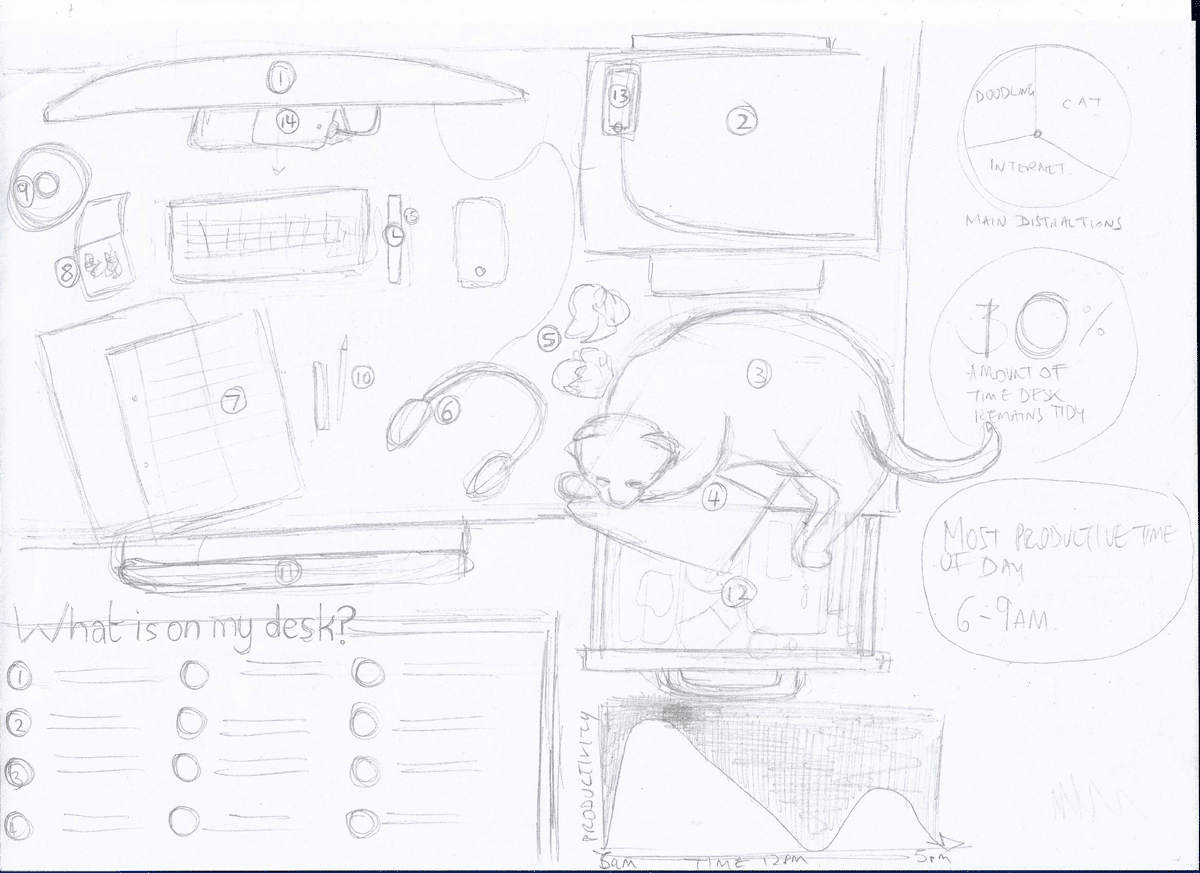
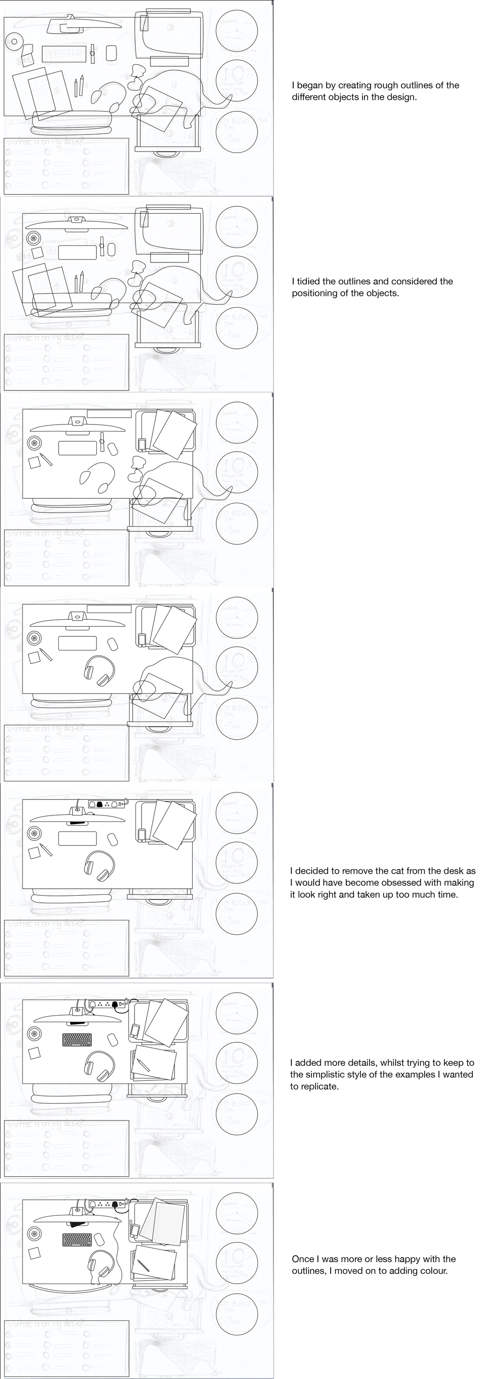
I began by making some rough sketches, but I found it very difficult to think of the design in terms of an infographic rather than a straightforward illustration.
I decided to keep it simple (which is the aim of an infographic – to show information, sometime complex in nature, in a simple easy-to-comprehend manner) and create a numbered plan of my desk, with the intention of including some additional (non-scientific) facts and figures to pad the design out and make it less like a just being an illustration.
CREATING THE INFOGRAPHIC
Once I had a rough idea of what I wanted to achieve I began working on the design in Illustrator.
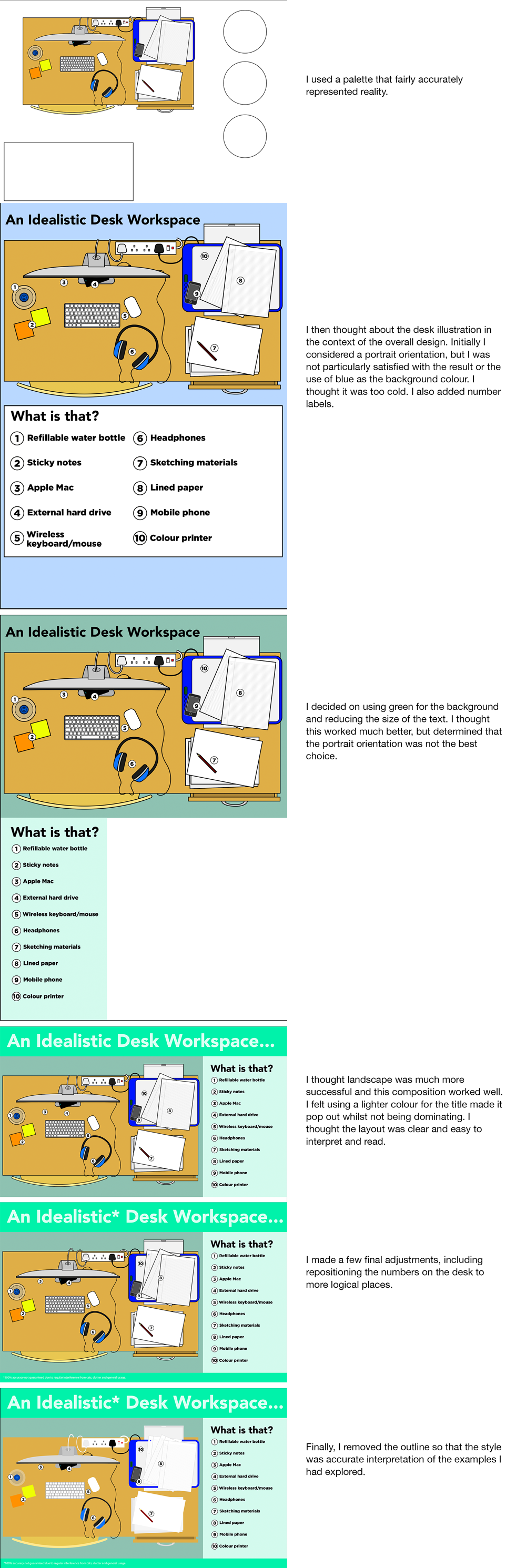
FINAL DESIGNS
EVALUATION
I found this exercise really difficult to get started on. I think part of the reason is I was not sure that the topic of my desk would be particularly riveting to look at. However, I realised that the purpose of infographics is to attempt to make even the most mundane information interesting and comprehensible for other people.
I decided to keep my illustration as simple and clean as possible, which meant I got some of the original details from my sketches, but as I mentioned previously I did not want to become too involved in making things look good and not focusing so much on the way the information is presented. I was quite pleased with the style of illustration I ended up with, particularly as I am usually quite resistant to not having outlines (which is force of habit).
I also could not think of any interesting facts or figures to add to the design, so I thought it would be best to resist cluttering the design with useless information.
I was overall quite happy with the design of my infographic and I felt the final layout made it easy to read and understand. If I am required to do any more in the future I would look at using a more interesting topic, which could be fleshed out with additional data that requires visual representation.
RESOURCES
Google Images: http://images.google.com
Shutterstock: https://www.shutterstock.com/search?search_source=base_landing_page&language=en&searchterm=desk+infographics&image_type=all
‘How to Organise Your Desk’: https://pnacolouryourworld.wordpress.com/tag/desk/
‘Here’s how your desk should be organised’: https://money.cnn.com/infographic/economy/desk-organized-tips/index.html
Infographic – What Your Work Desk Says About Your Personality: https://designtaxi.com/news/383164/Infographic-What-Your-Work-Desk-Says-About-Your-Personality/
Robert Nippoldt: https://www.nippoldt.de/en/illustration/info-graphics
Truth & Beauty: http://truth-and-beauty.net
William Palyfair: https://www.undiscoveredscotland.co.uk/usbiography/p/williamplayfair.html