Exercise: Judging a book by its cover
BRIEF
Choose a book by an author you are familiar with . Design two different covers for it, on using illustrations or photography and the other using just type.
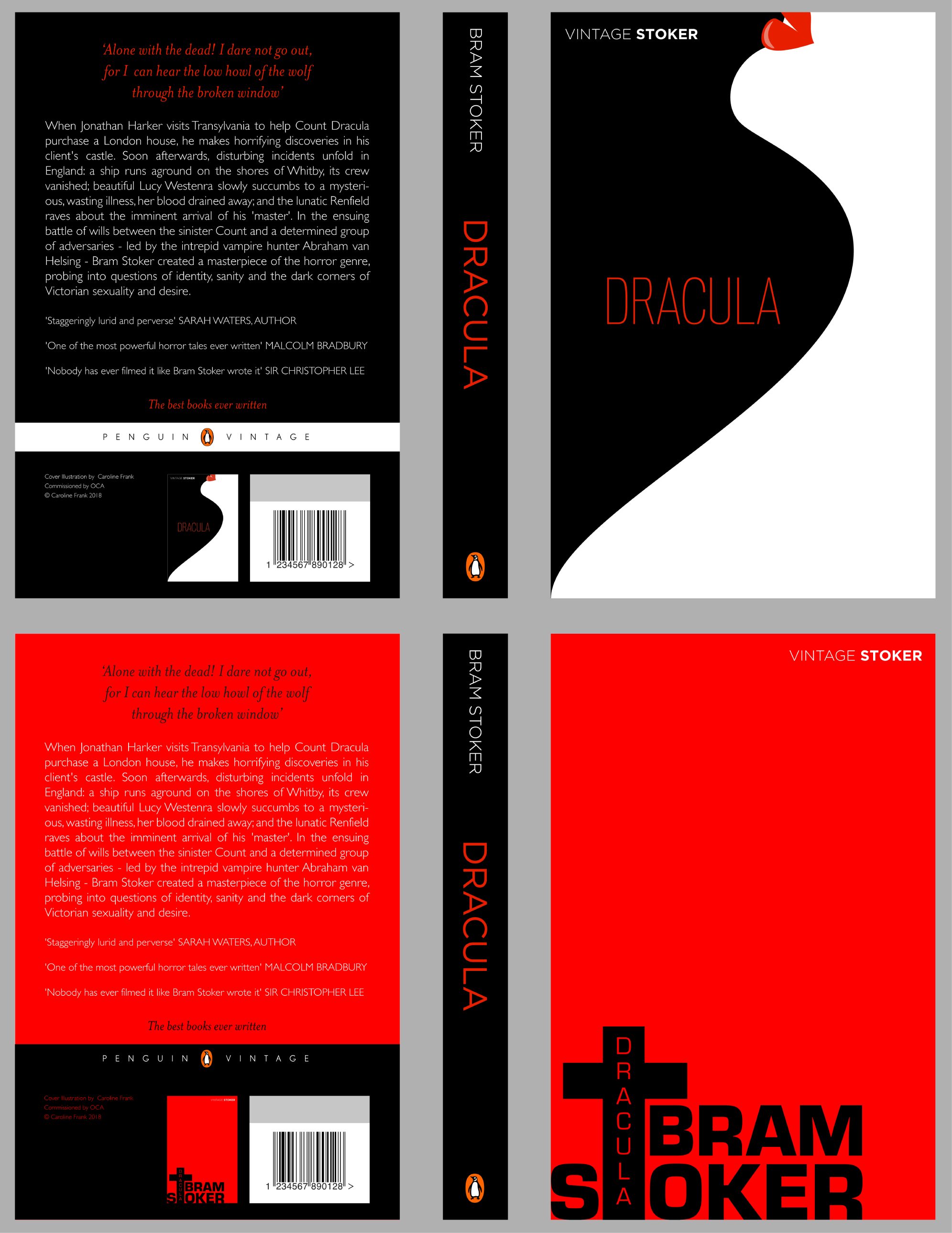
Design the whole cover including the spine and back page. Include the title of the book, the author’s name, a brief description oft he story and any other necessary information.
Remember the design is intended to help a reader know what the experience of reading the book will be. Is it a serious text or an off-beat, funny novel? Are the readers expected to be young women or older men and does this matter? Is it an ‘easy read’ or ‘literary’? Does the publisher have a house style you need to be part of?
Critique your work – which two designs are the most successful and why?
INITIAL THOUGHTS
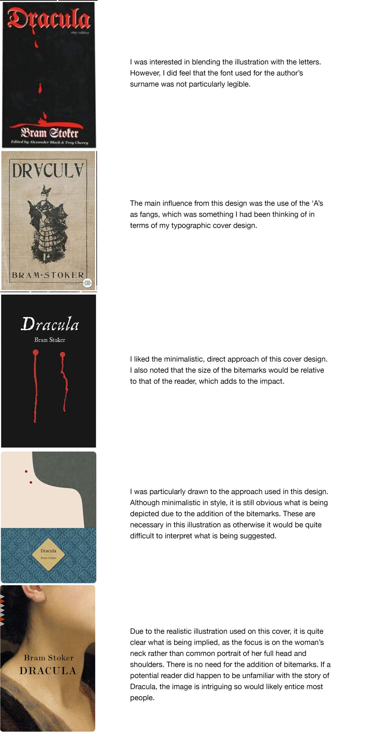
I decided my chosen book for this exercise would be Dracula by Bram Stoker, which is published by Penguin (the publishing house I chose for my related Research Point). I therefore decided to look at some examples of cover designs for this title. I began by carrying out a Google search:

My initial impression was the use of fairly limited colour palette of predominantly red and black, which can both be associated with darkness and malevolence as is appropriate for the subject. I also noted the designs tended to be similar in terms of images/illustrations, generally one of the following: bats. Dracula himself, a female sacrifice (often with her neck on show), blood, Dracula’s castle, or a pattern. Also, most of the designs use a similar serif typeface, which is instantly recognisable with being associated with Dracula (if you are familiar with the story).
I decided to go slightly against the grain as I wanted my designs to fit in with the minimalistic, modern Penguin covers I found in my research, which used sans serif typefaces and a completely different illustrative style than the above. These can be seen below.
However, I realised how important it was for the designs to still faithfully represent the subject matter so this is made clear to any potential reader.
Although there would be stark differences with my style of design, I still found plenty of inspiration from looking at other examples. A selection that stood out to me are shown below.
DRAFTING OUT IDEAS
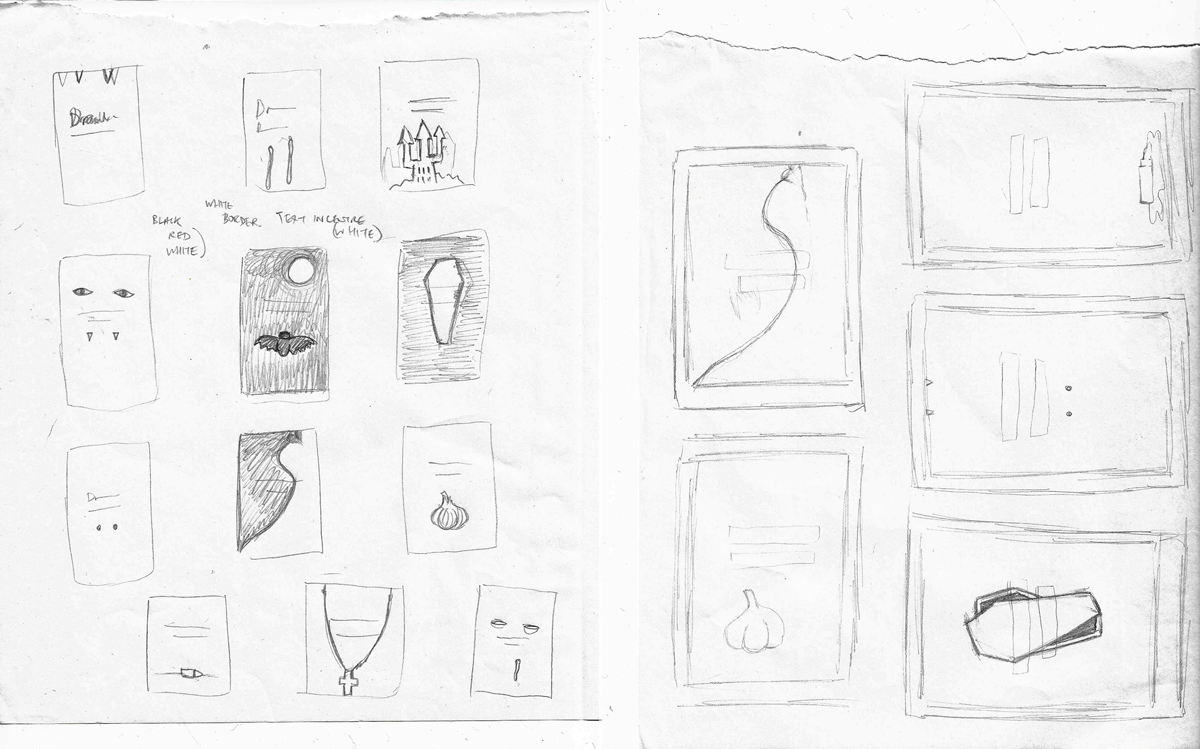
Taking on board what I had found in my research, I sketched out some very rough ideas for my covers. I had decided I was going to use very simplistic illustrations for a minimalistic approach, focusing on the use of shape and blocks of colour. The colour palette would be red, black and white, in keeping with what is expected for the subject matter – this would also add to the sense of ‘menace’, which could otherwise be lost without realistic illustrations. I was less sure of how to proceed with the typographic cover, so chose to tackle to the illustrative one first.
DESIGNS
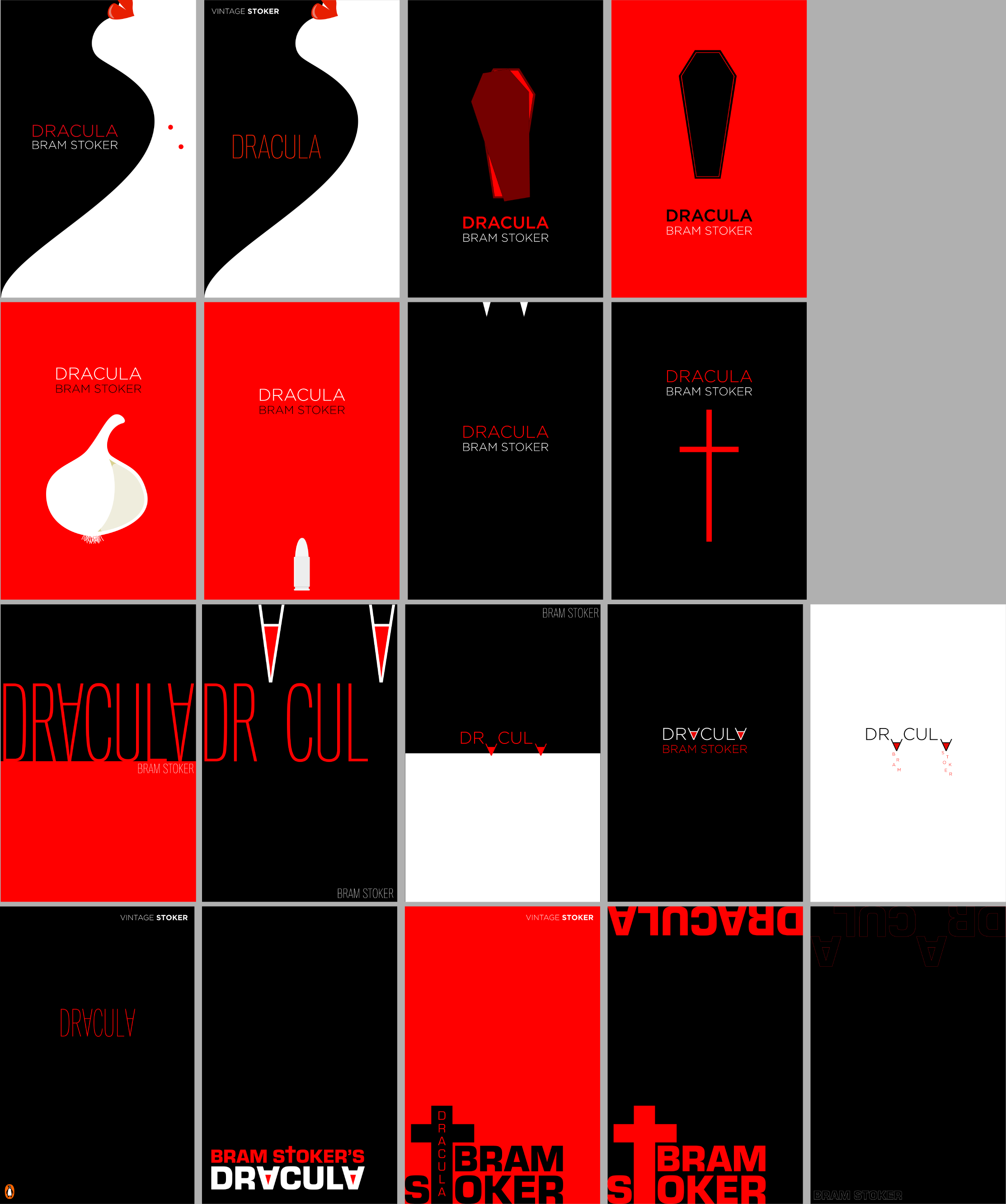
Using Illustrator, I designed several different covers.

I then went back a made some revisions, mostly in terms of colour choices as I thought white was too overused in the above. There needed to be more use of the red and black to ensure the intended mood of the story was portrayed. The revisions can be seen below.
I made some notes about my design choices:
FINAL CHOICES
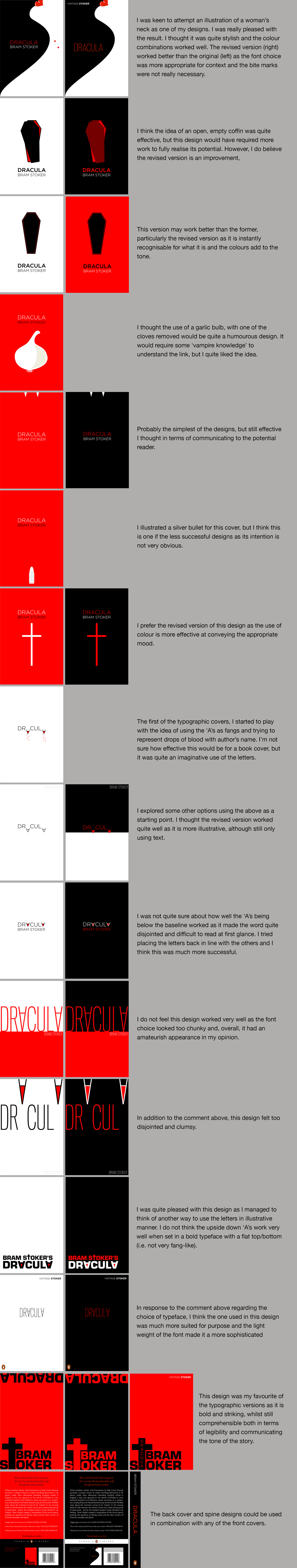
I chose these two covers as my favourites as I think they look quite professional and resulted in minimalistic designs that reflect the aesthetics I was initially hoping for. I particularly liked the illustration of the woman. Both designs offer insight into what the story is about and, combined with the colour combinations, set an appropriate tone. I feel these designs would fit in with Penguin’s style (as this is so varied).
EVALUATION
I really enjoyed this exercise, once I had decided on the book, and trying to come up with a range of ideas. Starting with rough sketches did help with this exercise as I had something to build on and I could get initial ideas down quickly, without committing to them. I found it harder to come up with ideas for the typographic version, but this challenge meant I had to use my imagination more. I quite liked having a limited colour palette as it meant I was not distracted by too many choices.