Exercise: Magazine Pages
BRIEF
Choose a magazine, newspaper or journal and work out the grid or grids they have used.
Measure the size of the pages, the margins, the text columns and the gaps in-between them. How many columns do they use? Is it the same on every page?
Can you identify the fonts they use? Do you have one or one with similar properties?
How do they use photographs and illustrations? How much ‘white space’ on the pages is there?
Draw up a two page spread using the same grid as the magazine. Indicate text using Lorum Ipsum and indicate images by wither filling a picture box with 10% tint or using a picture from your collection.
When you have done this see if you can develop the grid further.
Select a title an images and see how many variations you an come up with. What happens when you alter the body font or headline font? Do different kinds of images change the ‘feel’ of the the publication? Do you think the readership of each of your variations would be the same? Does the image you choose suggest a different design? Which ones work best and why?
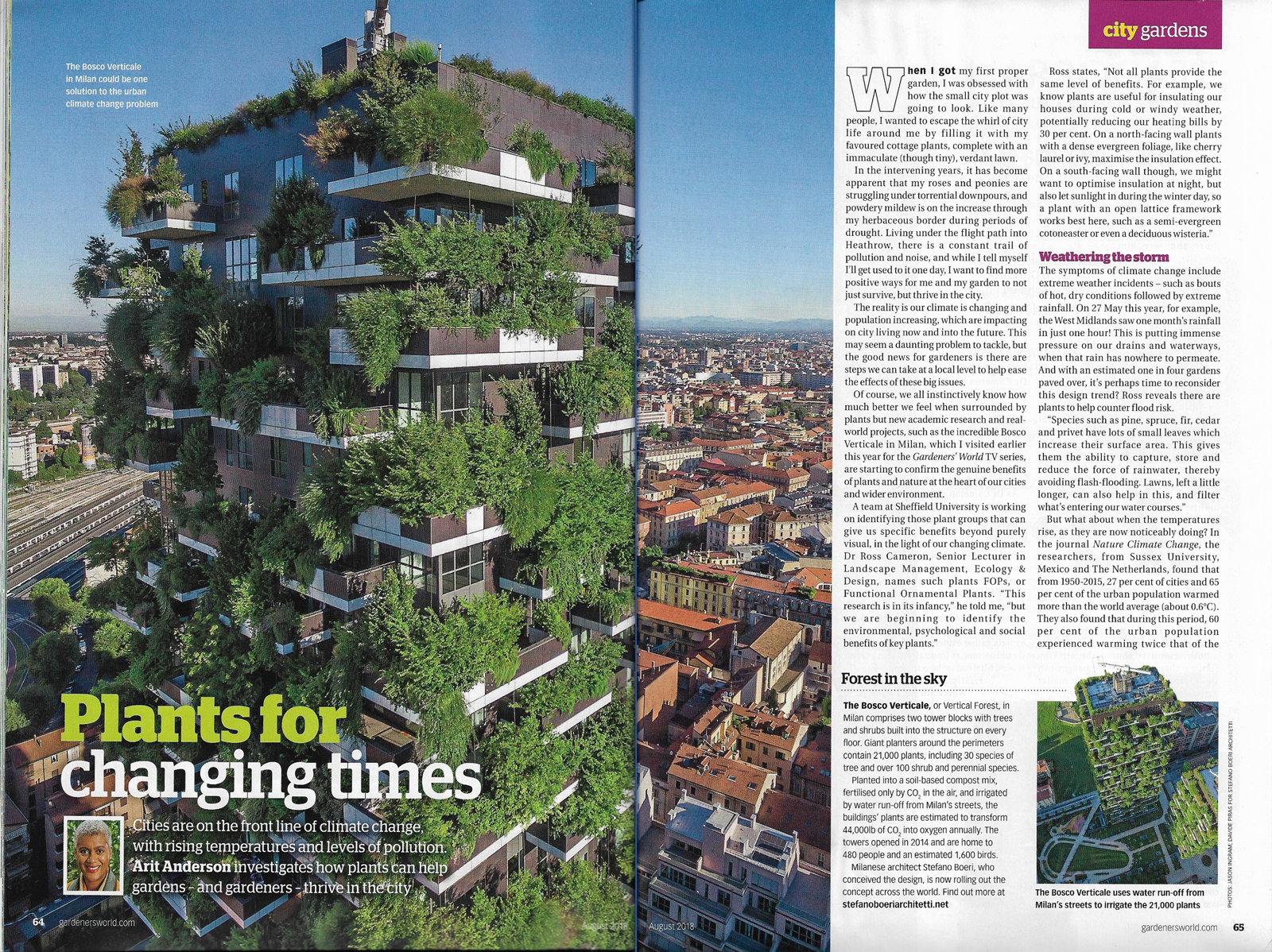
CHOSEN MAGAZINE
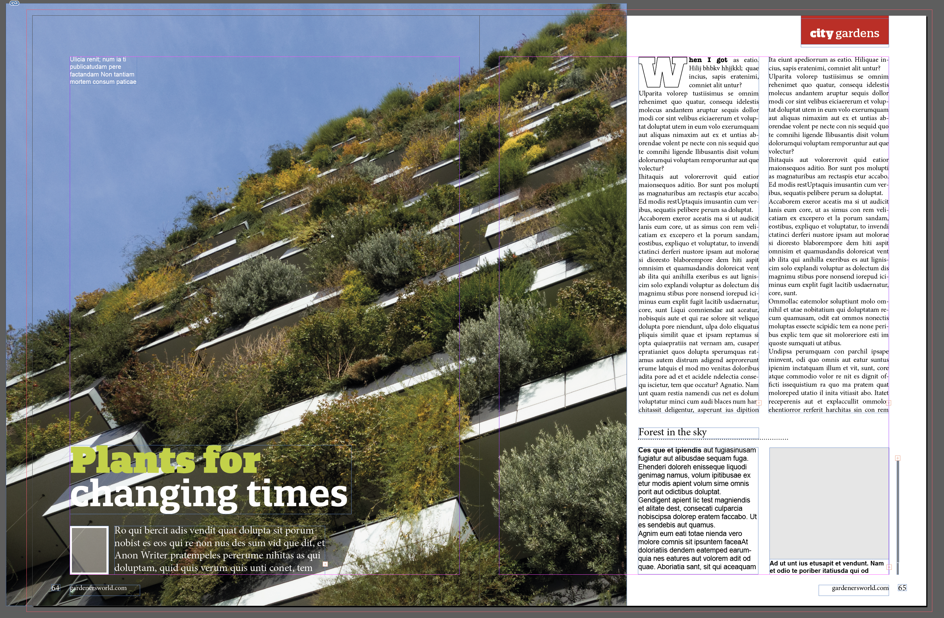
I decided to use a copy of Gardener’s World magazine (August 2018 issue) for this exercise. The spread I chose to replicate can be seen below.
I started this exercise by taking the measurements of the spread:
Grid Layout: 3 columns per page (I did note that some of the other pages in the magazine used 2 column layouts instead)
Page Dimensions: H300mm x W227mm (single page)
Margins: 21mm (Top) 16mm (Bottom) 10mm (Inside) 19mm (Outside)
Column Width: 61mm
Gaps Between Columns: 5mm
Photographs: One colour photograph takes up 2/3 of the entire spread; a smaller photo is used as part of the ‘extra info’ box; there is also a portrait photo of the article’s author.
Illustrations: None used
Use of White Space: There is a fair amount of white space in the article, enough so it does not feel ‘overcrowded’, which is helped by the large area covered by the main photograph. Each section of the page feels self-contained and logical. The leading and indentation of paragraphs makes the text more readable, assisted by the manageable line length.
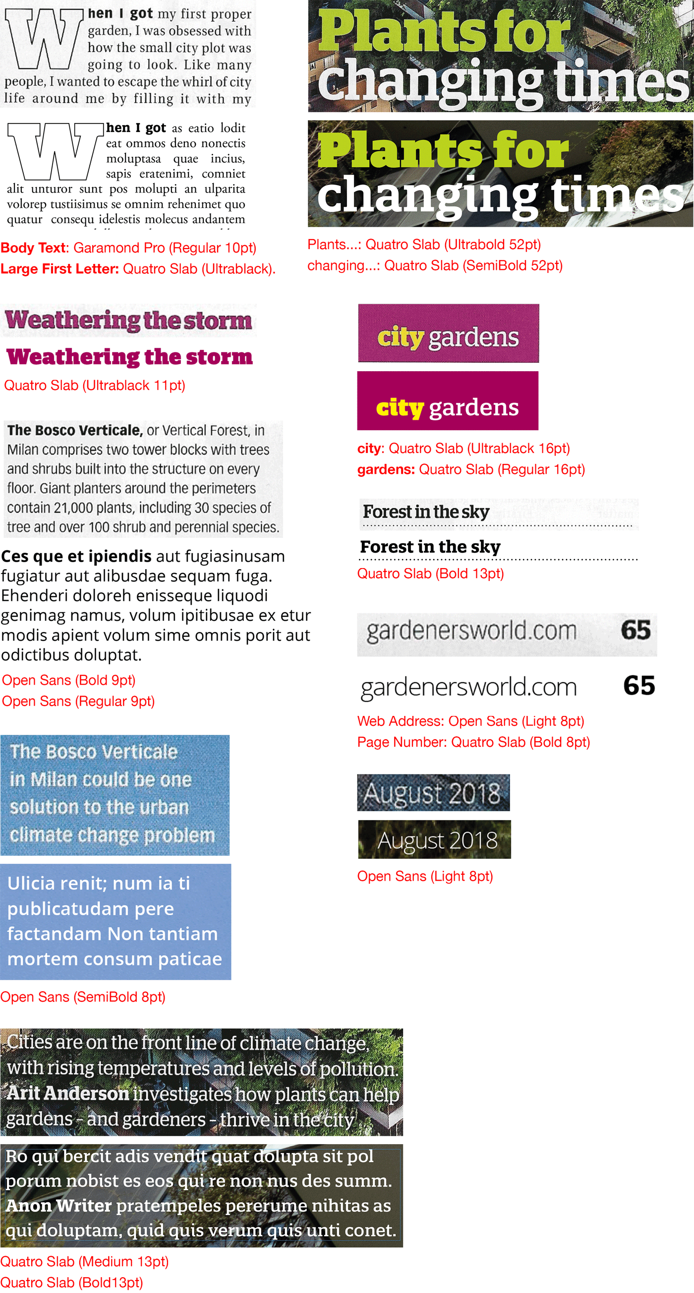
Fonts: I found not being able to find the correct fonts quite frustrating, although I did my best using Adobe Font (which I find helpful) and various other online font finders (most of which seem quite useless so far to me). Some of the fonts I recognised, but could not name them, so I made the best choices available.
RECREATING THE MAGAZINE LAYOUT AND DESIGN
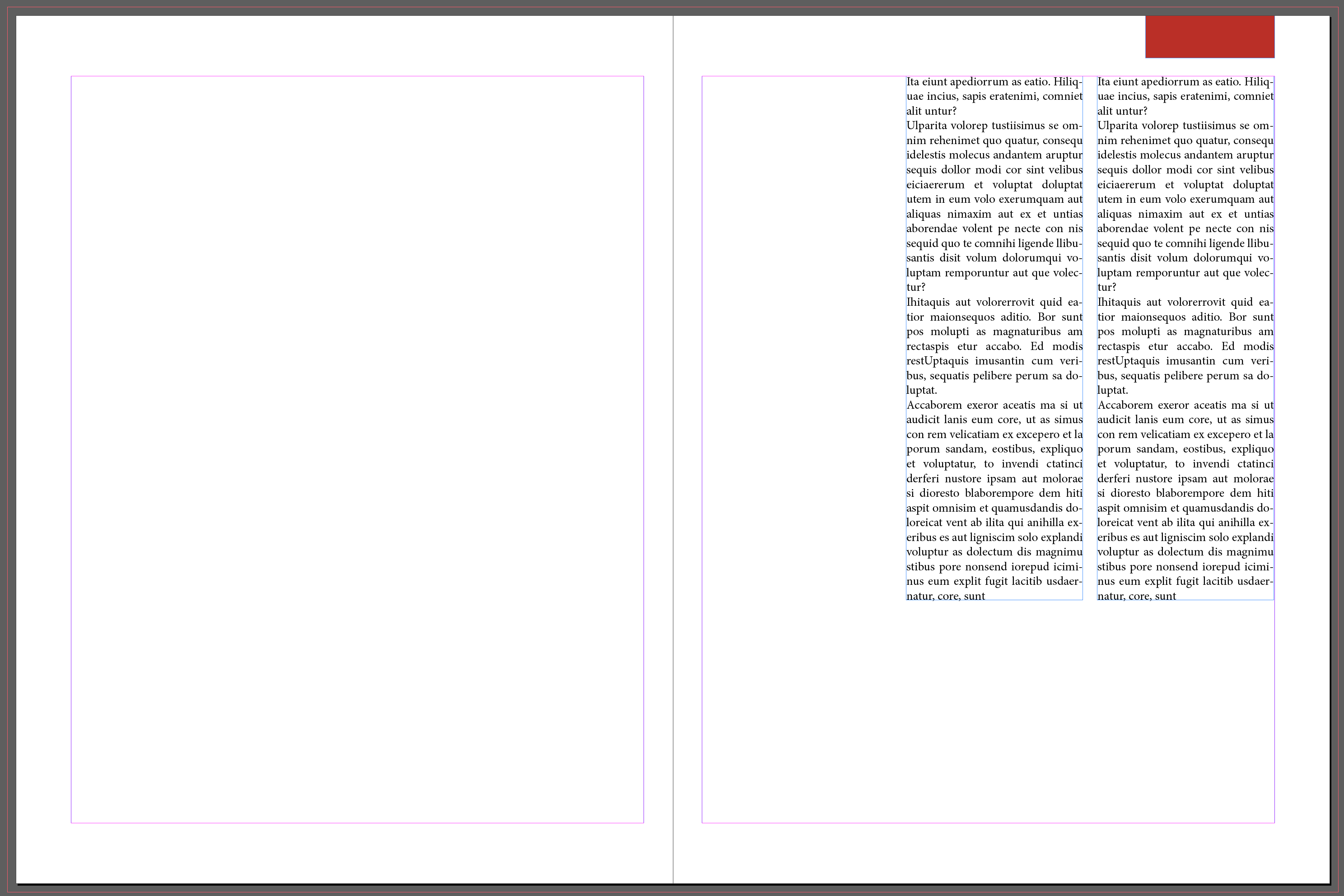
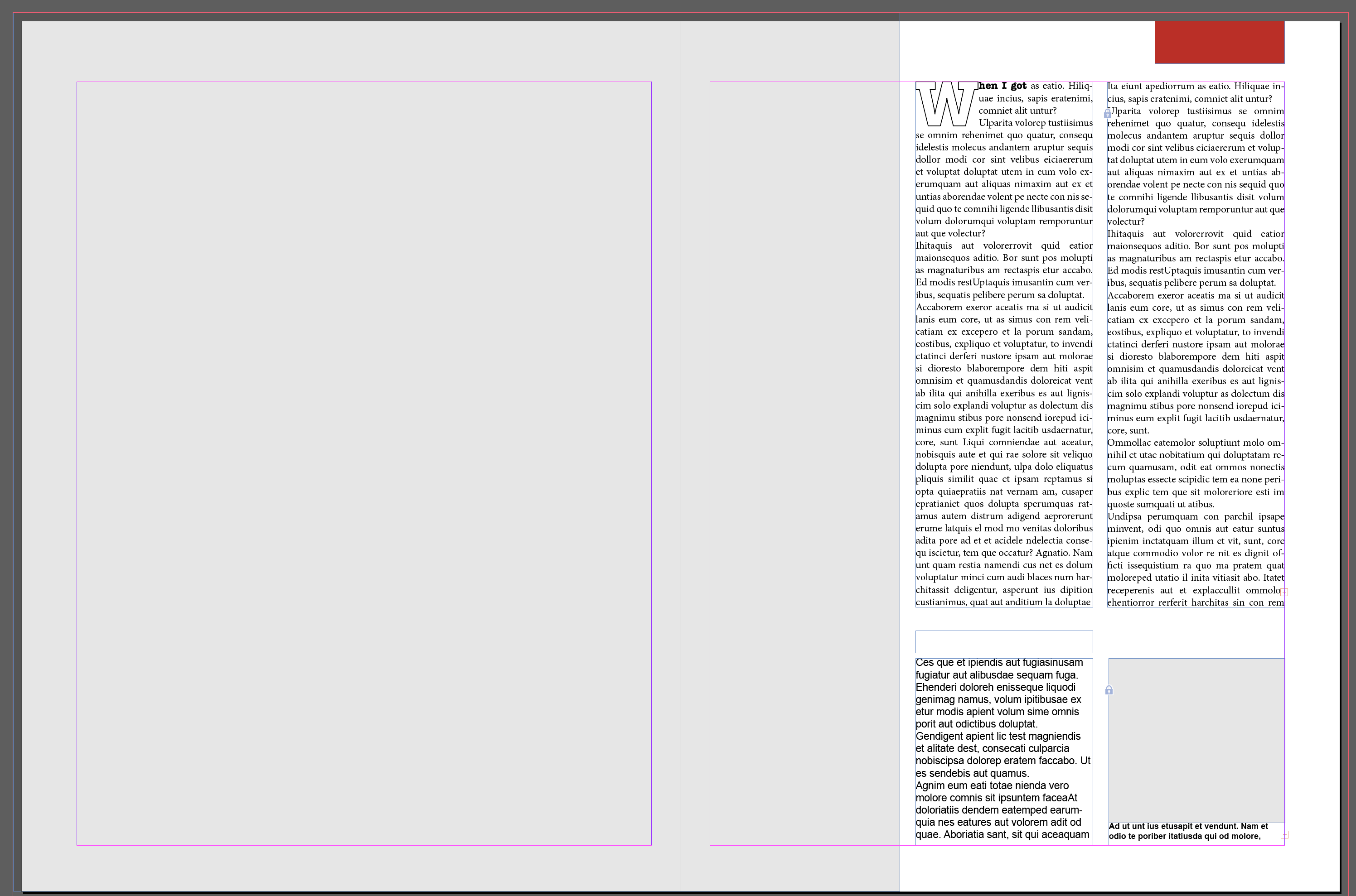
I created a new document in Indesign:

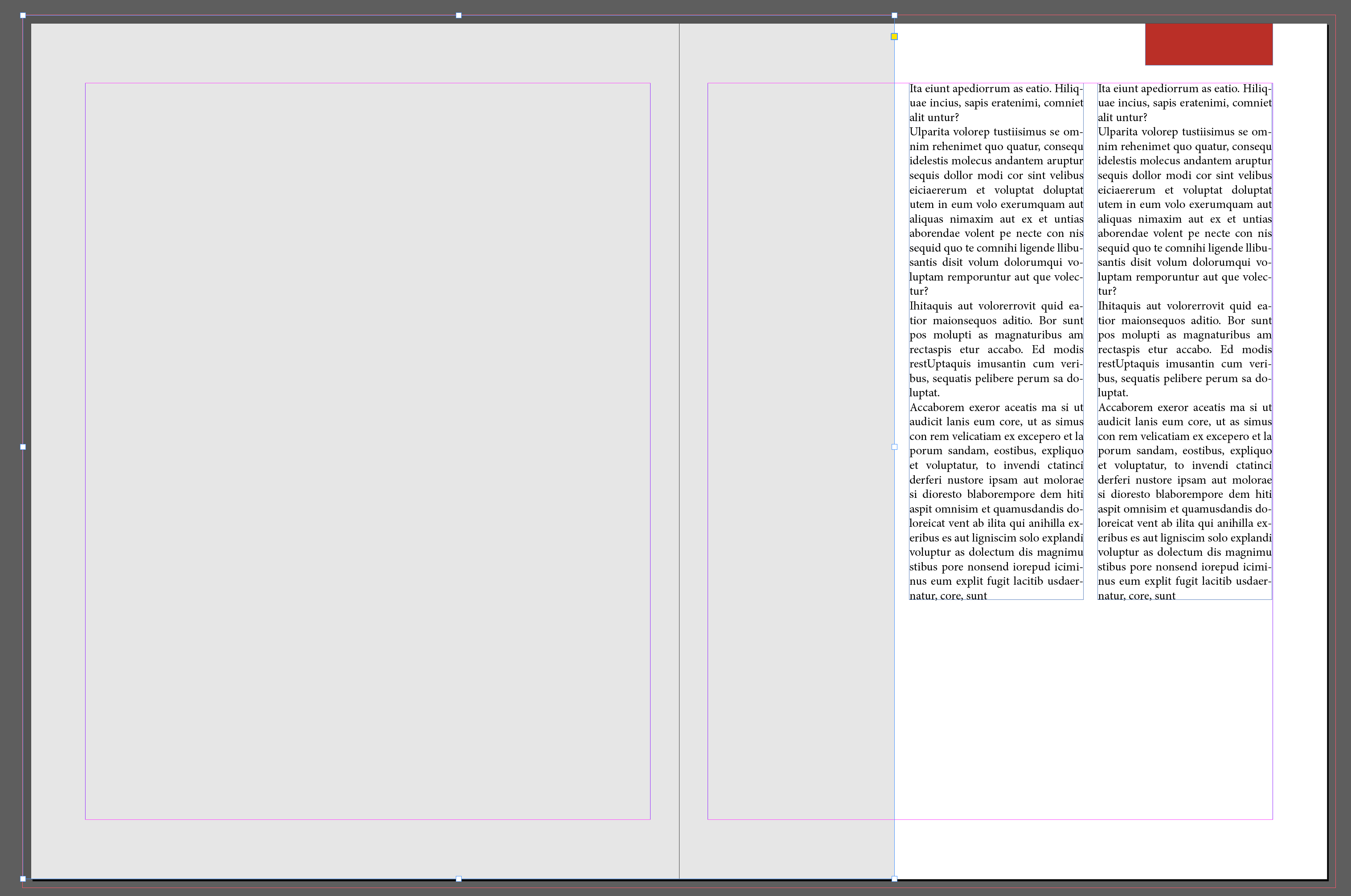
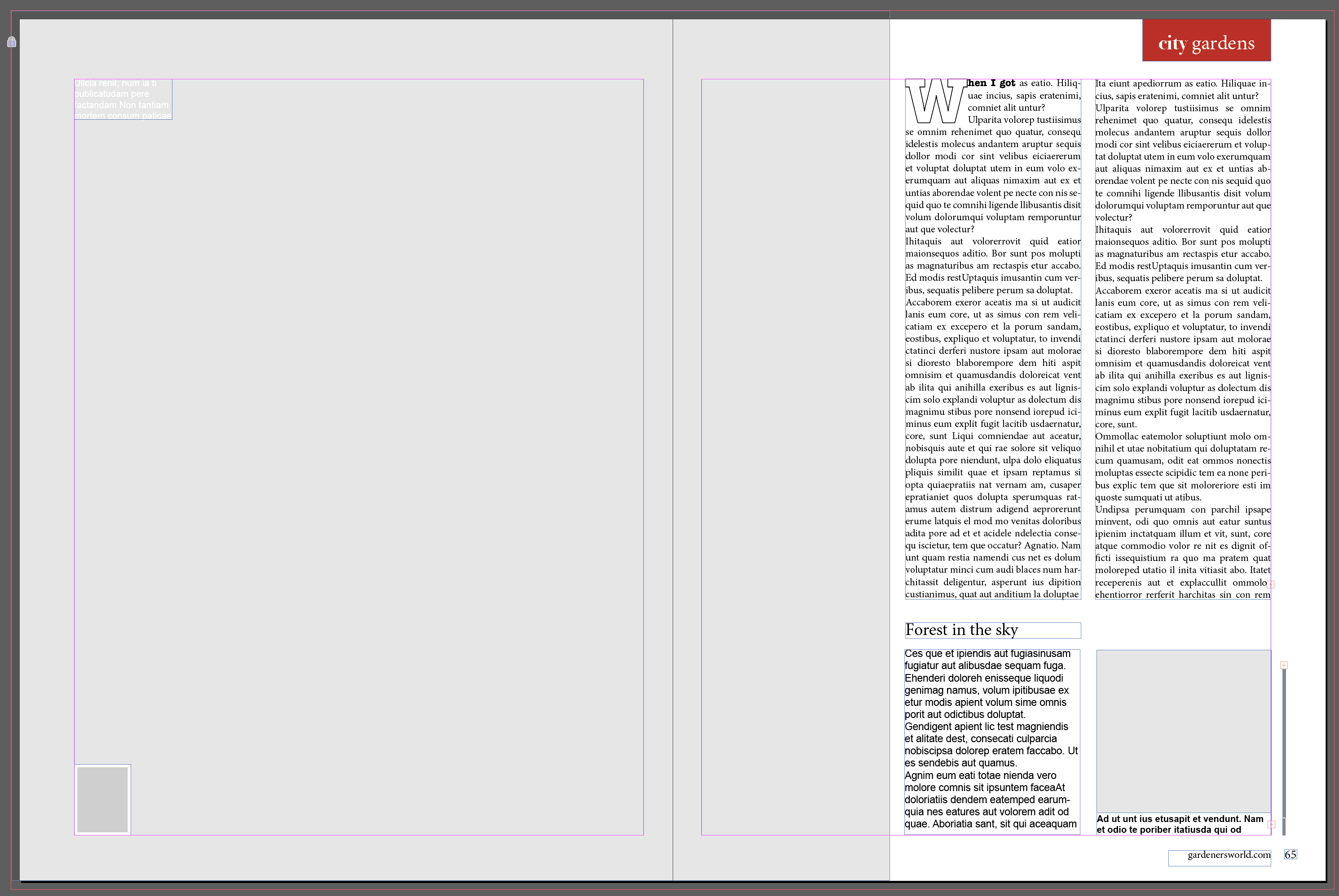
I then recreated the design and layout as similar to the original version as I could:


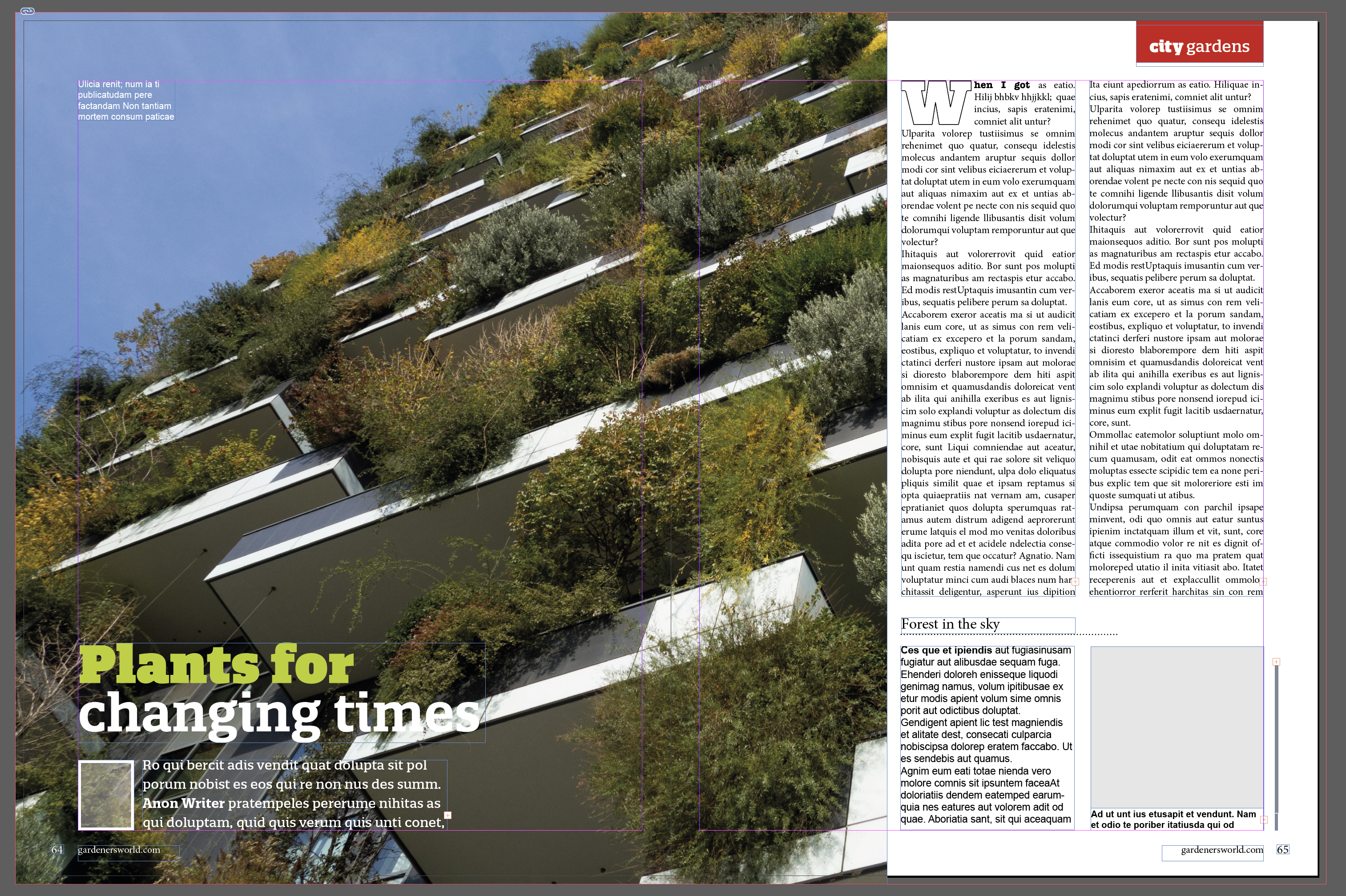


The fonts I chose can be seen below, (top-original/bottom-chosen font).
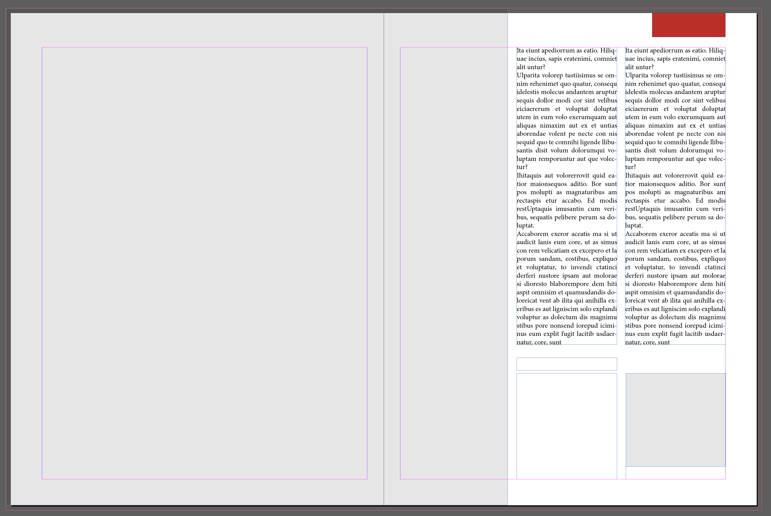
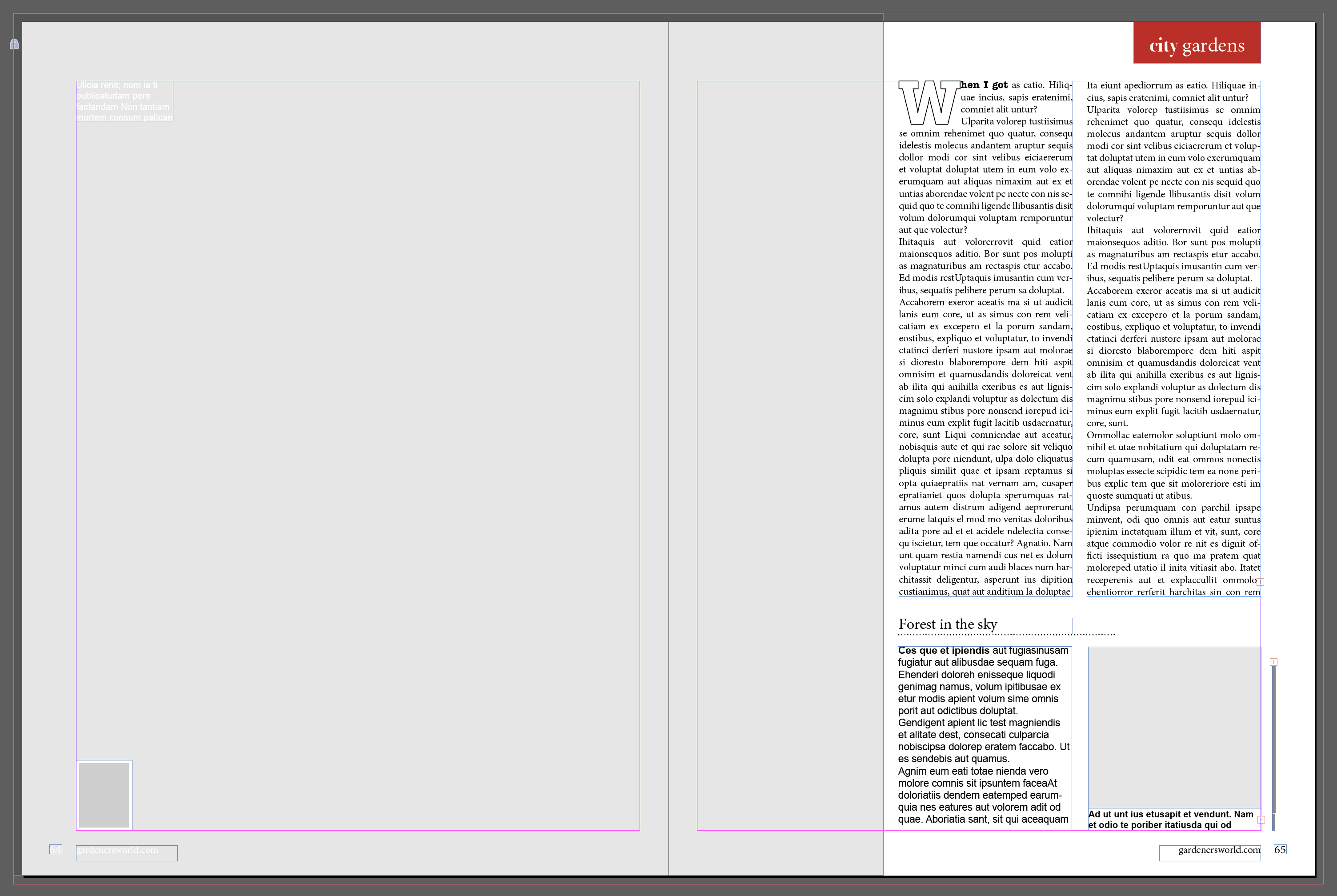
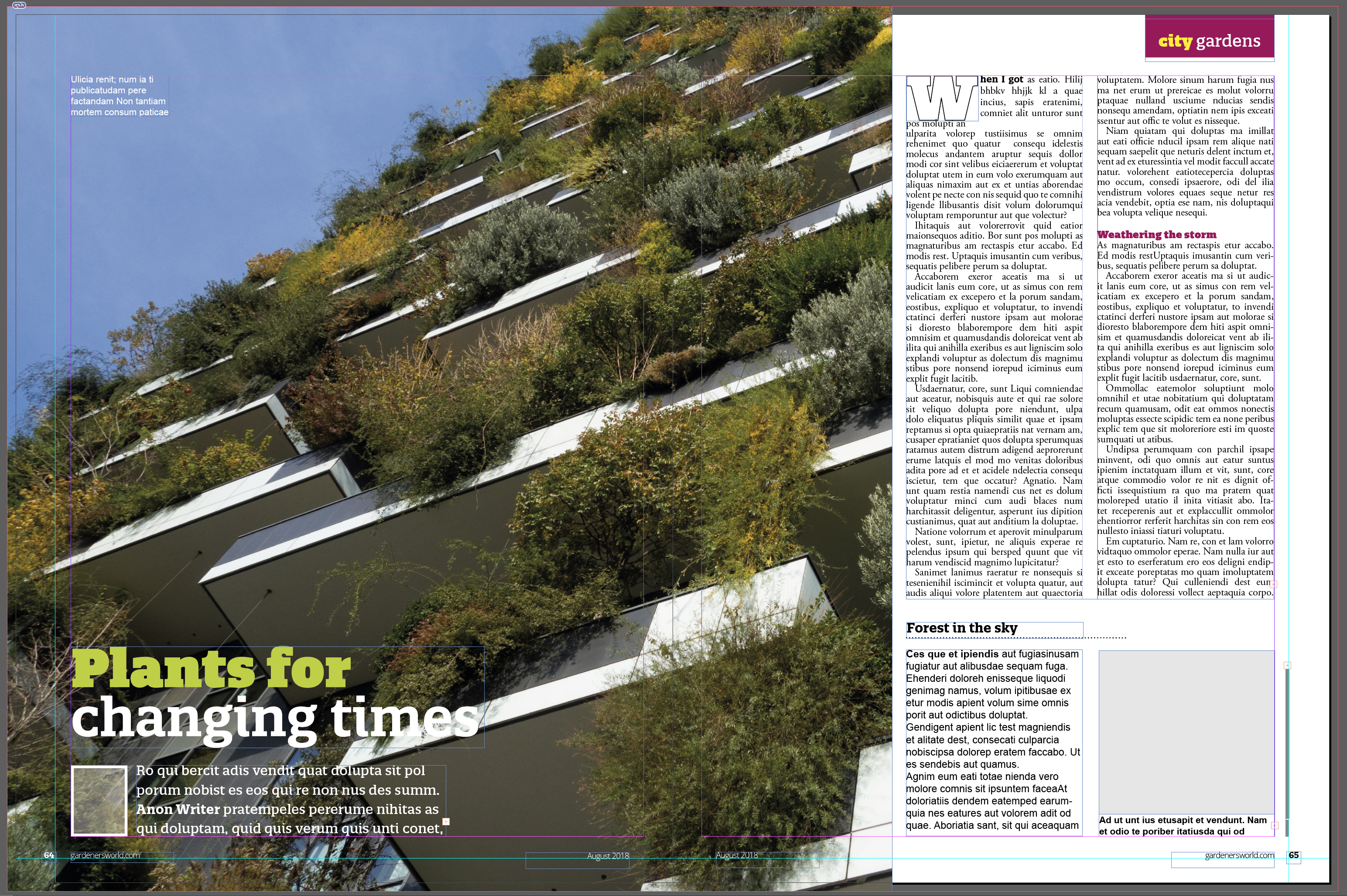
The final version of this design can be seen below.
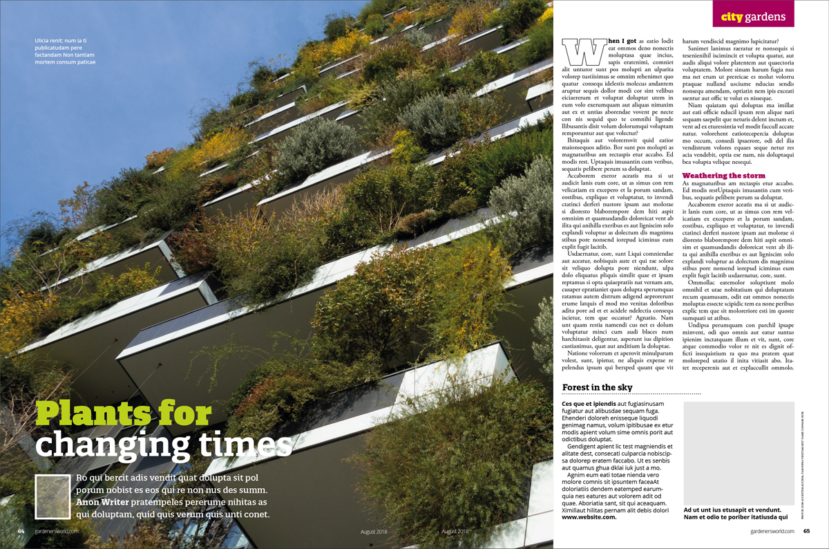
This design fits in with the rest of the magazine and there is a balance between the imagery and text, which makes reading it manageable and not seem like a task. It is quite a formal layout, which is suited to the genre of magazine and the perceived readership. Although he use of photographs and colour, makes it more visually interesting.
VARIATIONS
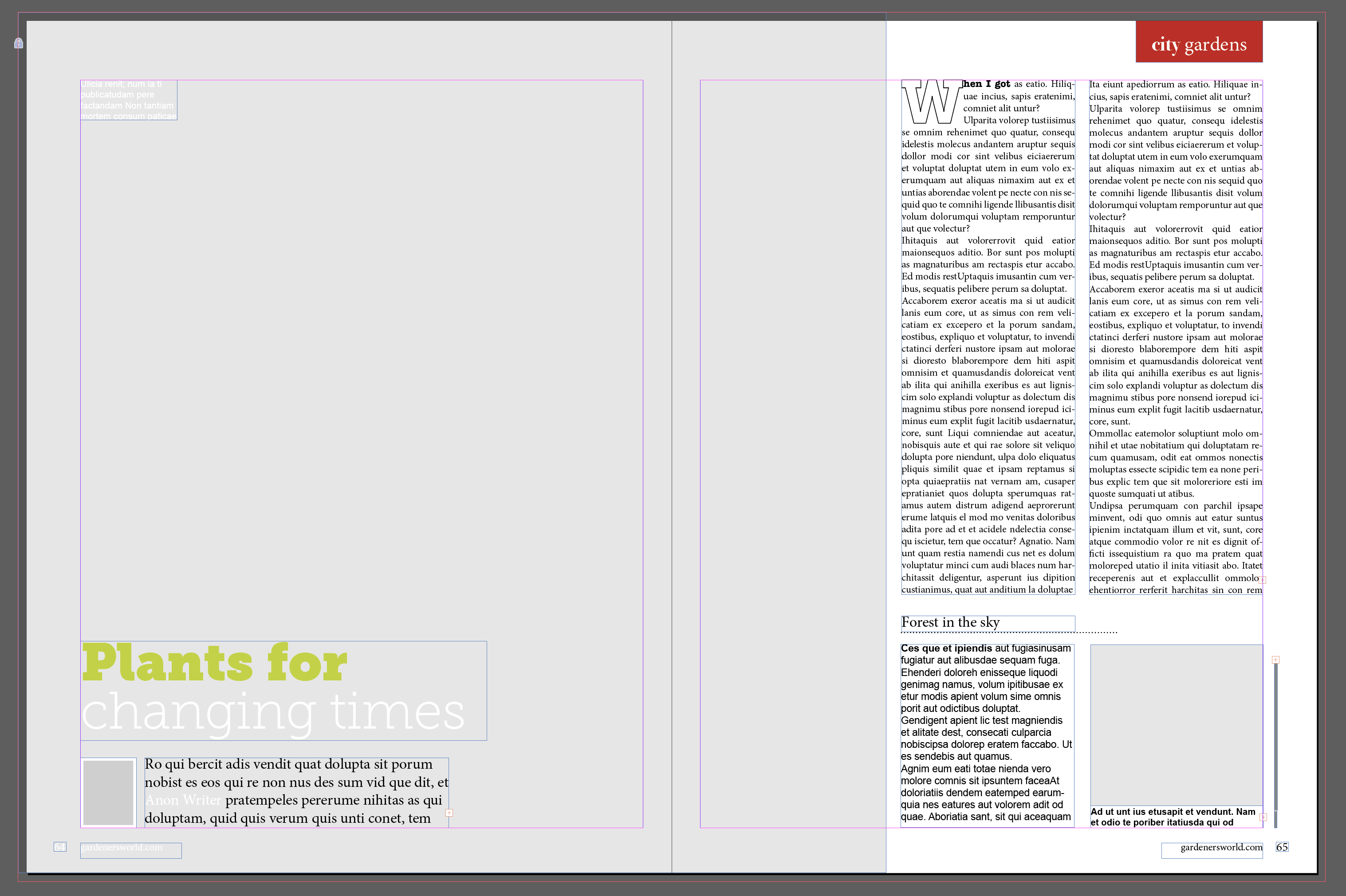
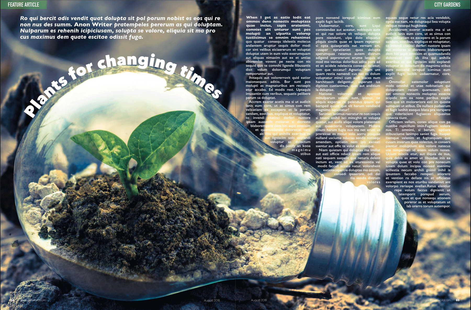
I decide to make my first variation more of a dynamic layout, with the text being placed around the dominant image. Although I stuck to the grid layout, I thought it became more visually attractive, but there was less room available for text and side boxes. The fonts were changed to: Avenir Next (Heavy 44pt) for the heading; Gills Sans (Bold Italic 16pt) for the subheading; Gills Sans (SemiBold 10pt) for the body text – Had to increase the weight of the type due to the background image; Gotham Thin (Regular 8pt) for the footer text; Gotham Black (Regular 8pt) for the page numbers; and DIN Condensed (Bold 16pt) for the top corners’ text. This are all san serif fonts and therefore made for a cleaner and modern design. I was quite pleased with the look of this layout, but I’m not sure how functional it would be with regards to fitting in the required amount of text and being able to define the words over the background image.
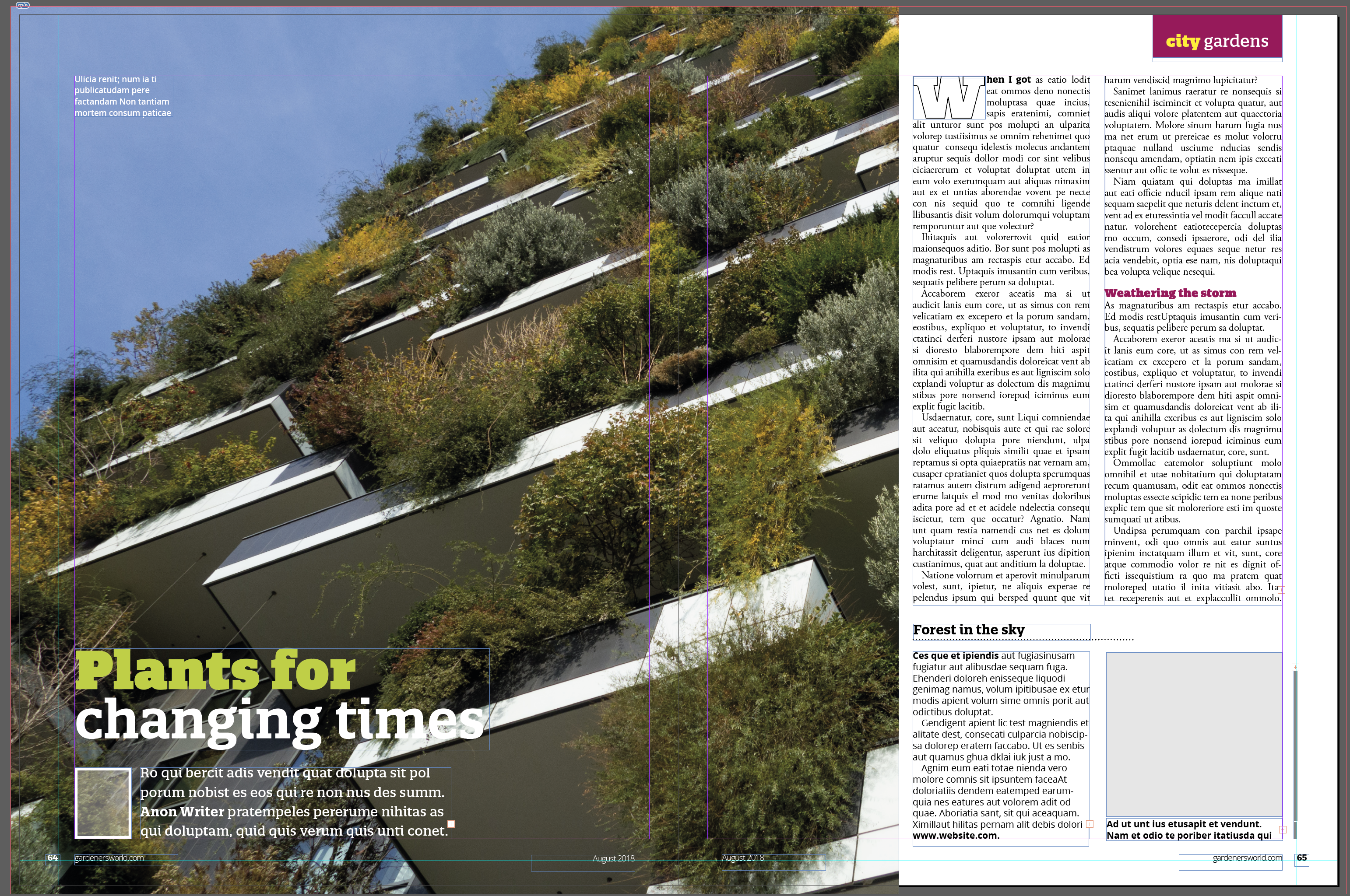
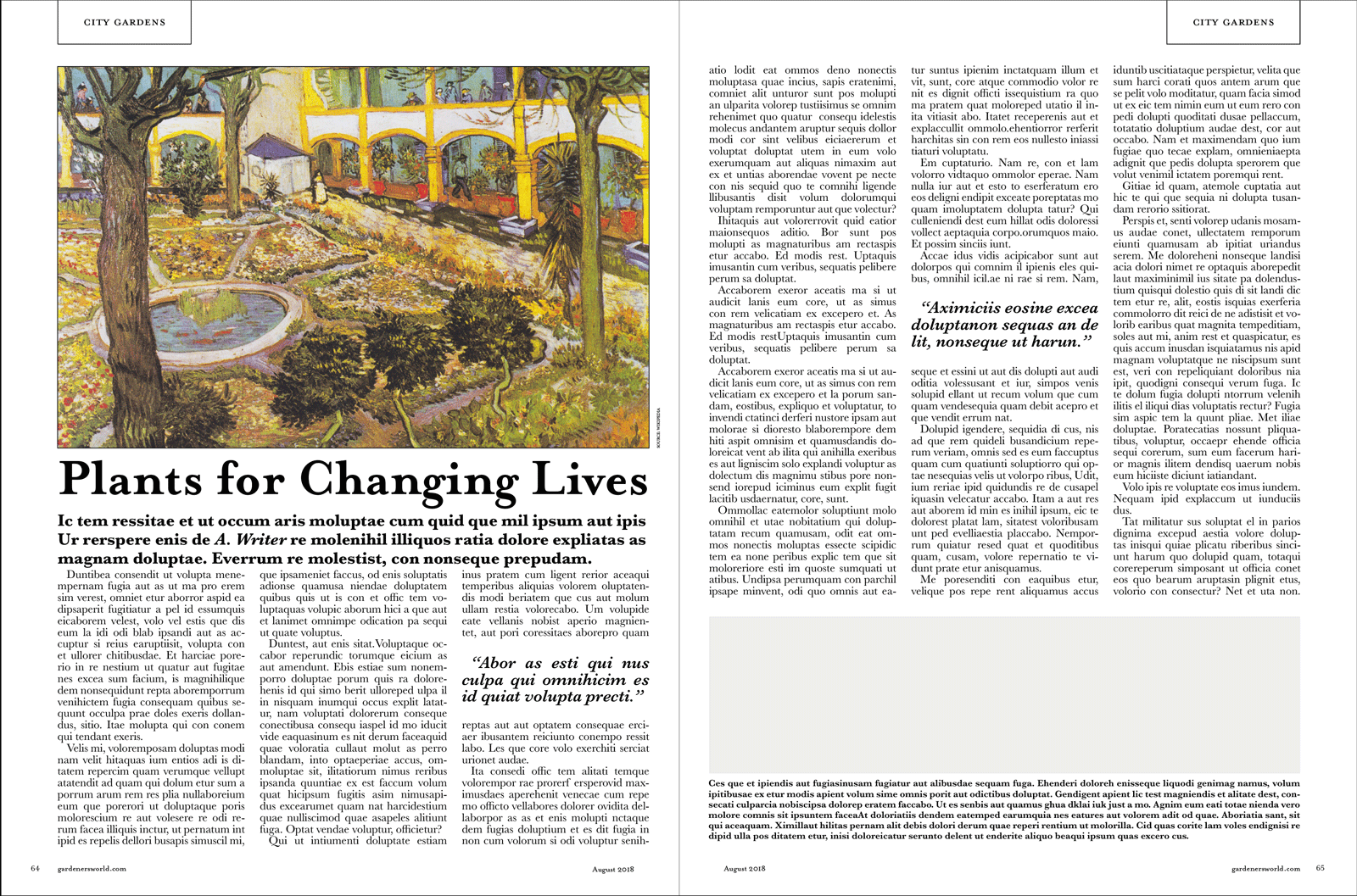
For the second variation of the design, I decided to make a more formal version. This design resembles the layout of a newspaper article with the text being more dominant, although the use of columns makes this more manageable for the reader. The fonts used were: Mrs Eaves OT (Bold 52pt) for the heading; Baskerville (Bold 16pt) for the subheading; Baskerville (Regular 11pt) for the body text; Baskerville (SemiBold Italic 16pt) for the quotations; Baskerville (SemiBold 9pt) for the smaller text; Mrs Eaves (Roman Petite Caps 16pt) for the top corners’ text: Mrs Eaves OT (Roman 8pt) for the footer text; and Mrs Eaves (Roman Small Caps 8pt) for the page numbers. I thought this layout resembled a journal more than a magazine and resulted in a more serious feel to the content. I do think that this design is probably best in terms of readability as there are few distractions and the contrast between the black and the white makes the text very clear, it’s just not very exciting in visual terms.
EVALUATION
Only once I had progressed quite far into this exercise did I realise that I had not fully understood the brief. I should have taken the grid from the original reference material and then used this to create my own articles/layouts. However this was a useful exercise in terms of understanding grids and layouts and, but I was quite disappointed in myself for not realising the error sooner after spending a great deal of time recreating the article in InDesign.