Exercise: Poster and Flyer
BRIEF
This exercise is about how you deal with two different spaces to work in.
You have been asked to design an A3 poster and an accompanying double sided A6 flyer promote a singing course run by an organisation called SingOut. They have very little money so want to print these posters on there black and white photocopier (colour paper can be used).
You may want to include an image such as a drawing or photograph, but be very careful with photos as they tend not reproduce well on a photocopier, particularly if they are colour photos. You will need to check by printing of your design and/or photocopying it.
The information to be included is:
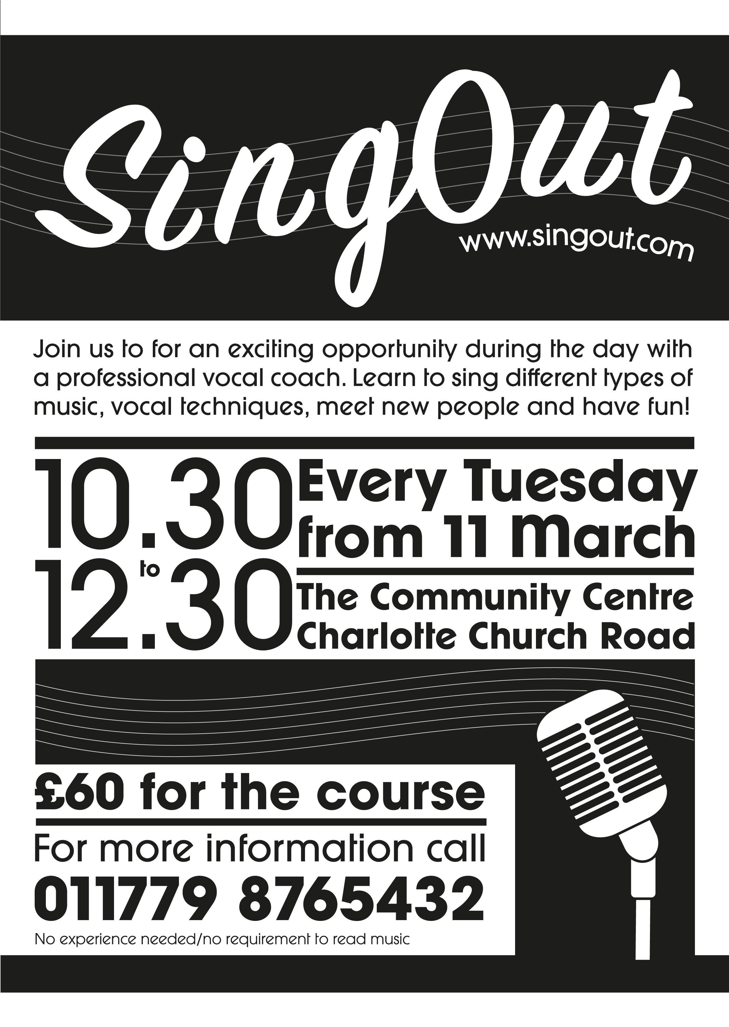
- Do you love to sing?
- Join us for an exciting opportunity during the day with a professional vocal coach. Learn to sing different types of music, vocal techniques, meet new people and have fun!
- 10.30 to 12.00 every Tuesday from 11 March
- The Community Centre, Charlotte Church Road
- £60 for the course
- No experience needed/no requirement to read music
- For more information call 011779 876432 www.singout.com
The first thing you need to do is work out if you have all the information you need to fulfil the brief. If not, what is missing? Work out the hierarchy of information. How will you divide your your information up to fit on both sides of the flyer? How can you make the poster eye-catching and effective with such a limited palette? Which typefaces or faces will you used why have you made that decision?
Once finished, pin the poster up and critique your work. What do you think?
ANALYSING THE BRIEF
To begin this exercise I considered the brief and the questions put forward:
I felt that all of the key information had been provided – the topic/title; the day/time, the venue and the price.
In terms of a hierarchy of information, I thought that the bullet points provided were more or less organised in the order of priority. The title ‘Do you love to sing?’ would be at the top, as this is what would draw someone’s attention to the poster/leaflet – it is a direct question to potential students. Also, the time, date and location would need to have a primary role int he design as this is what most people would think of first when considering going a class/club. Also, I do think the phone number and website address would need to be fairly prominent on the design as this is what the viewer needs to act on the advert.
For the flyer, I decided it would be best to divide the information up so that the title/description, along with any illustration/photo, would be on the front, as this would be needed to catch someone’s eye, with the additional details on the back. This would allow better use of white space and result in a less cluttered design.
With regards to making the poster effective with such a limited palette (i.e. black and white), I actually did not see this as a limitation as I felt it was possible to make an eye-catching design in this way as I have seen examples, so I saw it more as a challenge.
I decided my designs would use mostly sans serif fonts as they are generally considered the most readable when viewed at a distance (i.e. as a poster would initially be) and I thought they would be more effective in the context of their brief. I wanted to have a clean design, which sans serif lends itself to very well.
The brief does not state how many flyers/posters would be required and what budget is available.
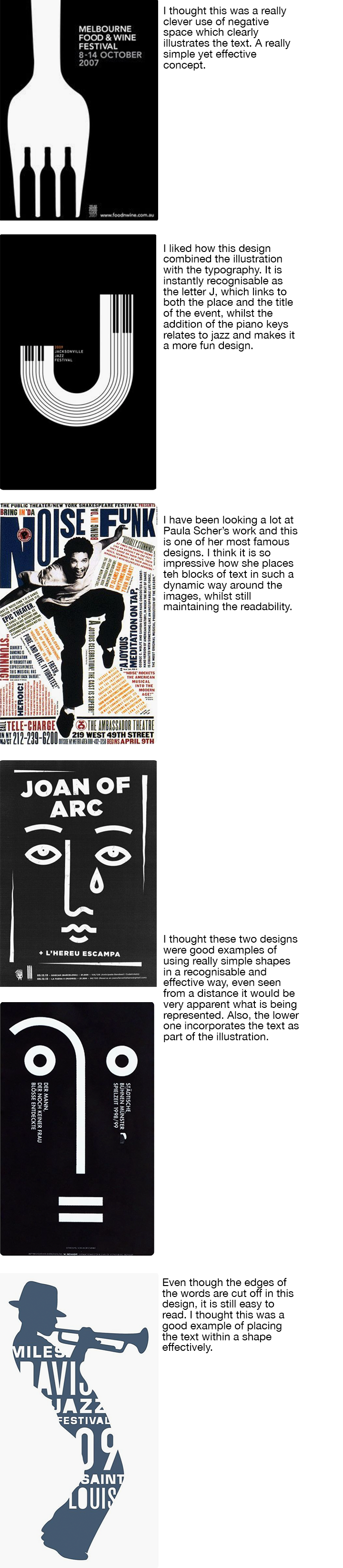
RESEARCH
I looked at Pinterest for some inspiration of working using just black and white.
I’m really interested in this way of working as it forces the designer to be imaginative without the use of colour. As black and white have such a strong contrast, I think this can be used very effectively.
I picked out some examples, which particularly stood out to me in terms of generating ideas for my poster and flyer.
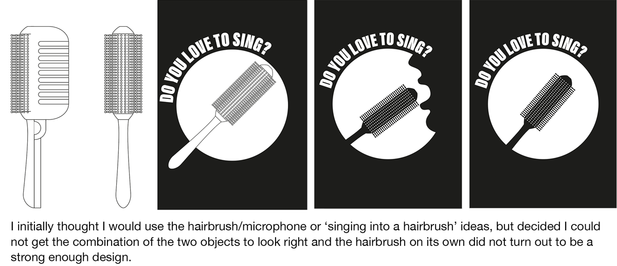
INITIAL IDEAS
I made some rough sketches of ideas, which can be seen below. I found these quite useful for generating some thoughts to build upon.

DESIGNING THE POSTER


DESIGNING THE ACCOMPANYING FLYER

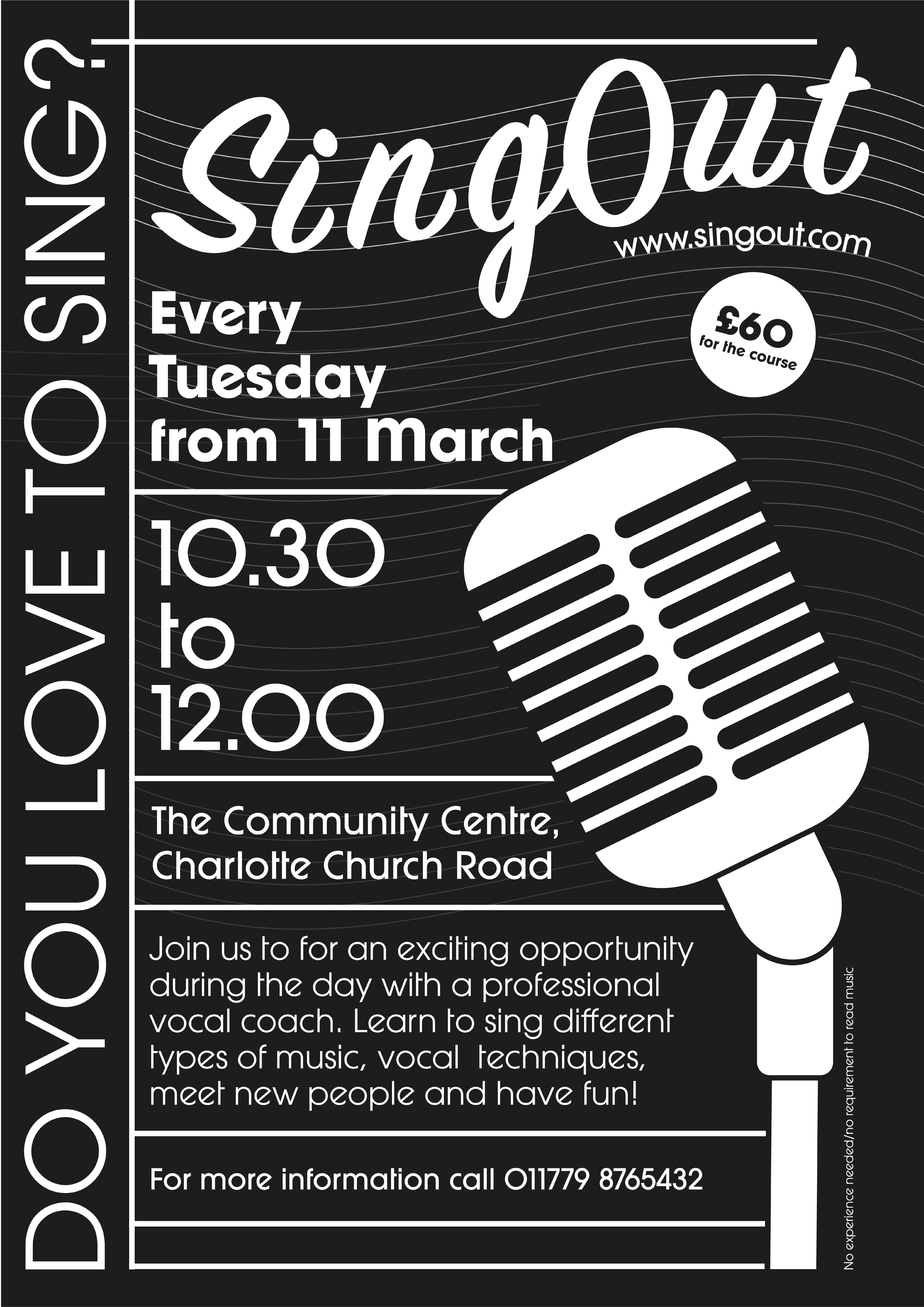
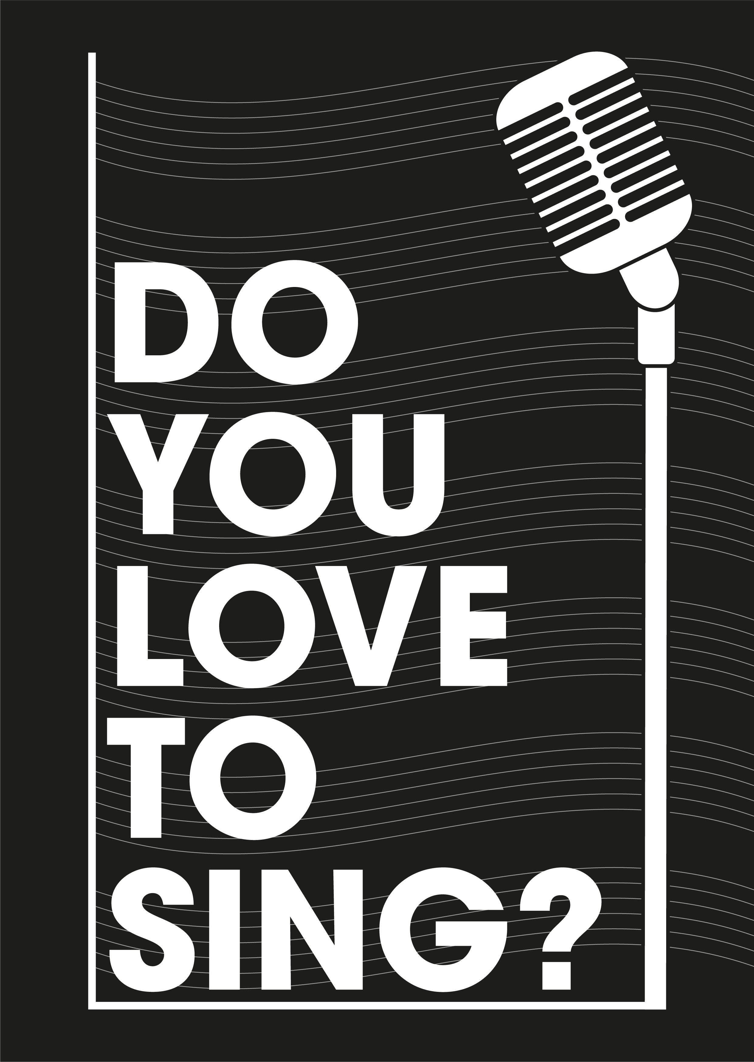
FINAL DESIGNS
The final designs of the poster and flyer can be seen below. I decided to leave the notes off the poster as they did not add anything and it was more a more pleasing design without them.
EVALUATION
I found this exercise both enjoyable and frustrating. I enjoyed the challenge of using just black and white as I’m still not confident using colour effectively. I found it hard to create a layout that worked and fitting the different elements in both a logical and visually pleasing way. I did not choose to use colour paper as I thought this would weaken the contrast and in my opinion, black and white look the best. I would have preferred to add another single colour rather than taking the white away. One negative of my final designs would be the cost of printing using so much black toner, which I was unsure about. Overall I though my final designs were quite successful and fulfilled the objective of linking to one another in a recognisable way. I also thought I managed to get the hierarchy working in both by the end of the exercise.