Exercise: Symbols and Signs
BRIEF
In this exercise you will read existing signs, symbols and images, and then drawing on their visual language, create your own symbols.
Choose one of the following concepts:
DANGER MOVEMENT LOVE HERE
How does existing visual language represent these concepts, or example both ‘danger’ and ‘love’ use red, whiles ‘movement’ and ‘here’ use arrows. Research the different similes and metaphors that are in common use. Document through drawing, collecting examples and mind maps.
Now create an alternative symbol to represent at least one of these concepts. Pencil and paper is the fastest and practical way of working out your designs. You may then want to develop your ideas using computer software.
I chose the concept of MOVEMENT for this exercise as I thought it would be a challenge to represent this visually. I created a mind map of what the word movement means to me. I found it quite challenging at the start, but the more I wrote down, the more examples and connections I thought of.

I found two tutorials by Edward Boatman on Skillshare – Illustrate Your Day: An Intro to Symbol Design and Icon Designs: Creating Pictograms with Purpose – both of which were really useful in explaining the creative process. He is also the co-founder of The Noun Project, which has over one million different symbol designs, an excellent resource to explore examples for inspiration.
Next, I researched some examples of how movement has been depicted in various forms of visual arts.
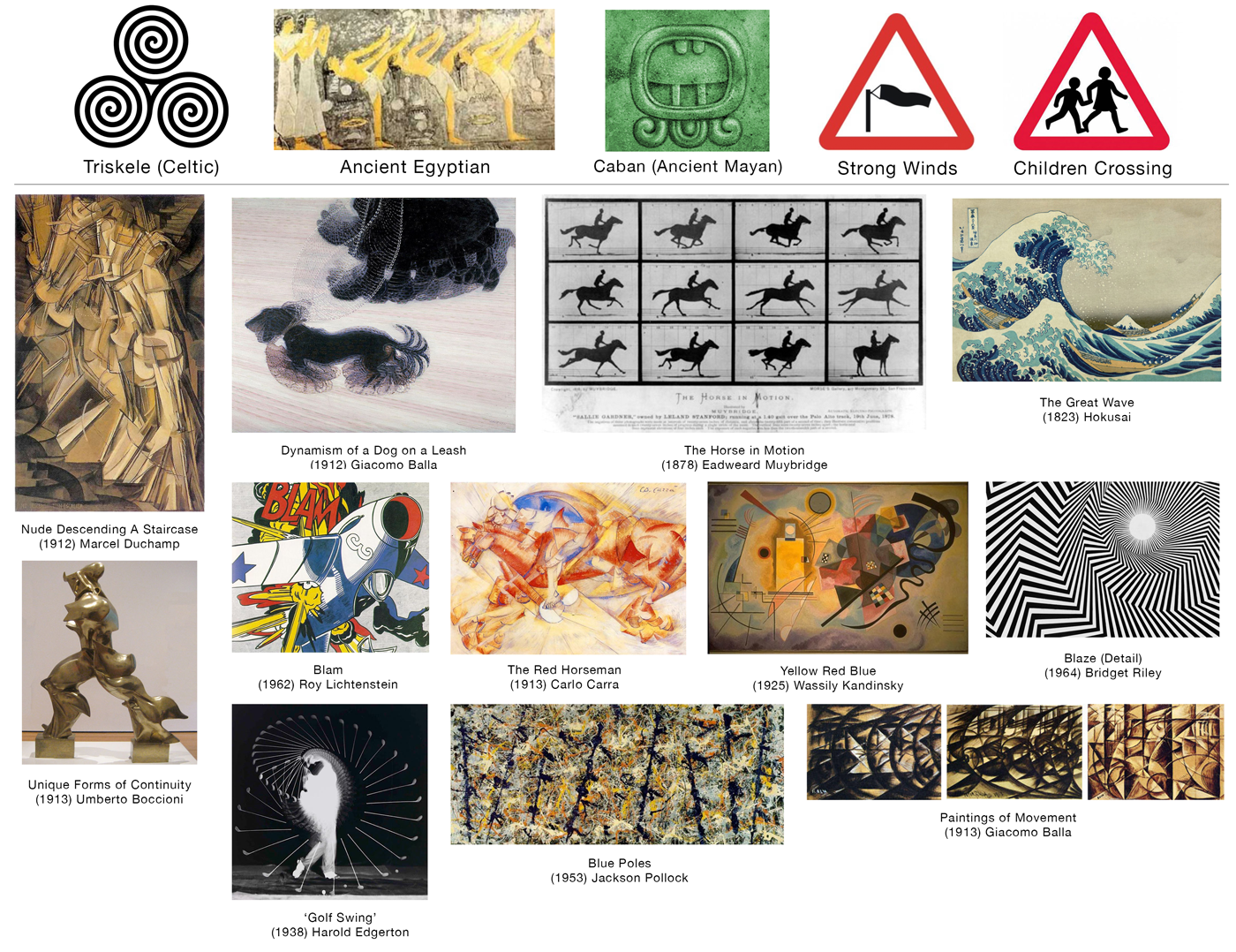
I also created a Movement Pinterest board with examples of images that I thought were particularly effective at depicting movement.
After looking at these examples and reading a particularly useful article regarding motion in art I was able to better understand how the concept movement can be represented visually. I concluded that whilst only one single moment of an action can be captured at a time (even a film is a series of stills), it is possible to imply the illusion of movement taking place. These include:
*overlapping/overlaying the images of each part of the action, several of the images above demonstrate this.
*the use of gesture lines – e.g. curves, angles or zig-zags, such as in Riley’s work which is ‘just’ a composition of lines cleverly positioned to produce an optical illusion of movement.
*the positioning of the visual elements in the composition, e.g. Kandinsky’s piece demonstrates this as the placement of the individual elements suggests movement.
*how the media is applied to the background, e.g. Pollock used ‘action painting’ to create his abstract paintings.
*depicting the ‘peak point’ of the movement, e.g.the wave in Hokusai’s work is at the point just before it comes crashing down – the pent up energy is about to be released.
I then looked at the use of movement in logos:

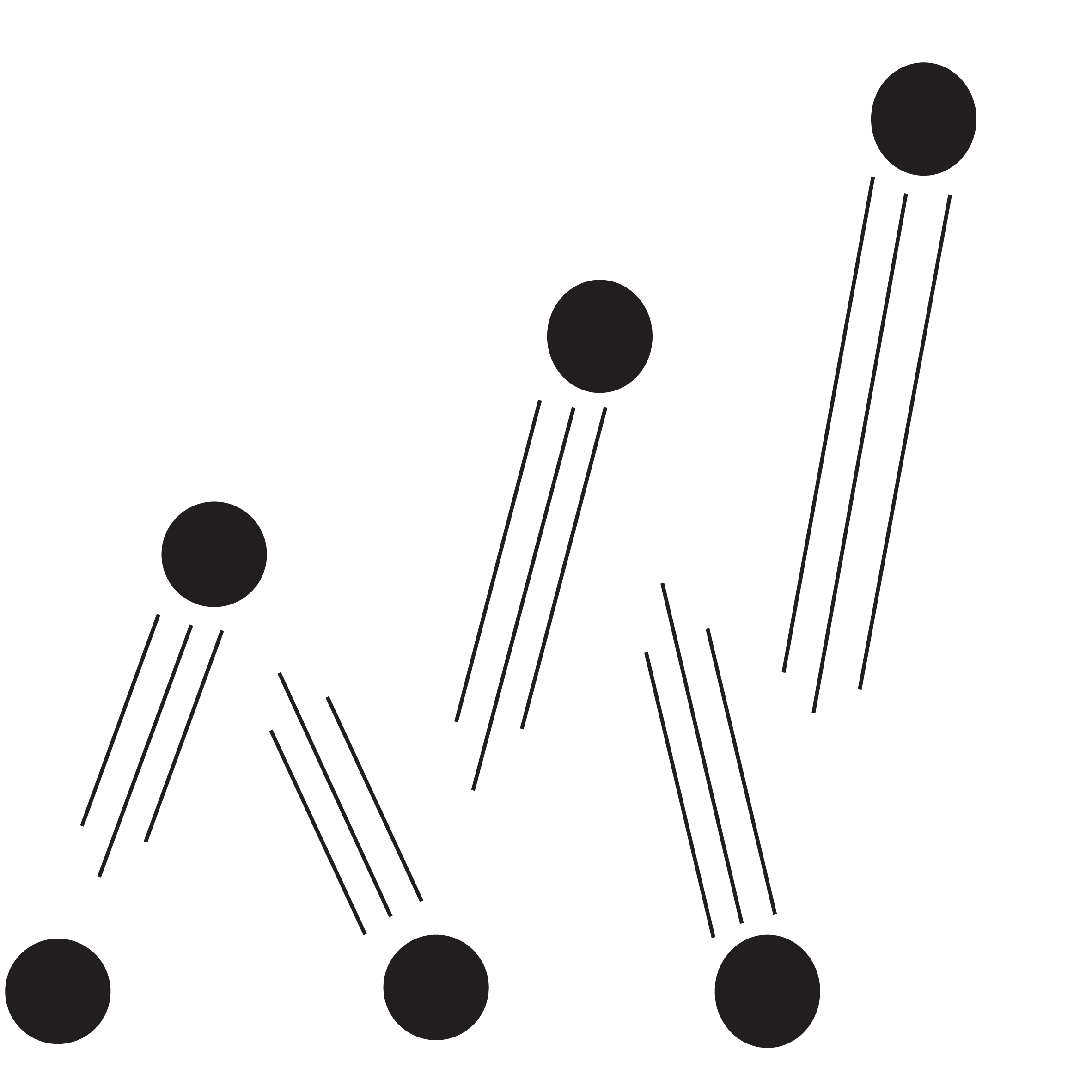
The definition of movement (in this context) is: the changing of position or location. So I tried to keep this in mind whilst thinking of ideas for a suitable symbol. I found it really challenging to think of a symbol that would not be interpreted as representing something else. Using inspiration from some of the examples above, I sketched out some rough ideas (below). I wanted to incorporate the different ways movement is represented – scale, transparency, gradient, line, repetition, overlapping and colour. I found the use of curves and circles was prominent in the examples.

FINAL DESIGNS
Building on the sketches above, I used Illustrator to work on the designs, the results of which can be seen below. I think some were more successful than others and I have added notes for each one further below.
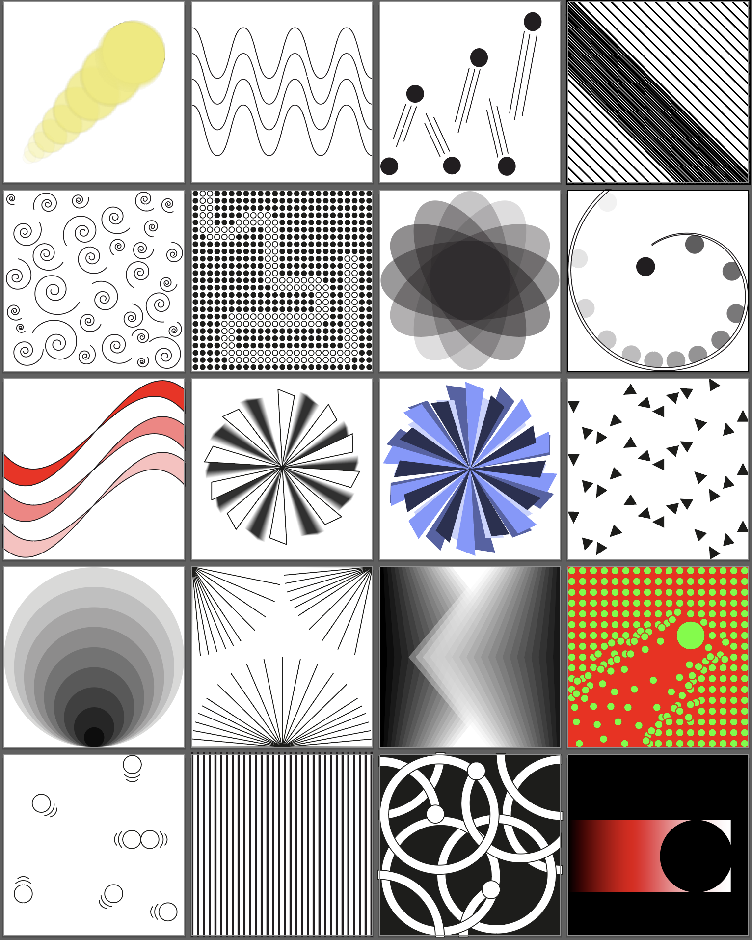
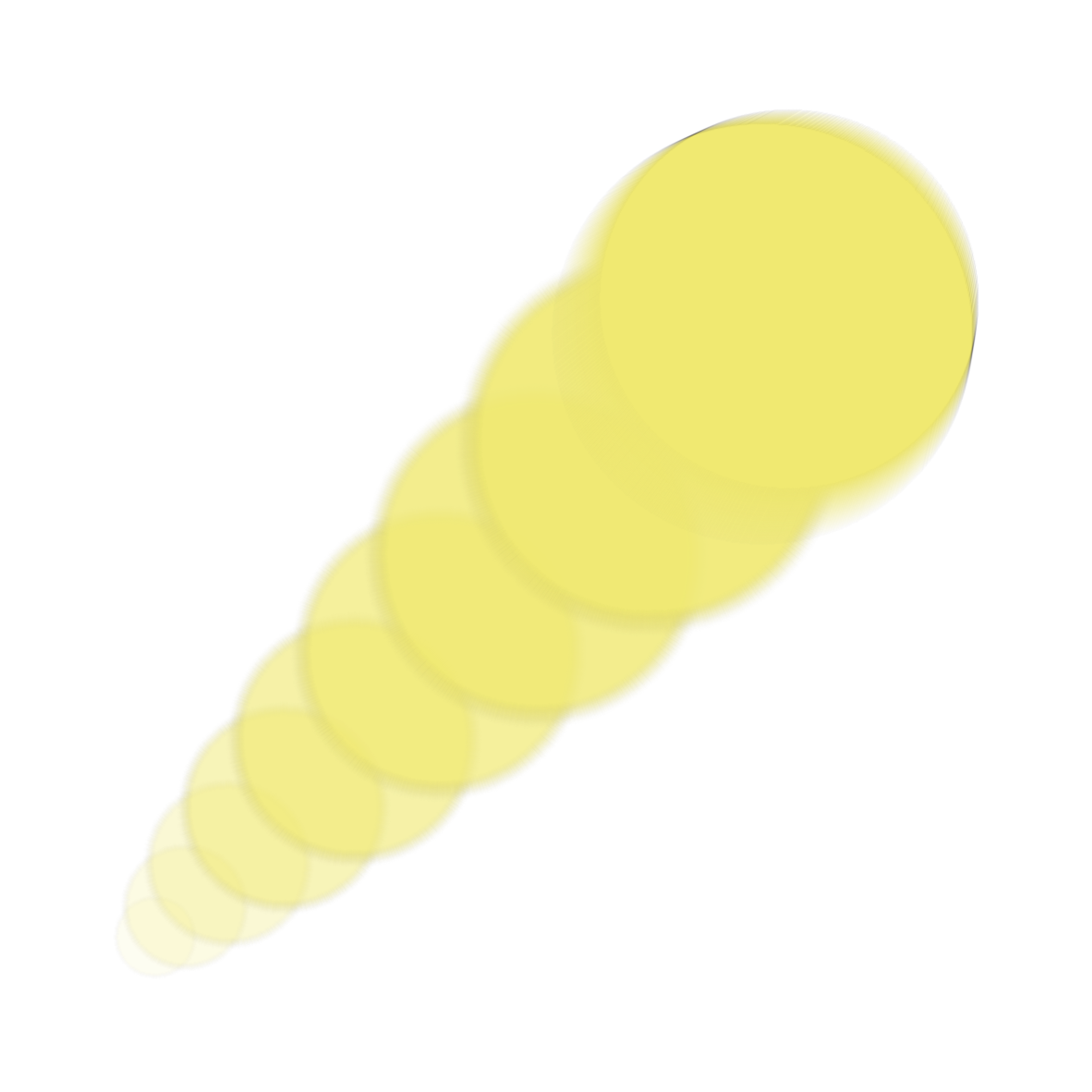
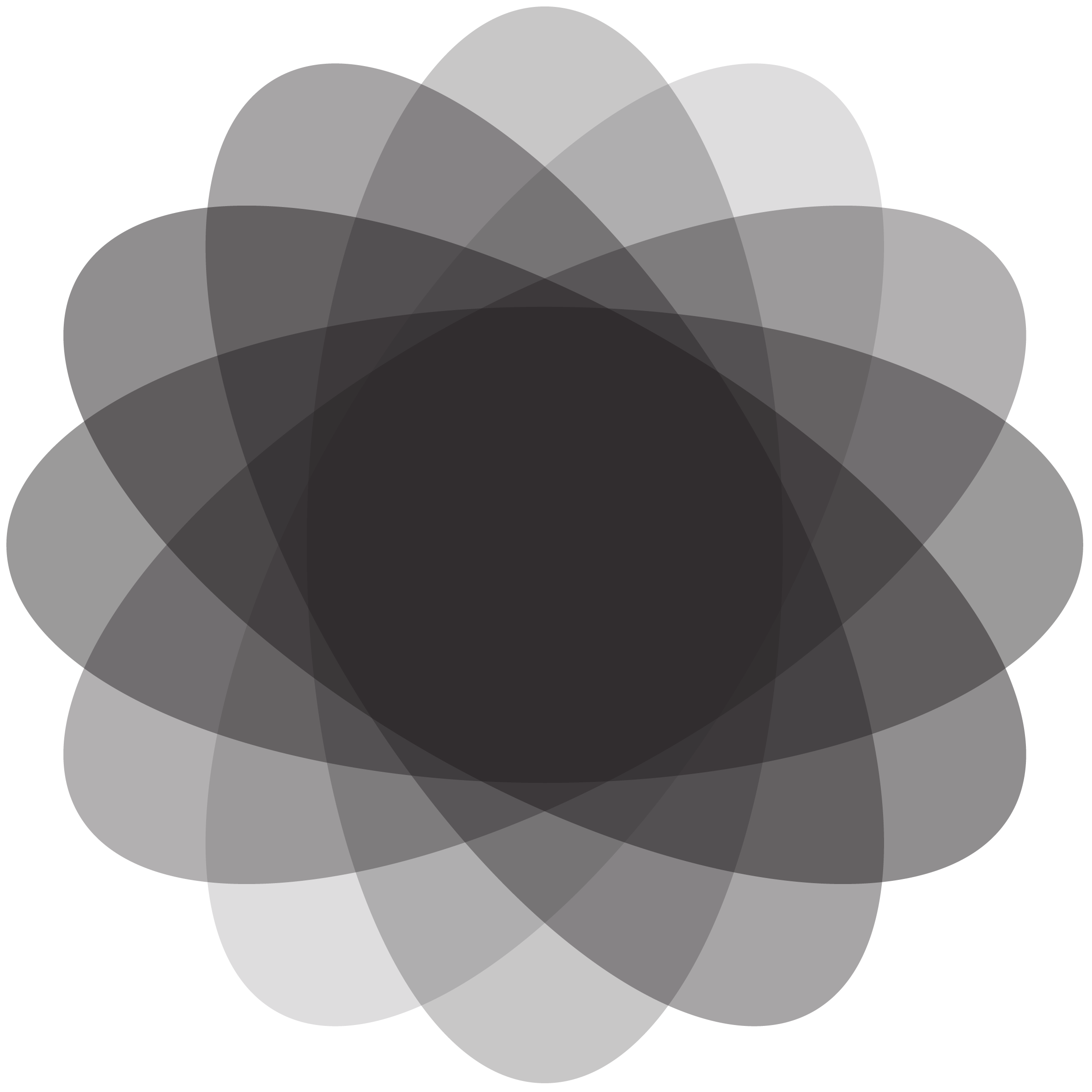
For the first design I used opacity, saturation and scale to give the impression of a yellow circle swiftly moving forwards. I added a radial blur to add to the effect. I definitely felt this design was successful at appearing to be in motion.
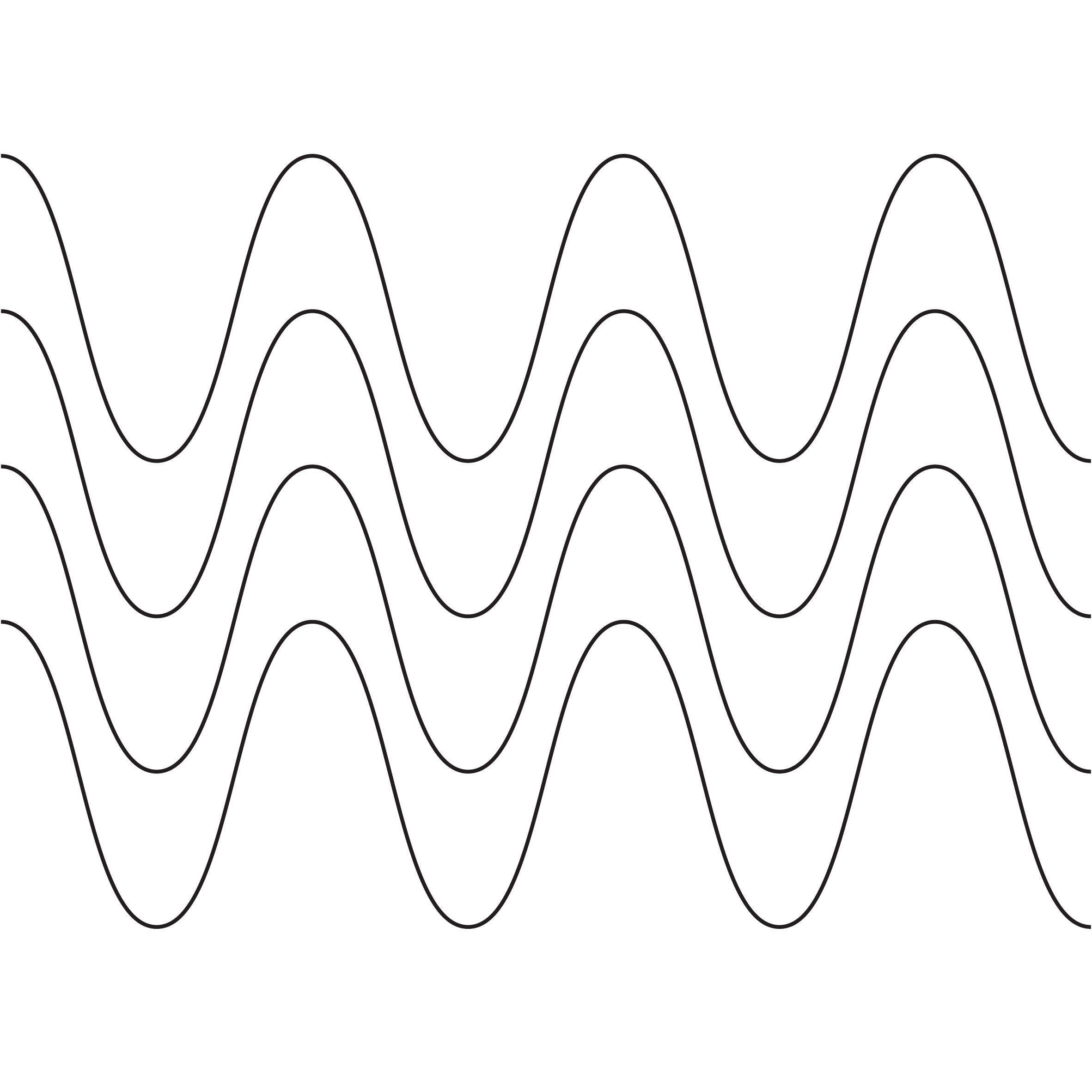
This wave design was created very simply using the Roughen effect.
One of least successful designs, this one is based on the movement a bouncing ball, but I do not think it is very good.
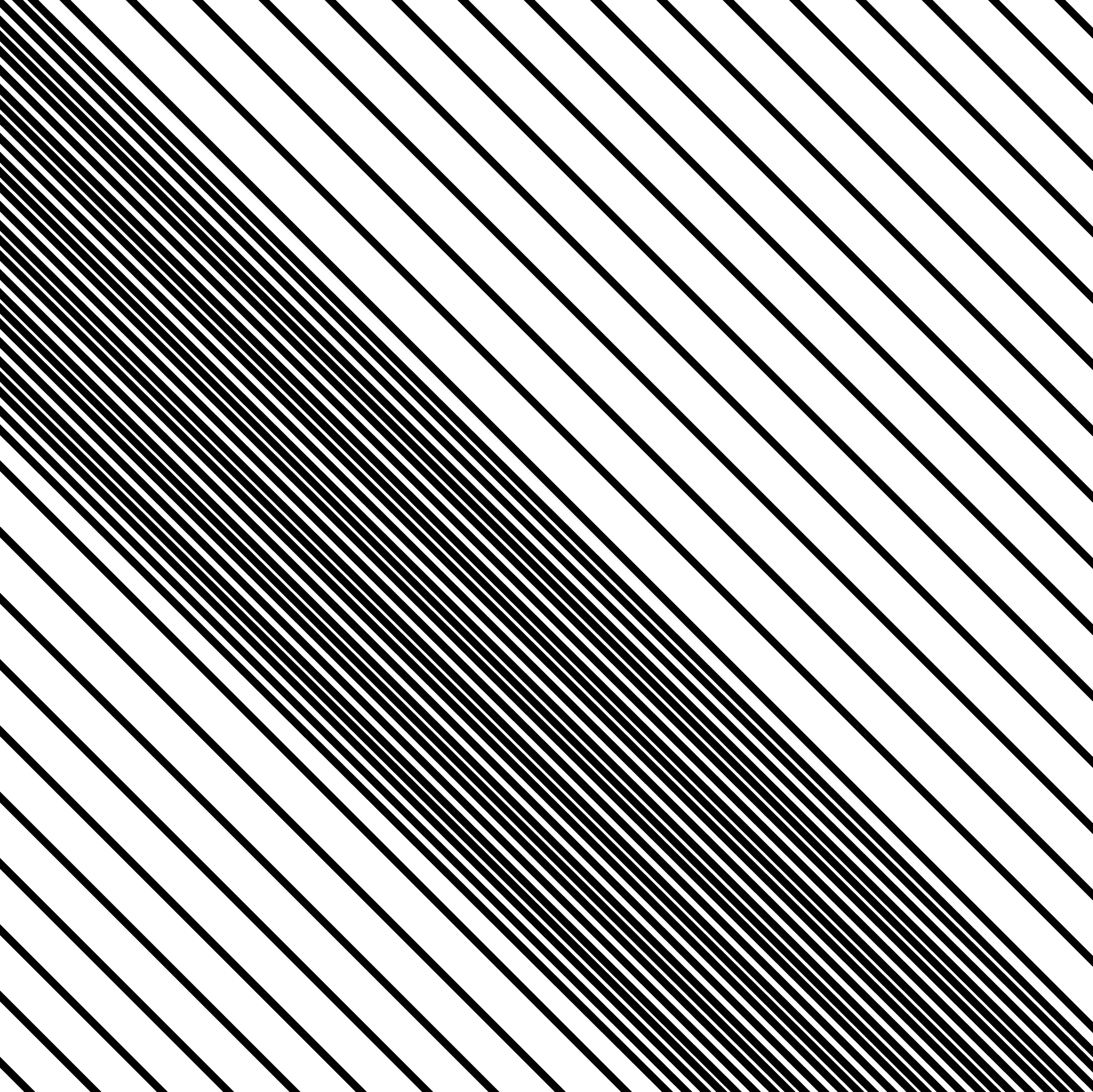
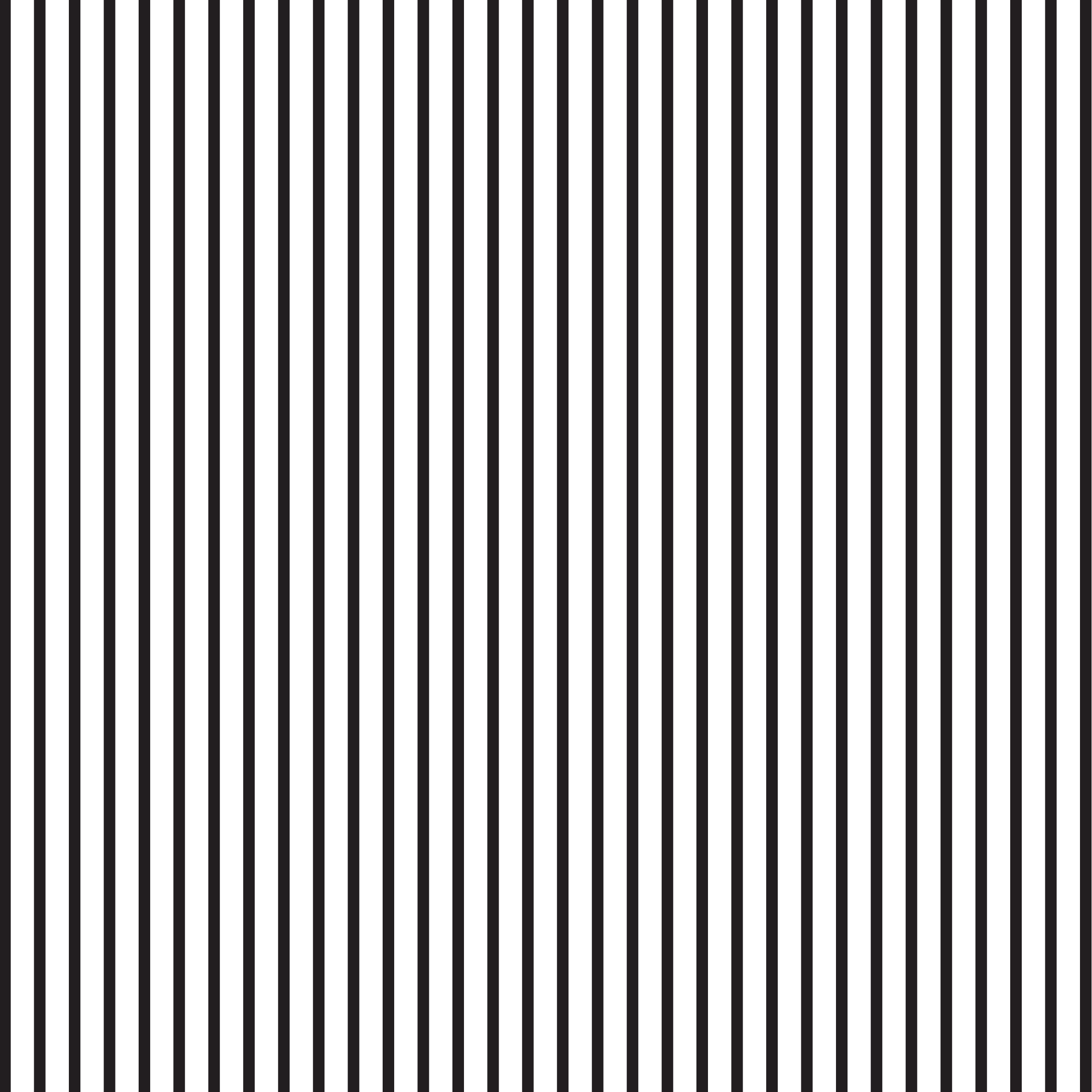
This was one of the first designs in which I tried to implement a kind of optical illusion. In this one, the lines that are closer together appear to be in motion. Although it does look like the lines are moving, I’m not sure it would be a very effective as a symbol.
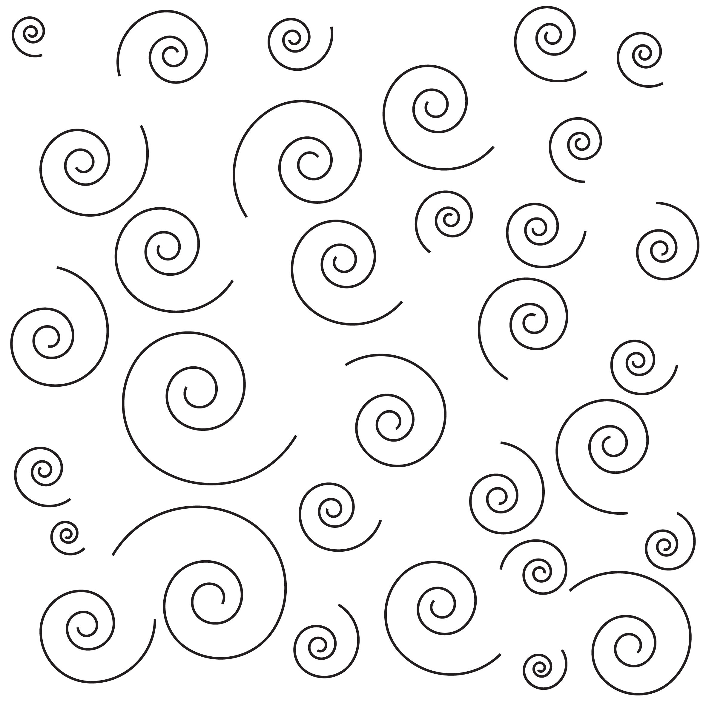
Another unsuccessful design, it just looks like what it is – various sized spiral shapes randomly placed in the composition.
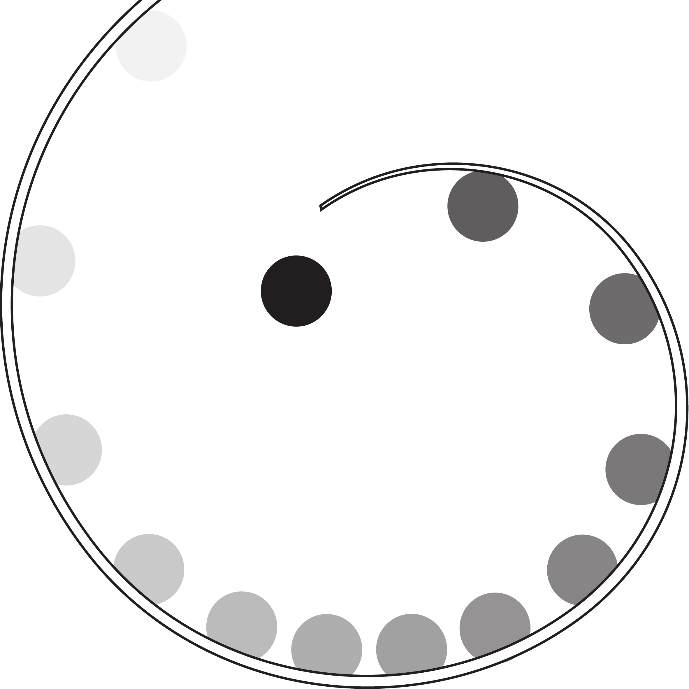
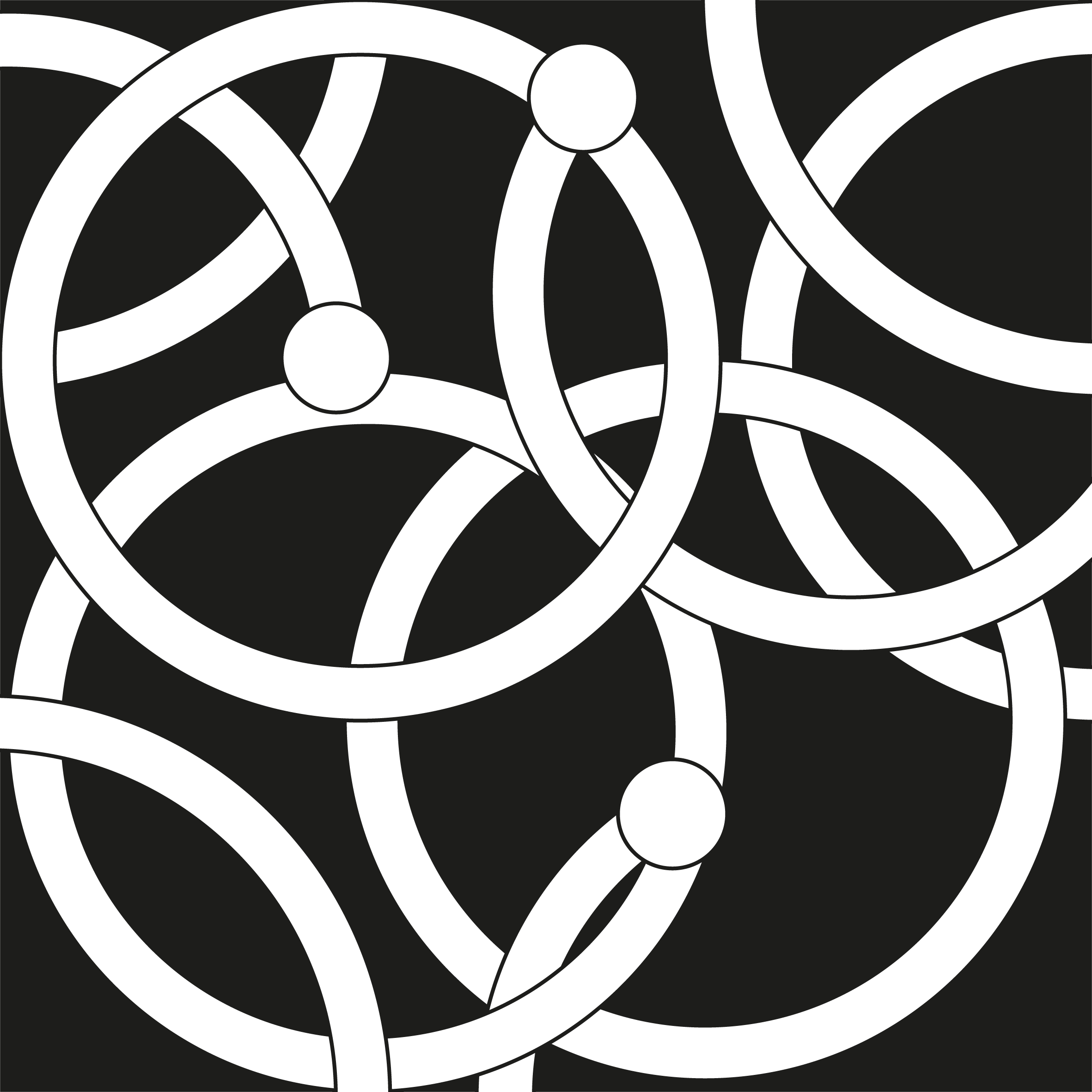
For this design I wanted it to look as though the white circles were winding their way through the black circle; I thought this design ended up looking like the ‘snake’ game from mobile phones. I tried to make it look as though the movement was still in progress by leaving one open ‘end’ inside the composition.
I thought this design was one of the more successful ones. I rotated copies of the shape around the same axis and changed the opacity to make it appear as though it was spinning in place, leaving traces of its movement.
The intention of this design was to show the progress of the circle from the top of the curl to ‘flying off’ the tip of it. I used different opacity percentages to show its progression and attempted to use spacing between the circles to indicate natural movement around the curl.
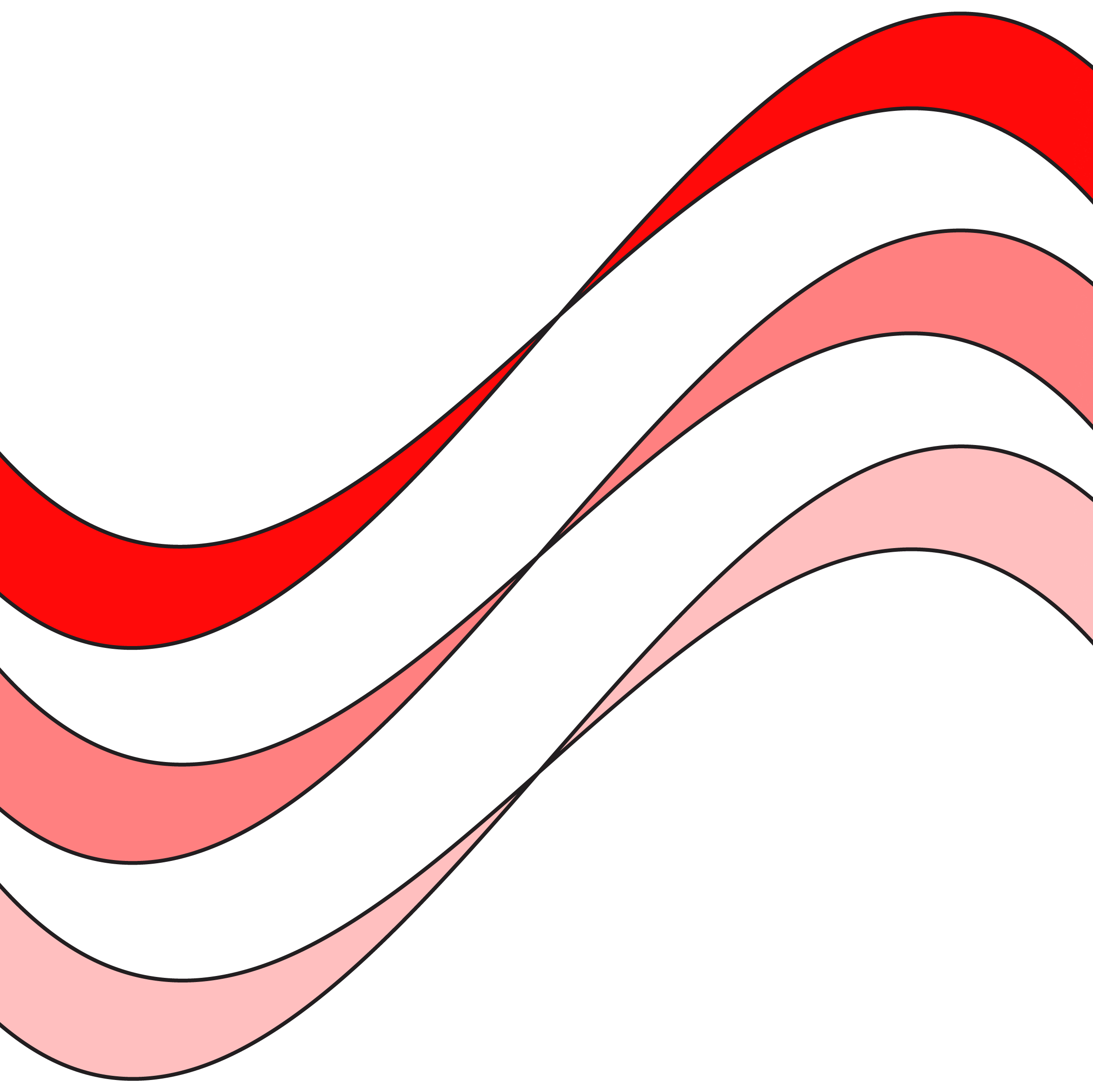
Using the idea of waves, I created these ribbon-like shapes to suggest movement across the design. I thought using three, rather than one, and using different levels of saturations to differentiate between the ribbons was more effective at conveying this concept.
This design ended up looking like a rotor blade. I duplicated the white shape, rotated it, changed it to black and then added a Radial Blur. I think the result does imply movement fairly well.

Based on the design above, I rotated several copies of the original shape, coloured each one a different blue and then varied the scale of each. I think the result is more visually interesting than the previous design.

This design was simply created with copies of a triangle rotated and then randomly scattered over the composition. I do not think it would be easy to interpret it as a symbol of movement.

Again, I used scale and opacity for this design. However, I think the result looks more like a symbol for increasing something, such as volume, rather than for movement.
I based this design on the way that pages in a book move if you open it wide and place it on a flat surface. I think it is fairly successful at indicating movement, but it is not very visually interesting.

Another design based on optical illusions, I copied the original shape and shifted each copy slightly to the left. I then progressively changed the saturation of each one. I copied this group, rotated it and place it behind. I then reduced the opacity of the original shape so the duplicate could be seen. I thought the result did imply movement quite well, but was unsure whether it would successful as a symbol.

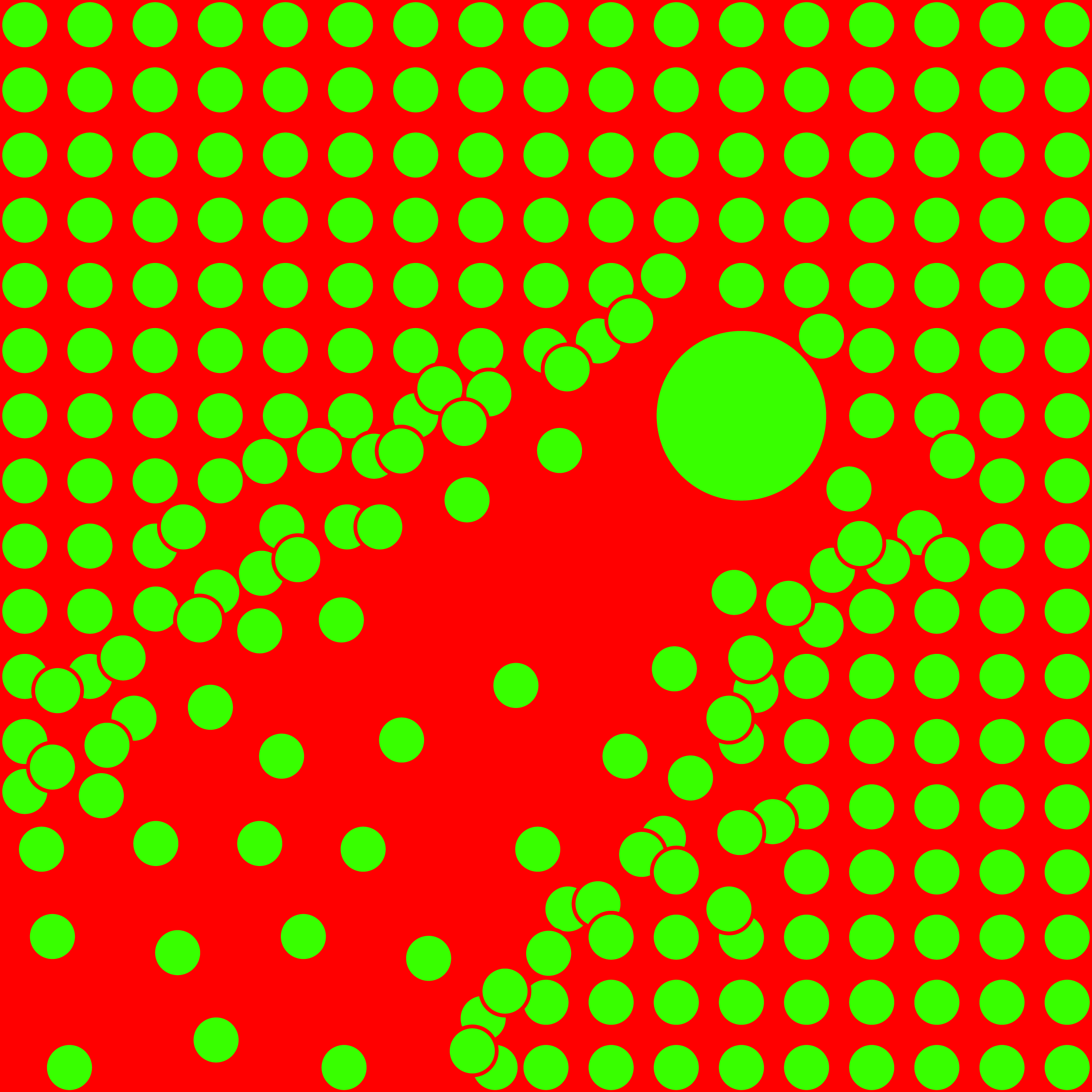
I wanted it look as thought the larger circle was moving through through the smaller ones, creating a path in its wake. I used red and green of the same saturation and brightness levels as they really vibrate off one another. Again, I think this design does imply movement rather well, but I do not know if it would be successful as a symbol.
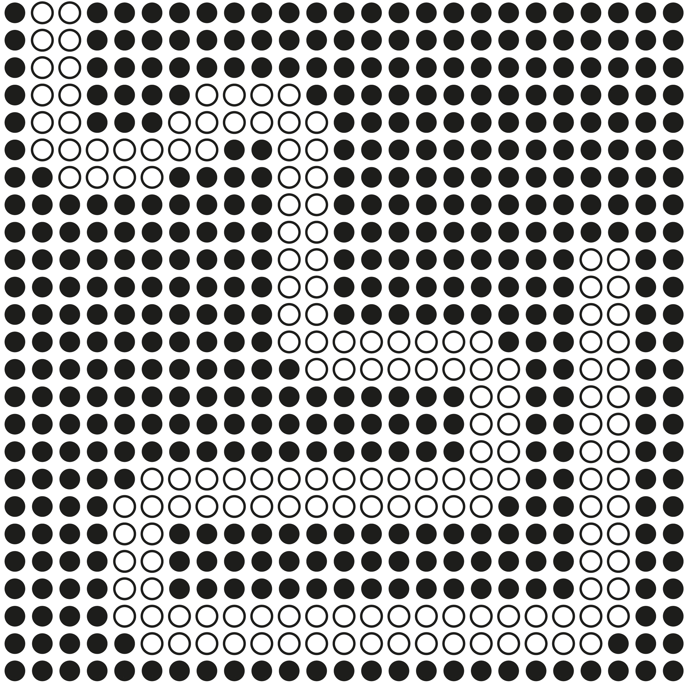
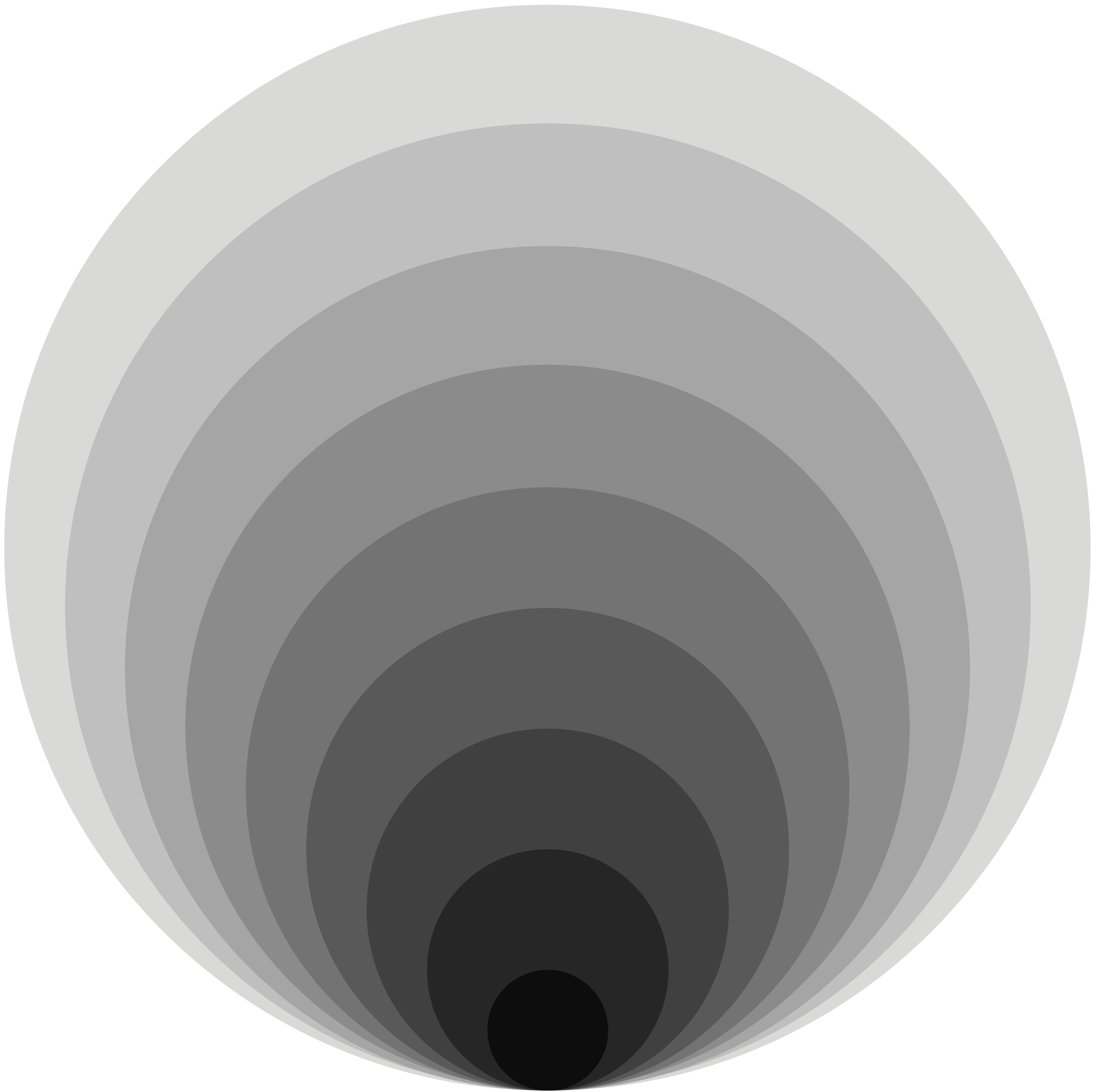
These circles are based on the diagrams of gas molecules in science books, moving rapidly and randomly around the composition. However, due to this inspiration this design would probably be interpreted as such rather than to indicate the concept of movement.
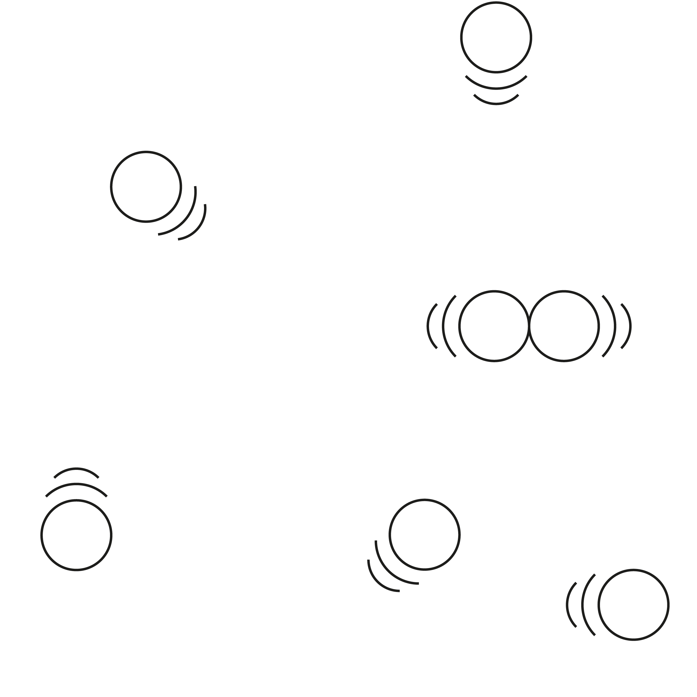
I found that just by placing a series of lines side by side created the illusion of them moving, which is quite disconcerting if you stare at them for long enough.
I tried to create a sense of movement in this design by intertwining circular shapes, with three of them having ‘heads’ so it looks like these ones are winding their way through the others. I thought it did create a sense of movement quite successfully. This design is based on the ‘Orange Movement’ logo in the examples above.
Strongly inspired by the last logo in the examples above, I used a gradient to make it look as though the silhouette of the circle is moving from one side to the other. I used the colour red as it has sense of action about it. I thought this design was rather successful at indicating movement.

EVALUATION
When I started this exercise I thought it was going to be very challenging to devise a symbol for the concept of movement and I was proved right. However, once I had started to research examples of visual representations of movement by other artists, especially the logos designs, I felt more inspired to come up with my own attempts. As stated in the accompanying notes, some of these were more successful than others. I also found that I tended to end up creating illustrations, which I’m not sure would serve well as symbols. This exercise helped me understand how difficult it is to create designs that can be universally interpreted without explanations.
Sources:
http://www.ancientpages.com/2016/05/23/10-ancient-celtic-symbols-explained/
https://www.ancient-symbols.com/mayan_symbols.html
http://www.touregypt.net/featurestories/symbolism2.htm
http://www.words-chinese.com/images2/chinese_symbols_for_motion_9414_2_18.png
https://www.kingston.gov.uk/info/200246/museum_collections_and_exhibitions/539/eadweard_muybridge
http://www.artsology.com/motion_in_art.php
https://www.sophia.org/tutorials/elements-of-art-movement-and-time
http://legomenon.com/time-and-motion-in-art-futurist-paintings-of-movement.html
http://www.theartstory.org/movement-kinetic-art.htm
http://www.tate.org.uk/art/artworks/riley-blaze-p05083
http://www.tate.org.uk/whats-on/tate-britain/exhibition/eadweard-muybridge/exhibition-guide/horse-motion